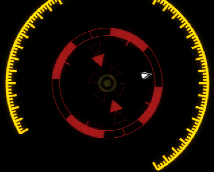
Quickly add animated heads-up display elements into your motion graphics, interface animations, and visual effects shots.
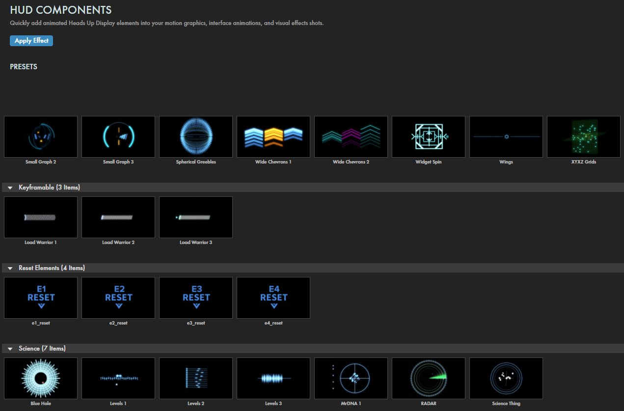
Presets
Get your HUD effects quickly locked on target with this tool's dozens of varied and convenient presets. Find them via the blue Open Dashboard... button or the Choose a Preset... button below it.
As with all other Universe tools, you can modify or create a HUD Components look and then save it under its own name by pressing the Save Preset... button.
Presets are now available in six categories:
Analog, Arcs, Bug, Fantasy User Interface, Keyframable, Reset Elements, Science, and Targeting.
Before we dig in, you might want a more visual overview of HUD Components' capabilities and features. If so, please CLICK HERE to watch our Cineversity Getting Started video.
Master Controls
Master Animation Speed
controls the speed of animation for the entire HUD build. Speed for individual elements can be controlled locally in each element's controls.
Note that a 0 speed will be motionless. Maximum speeds of 10 and -10 will be equally fast, but their movements will be in opposite directions. (Use negative values with the AnalogClock preset to make the seconds hand run backward.)
Master Random Seed
gives results with different random values. If you don't like the result of the effect on a given frame, change this value and it will recalculate any of the random values used to create it. This slider is also helpful if you have more than one layer being affected and you don't want them to look exactly the same.
Elements
You will see controls for each HUD effect's four elements (Element 1 = E1, Element 2 = E2, Element 3 = E3, Element 4 =E4). By default, all scaling, positioning, and animation for the four elements tie to Element 1 as the master. Each can be unlinked within the element controls.
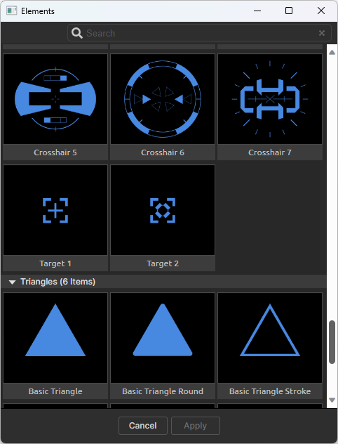
Browse Elements
pops up a browser window containing the element types available for that element (Arcs, Arrows, Chevrons, Circular, Grid, Hex, Organic, Pointers, Square, Targeting, Triangles, and UI). After choosing an element, it will appear in the Element Type drop-down (see below).
Element Type
shows all the elements available in a drop-down menu. You can select the element here or from the Browse Elements button (see above). Note the up and down arrows at the top and bottom of the menu, as these may reveal more options. At the top of the menu, Reset Element Group will revert all parameters for that element to their default settings. Selecting None effectively disables an element.
Link Element (2/3/4) to Element 1:
This checkbox is selected by default, which means Element 1 acts as the parent and all transformations and animations link to it. Unchecking this box will un-parent that element from Element 1 and allow animations and transformations to be controlled separately for that element.
Color
selects the color desired for the element.
Opacity
sets the element's transparency level.
Animation:
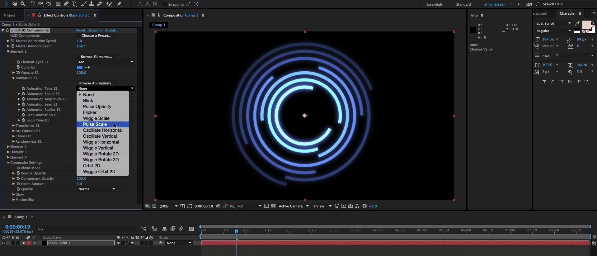
Browse Animations
brings up a browser with animated thumbnails to show what animation will apply. When you first open the browser, all thumbnails run through their animations once. To see any of them again, hover the mouse over that thumbnail. Once selected, the animation name will be visible in the
Animation Type
drop-down (below).
Animation Type
shows all animations available in a drop-down; you may select them from here. Once an animation is selected, it's name will be visible here.
Animation Speed
controls the speed of the animation.
Animation Amplitude
controls the amplitude of the animation, changing the high and low values of the arc of the motion.
Let's illustrate these last two parameters. In our first example below, we use Animation Type: Oscillate Vertical with Element Type: Square Outline Medium. Then we set Animation Speed: 1.5 and Animation Amplitude: 2.0.
Now compare that to values of Animation Speed: 4.0 and Animation Amplitude: 12.0.
Animation Seed
gives results with different random values. If you don't like the result of the animation on a given frame, change this value and it will recalculate any of the random values used to create it.
Animation Radius
controls the trajectory radius of orbit animation types, changing the width of the motion's arc. The following example puts a Basic Chevron on an Orbit 2D animation, then applies Animation Radius values of 2 (left) and 40 (right).
Loop Animation
(enabled by default) loops the animation so it doesn't stop.
Loop Time
sets the length of time for the animation loop. The default is 5.0 seconds.
Transforms:
Position
establishes the element's location. Type in x and y values or use the cross-hair to drag it wherever desired.
X/Y/Z Rotation
controls element rotation on each axis.
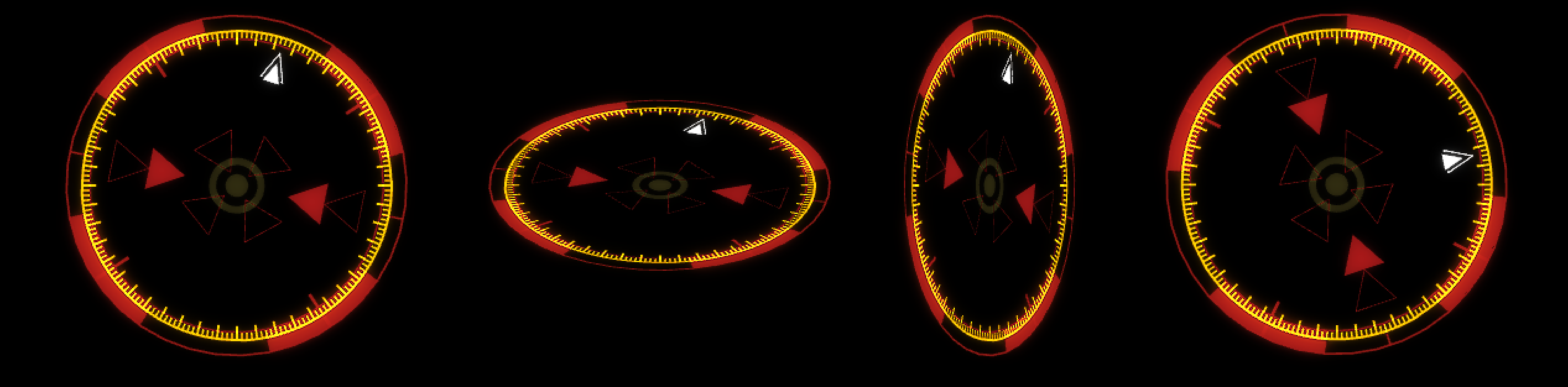
In the comparison below, based on the HUD Clock 1 preset, we start with all axes at 0 degrees of rotation (far left). Then we progress through setting the x, y, and z axes at 0x+60 degrees, respectively. In this preset, Element 1 uses the Measure Arc 3 element type, shown in yellow. Notice how the other HUD elements move in sync with each change to Element 1 transforms, because each has its Link to Element 1 checkbox enabled.
Scale Uniformly
(on by default) proportionally scales the element that will be changed using the
Uniform Scale
slider (below). If unchecked, the
X/Y Scale
controls will become accessible, and you can change each independently.
X
and
Y Anchor Offset
controls the offset from the HUD's center (controlled by the Position parameter) along each axis.
Arc Options:
If you have chosen one of the Arc elements, this group of options will become available.
Segment Angle
establishes what portion of the arc is visible between 0 and 360 degrees.
Radius
controls the length of the circle radius around which the arc is based.
Stroke Width
sets the arc's width.
Stroke Location
controls whether the stroke is drawn on the arc's Inside, Outside, or Center.
The following example proceeds from our last image and uses values of Segment Angle: 270 (down from 360), Radius 500 (up from 390), Stroke Width: 12 (up from 4), and Stroke Location: Center.
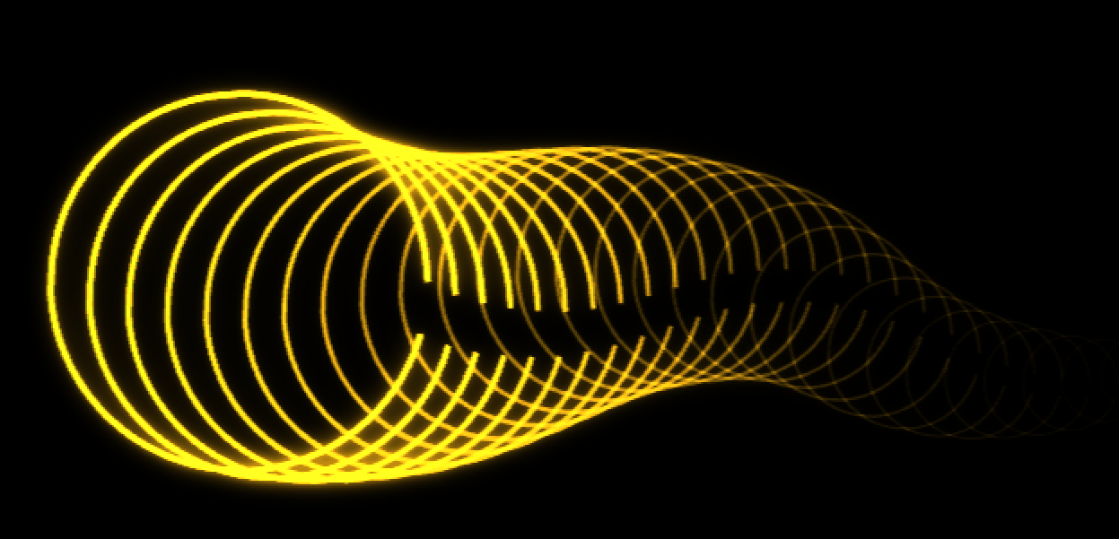
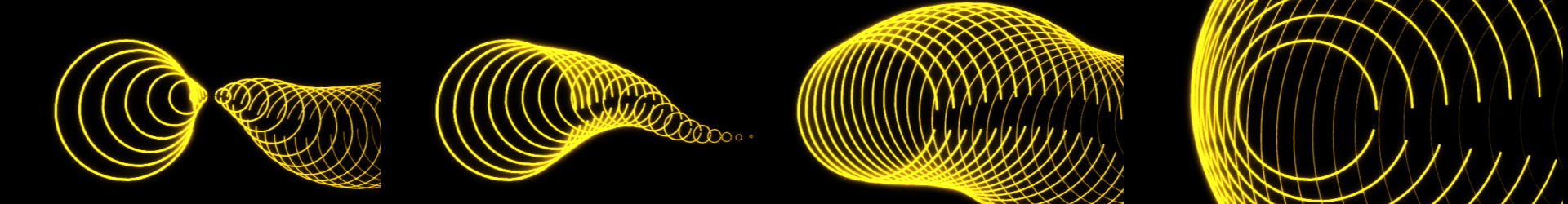
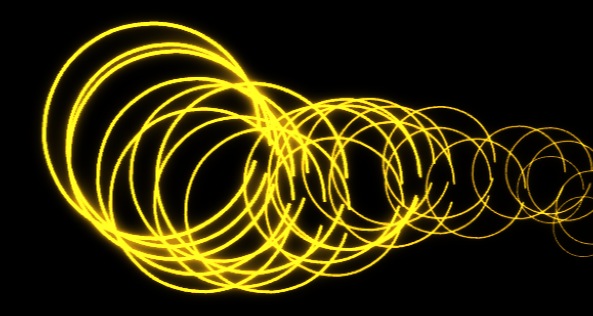
Clones:
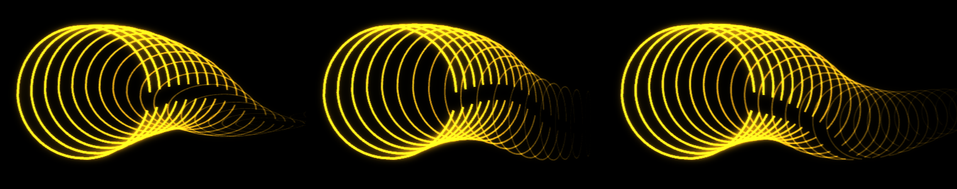
We'll illustrate this subgroup's parameters with a series of examples based off the Slinky Rings preset, with Segment Angle E1 reduced to 340 degrees to create that small gap in each ring.
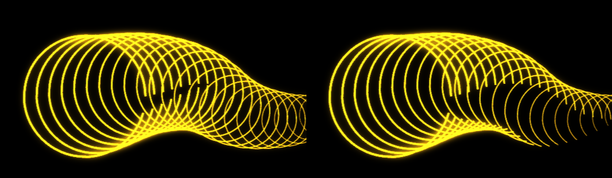
Number of Clones
ranges from 0 to 99.
Here, we've used the default value of 34. Increasing this number given our preset and other parameters yields no visible increase in rings.
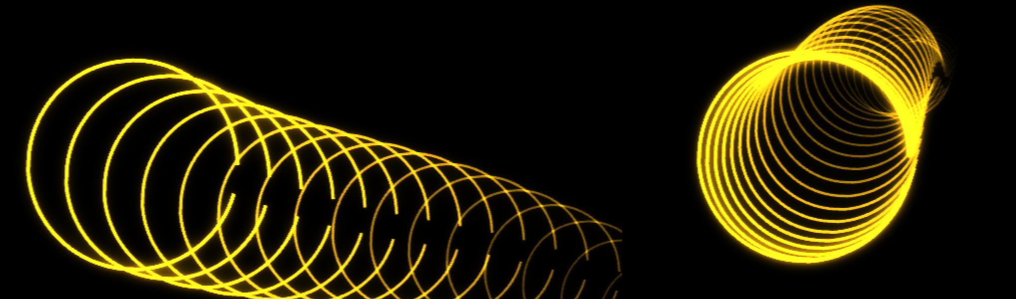
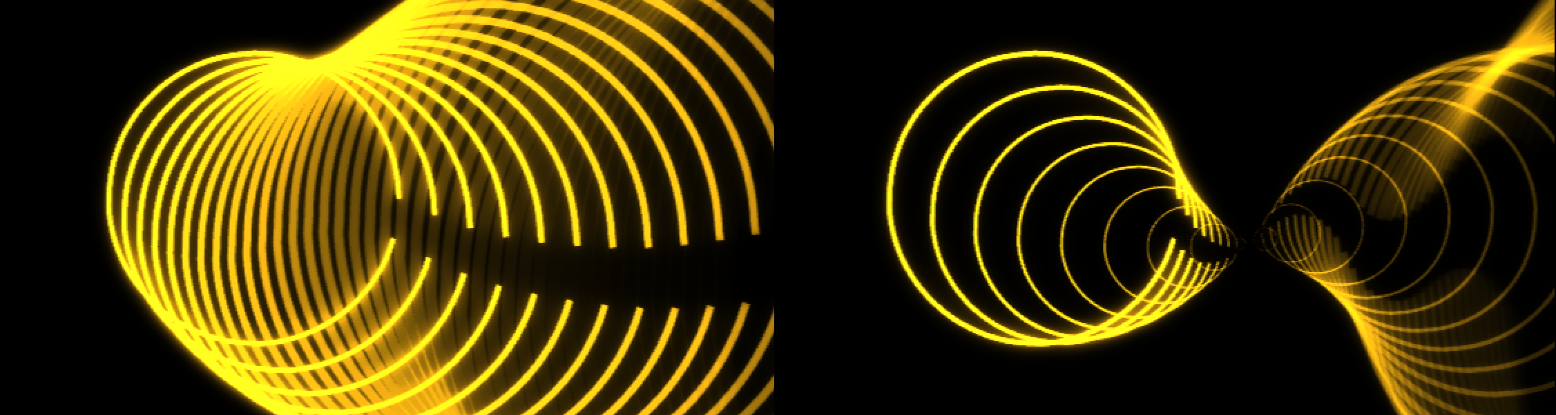
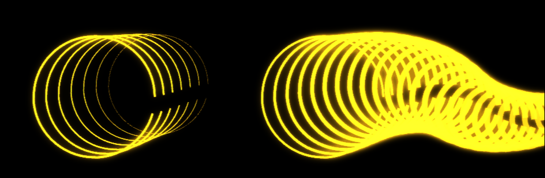
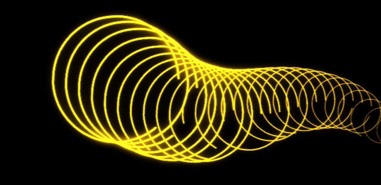
Clone Position
sets the x and y offset for a clone. The default values shown above are 997, 544. In the following two examples, we change these to 1030, 565 (left) and 970, 532 (right).
Rotate and Scale
lets you choose whether clones will be Incrementally Cascading (left, below) or In Unison with Element 1 (right) for their rotation and scaling.
Clone X/Y/Z Rotation
sets the rotation offset for each clone.
Shown below are +5 degree rotations for the x, y, and z axes, respectively, from left to right.
Clone Orbit Anchor
sets how far around the anchor each clone will orbit from the original.
Let's see this with an animation from 0 to 90 degrees shown over a few seconds.
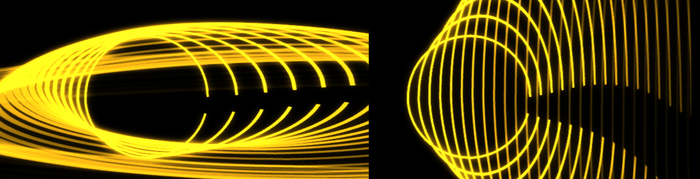
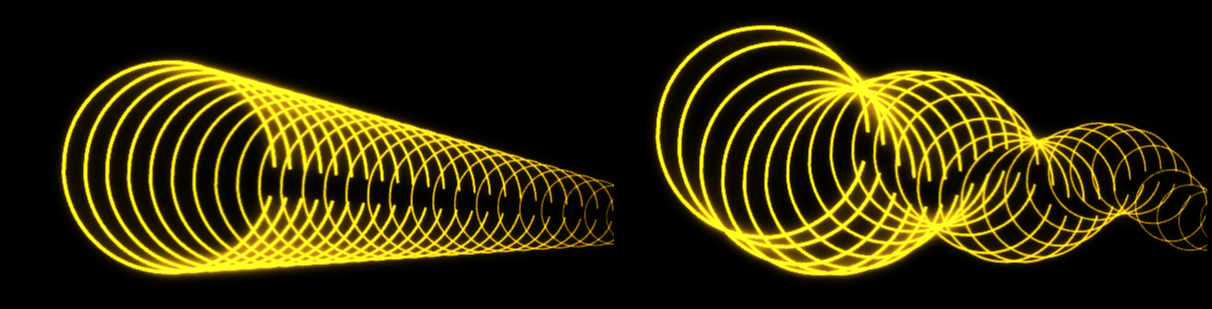
Clone Scale Uniformly
(checked on by default), scales the clone proportionally using the
Clone Uniform Scaleslider (below). The tapering you see in the prior clone examples arises from a default value of -3 in our preset. However, increasing this value (the left example, below, uses a value of 7) results in an enlarging of clone size. Conversely, decreasing values further into the negative (shown with -12, right) can yield an intriguing hourglass-like effect. When you uncheck Clone Scale Uniformly, the Clone Uniform Scale parameter grays out and Clone X/Y
enable. You can change each independently. Below, we show values of 30 for both the x (left) and y (right) controls.
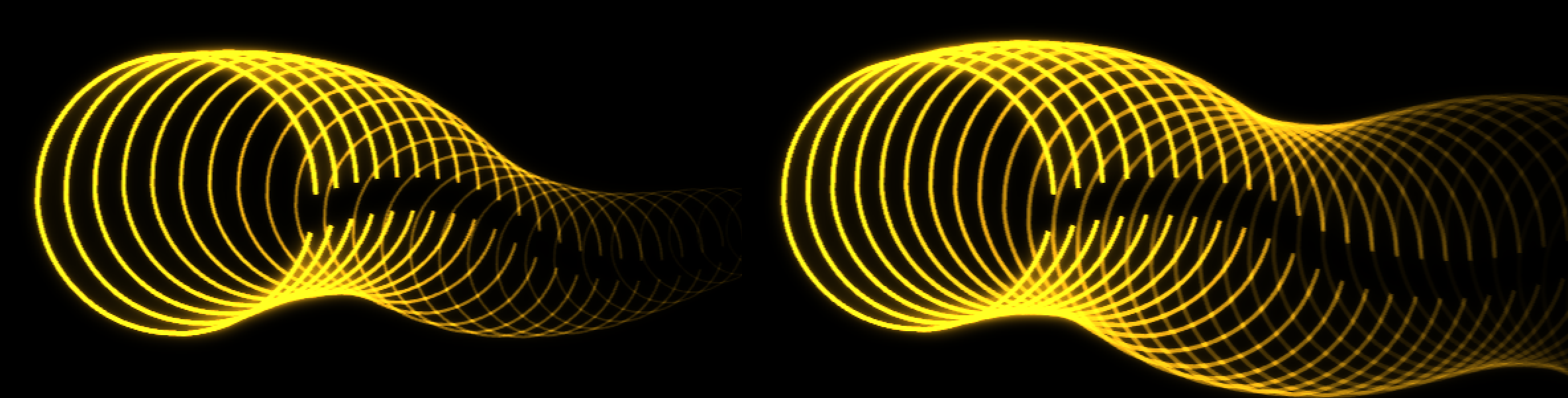
Clone Fade
sets the amount that each clone will fade from the next, growing more transparent as the number increases.
Below, we show settings of 0 (the minimum, left) and 20 (right).
Clone Radius Offset
establishes the offset for each clone from the radius of the arc.
Shown below are values of -30 (far left), -10, 20, and 80 (far right).
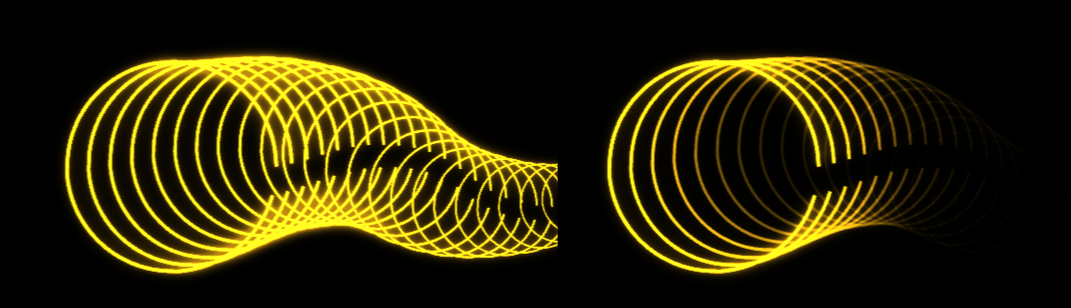
Clone Segment Offset
changes the size of the segment for the clones by changing the degree amount of the arc for each clone.
You can see how positive values (such as 2, below left) close the gap in our rings while negative values (such as -6, right) opens it. Animating this value could result in a pulsing, open/close motion in our element.
Clone Stroke Width Offset
lets clones become thinner or wider by setting a stoke width offset.
Depending on the element color, this can influence perceived brightness, as shown by values of -1 (left) and 2 (right) below.
Clone Time Offset
sets an offset in the animation time for the clone.
Most of the above images use a value of 0.25. Here are how values of 0 (the minimum, left) and 0.5 (right) appear.
Randomness
allows certain element transformations and characteristics to be affected randomly. The change amount is controlled by percentage values for each.
Now that you've seen how parameters such as offset, scale, and radius affect clones, only a couple of illustrations should clarify the impact of randomness on these controls.
Random Seed
gives results with different random values.
Random X/Y Offset
randomly changes the x or y offset of the element.
Here is what 8% random offset looks like when applied to both axes.
Random X/Y/Z Rotation
randomly changes the rotation of the element on the x, y, or z axis.
Random Scale
randomly changes the scale of the element.
Random Opacity
randomly changes the element's opacity.
Random Radius
randomly changes the arc's radius.
Random Segment Angle
randomly changes the segment angle of an arc. Notice in the example below, with a value of 50, how the top end of each clone's arc stays constant. Only the bottom end of the arc (a result of the amount of angle in the segment) changes.
Random Stroke Width
randomly changes the width of the stroke drawn for the element.
Composite Settings
Blend Mode
establishes the blending mode used to composite the HUD Components results over the original image.
Source Opacity
sets the transparency level for the source footage.
Component Opacity
sets the transparency level for the HUD component.
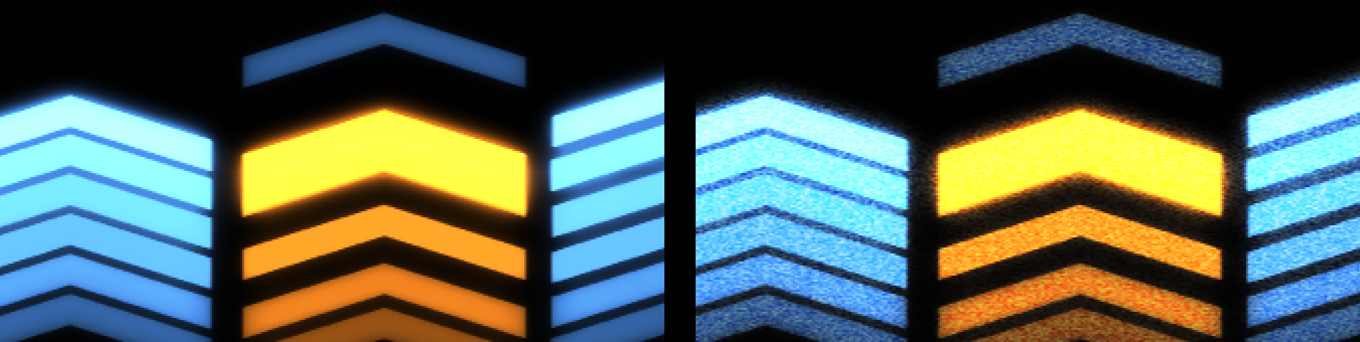
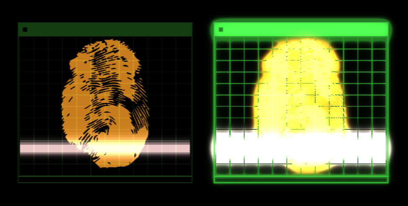
Noise Amount
add noise over your HUD component.
Below, we show a 200% zoom on the Wide Chevrons 1 preset, with values of 0 (left) and 80 (right).
Quality
selects whether the HUD component renders at Normal or High quality. Setting the quality to High may affect render time.
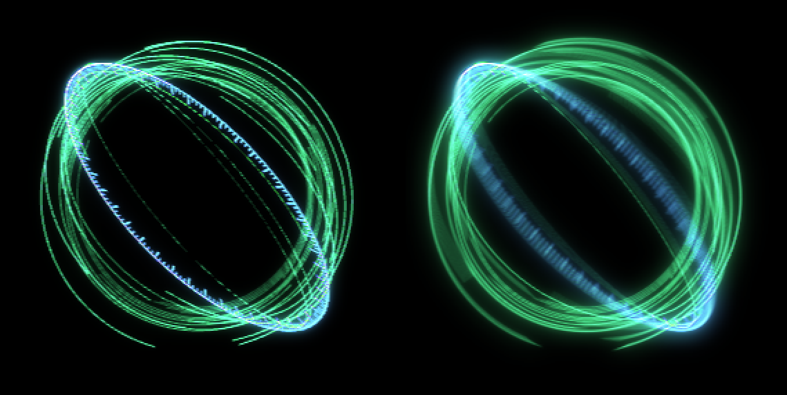
Glow:
Glow Color
sets the color desired for the glow on the elements. As shown in Glow Color Mix below, this color won't have any effect unless mixed into the HUD component with a positive value. Increasing Glow Radius and Glow Intensity can exacerbate the glows in those elements' colors. Glow Color, when mixed in, acts like an overlay on top of those element glows.
Glow Radius
determines how far the glow extends. This distance is measured in pixels from the
bright areas of the image. Higher values produce more diffuse glows. Lower values produce glows with sharp edges.
Shown below are values of 50 (the default, left) and 200 (right).
Glow Softness
controls the glow's edges.
Higher values yield a harder edge; lower values will show as more diffuse.
Glow Intensity
establishes the glow's brightness. Higher values increase the intensity of the glow.
This parameter defaults to a value of 1. Shown below are values of 0 (left) and 2 (right).
Glow Color Mix
controls the level of saturation of the color in the glow.
Note that a 0 value (shown left, below) means that none of the Glow Color mixes into the final HUD component. Conversely, a 100 value (right) effectively drowns out all other glow in the design.
Glow Mix
sets the overall amount of glow applied. Setting this to 0 means the glow is off; 100 means the glow is at full strength.
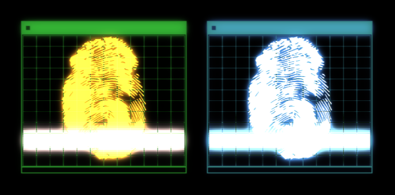
Motion Blur:
Motion Blur controls help create a smoother look to the effect. This group allows you to simulate the low shutter speed blur and frame blending commonly seen in film.
To enable the motion blur effect, choose Low, Medium, or High from the
Motion Blur
drop-down. Higher quality blurs may affect render speeds.
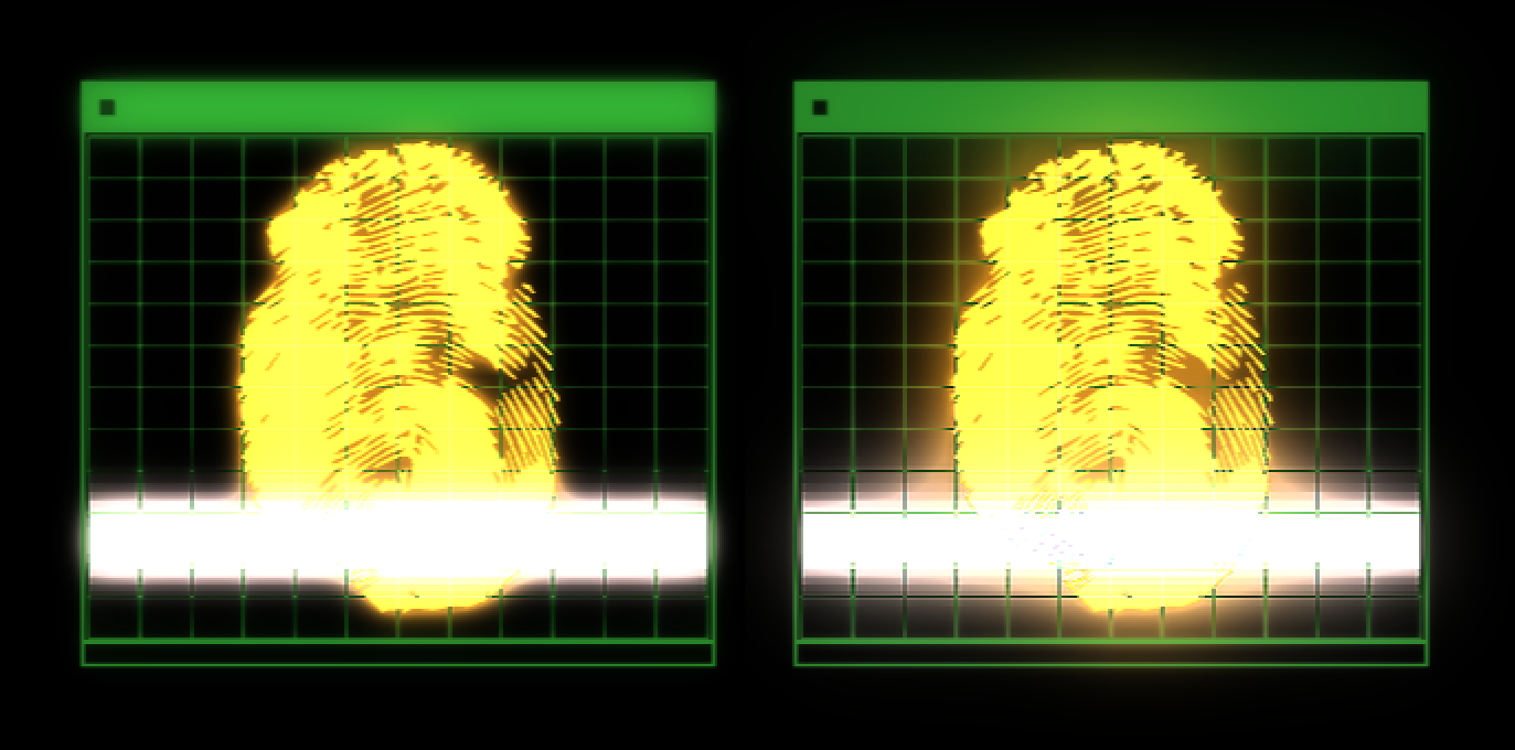
Below, we show the difference between Off (left) and High (right).
Motion Blur Shutter
can increase or decrease motion blur on moving HUD elements since the control mimics a longer frame exposure.
Motion Blur Phase
allows you to synchronize or desynchronize the timing of the shutter opening and closing with the footage's frame rate.