Creates an adjustable loading screen motion graphic displaying progress from zero to completion.
Presets & Video Walk-Through
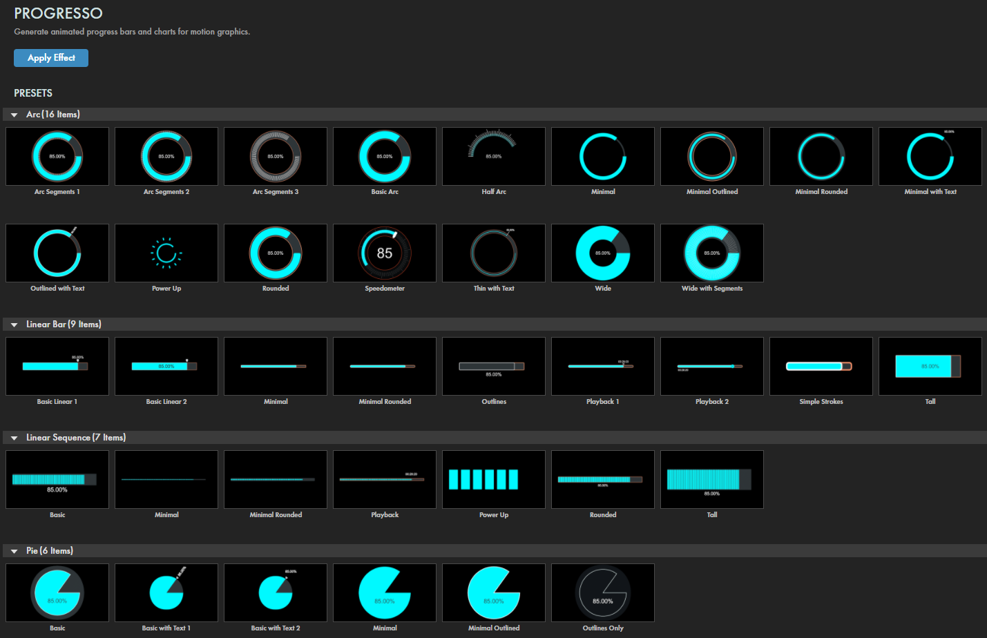
Progresso's many presets deliver one-click shortcuts to get you to an attractive, easily customizable progress indicator. Find our presets via the blue Open Dashboard... button or the Choose a Preset... button below it.
As with all other Universe tools, you can modify or create a Progresso look and then save it under its own name by pressing the Save Preset... button.
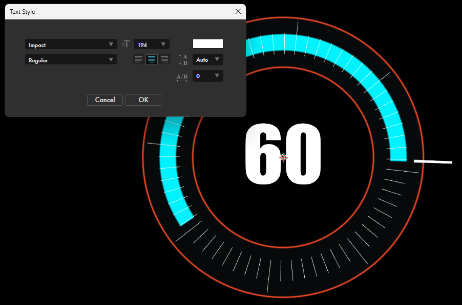
Unlike most Universe plugins, Progresso offers a Text Style... button below the Save Preset... button. Click this to adjust your text's font and other text attributes.
If you'd like a visual overview of the plugin before diving into this guide, we recommend giving our Cineversity tutorial a watch.
Modify the Effect
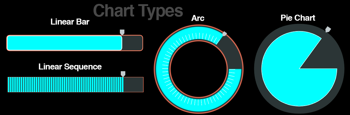
Chart Type
defines which chart layout will denote the loading progress from zero to completion. Progresso offers four basic types (Arc, Linear Bar, Linear Sequence, and Pie), shown in the above image.
Progress
adjusts where, between 0 and 100, the current chart progress is at. (Note: This will need to be keyframed between 0 and 100 to create a basic progress animation.)
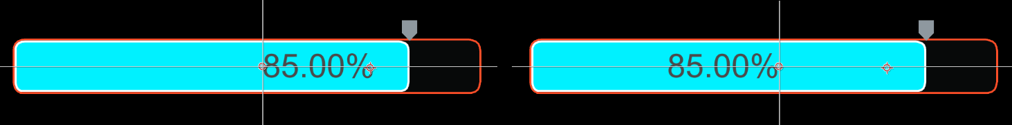
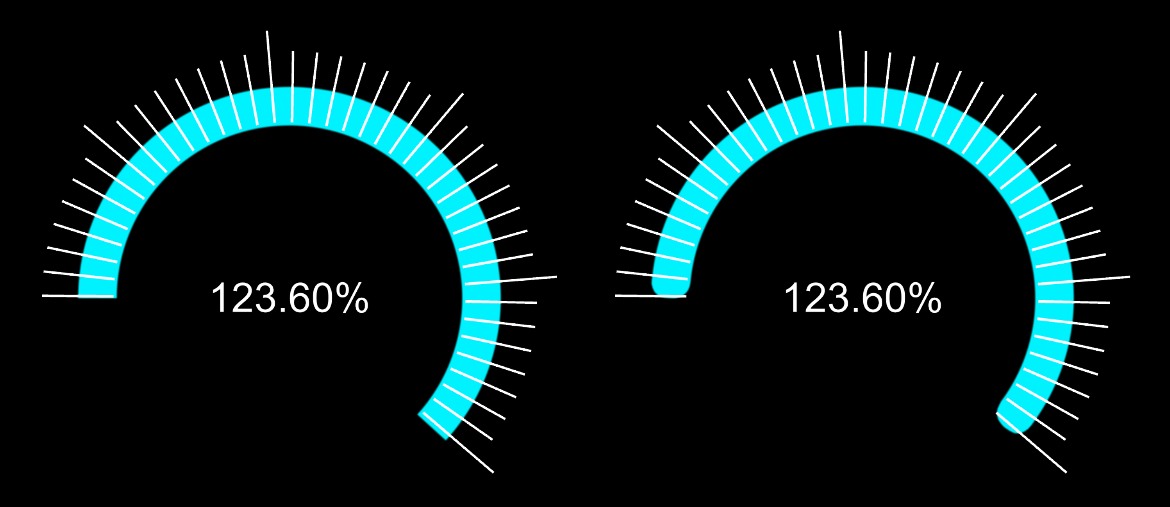
Obviously, if you input a Progress value of 85% when your Numbers > Final Value is set to 100, then the displayed Progress value will be 85.
Fun fact: The Peel 50 stands (squats?) as one of the smallest and slowest production cars in the world. The original 1960s model offered a top speed of 38 mph (61 km/h). To represent this in Progresso, you would set Final Value to 38, pick whatever Progress percentage is desired, then laugh at such a silly, silly vehicle.
Position
provides coordinates and controls that define where within the frame the chart appears.
Color
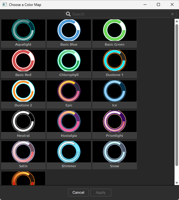
Choose a Color Map
launches a modular window with a visible color map preset library for your chart.
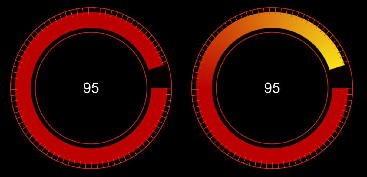
Fill Style
determines whether the chart's color uses a Solid (left, below) or a Gradient (right). Note that in both cases we used the Warm color map preset. However, selecting Solid tells Progresso to ignore your FG Fill Color 2 value.
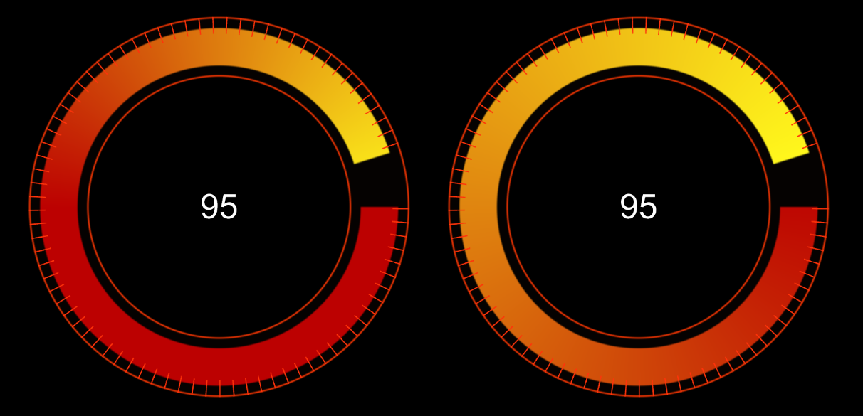
Gradient Anchor
adjusts whether the gradient progresses from one color to the other starting at the
Start (left, below) or End (right) of the progress bar. Another way of thinking of this is the amount of priority placed on your FG Fill Color vs. FG Fill Color 2 values within the gradient.
FG Fill Color
and
FG Fill Color 2
define the first and second colors of the foreground element's gradient.
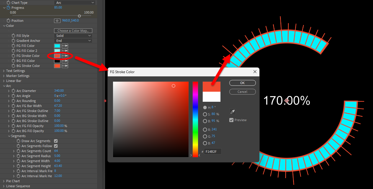
FG Stroke Color
defines the foreground element's stroke color.
In the examples shown here, this refers to the arc within the circle.
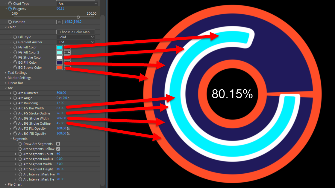
BG Fill Color
defines the background element's color.
BG Stroke Color
defines the background element's stroke color.
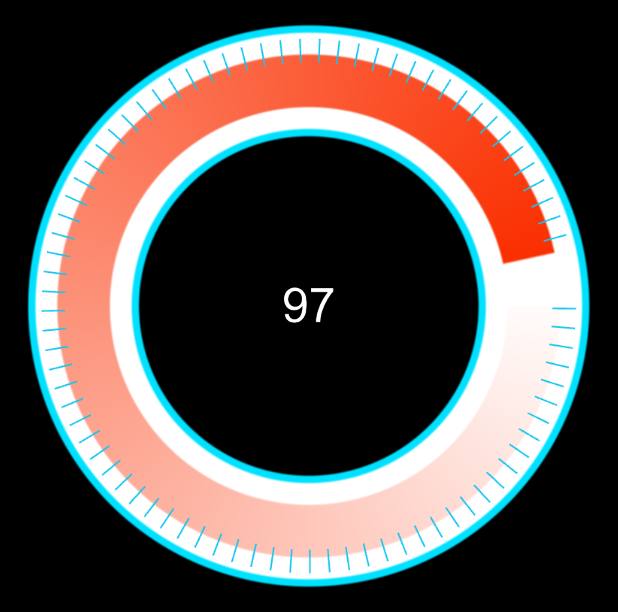
In the following image, we set both the FG Fill Color and the BG Fill Color to white, so the progress arc would seem to emerge gradually from the background. We set BG Stroke Color to aqua and increased the Arc BG Stroke Outline (see below) to 10 for easier visibility.
Text Settings
Render Text
toggles the effect's alphanumeric text element.
Number Style
determines whether the progress is formatted as Time or Numbers. Your selection here determines whether the Time or Numbers subgroup controls (see below) become active.
Text Follows Progress
toggles whether the text element is paired to the progress completion.
You can see this here in our adaptation of the Playback preset.
Auto Rotate Text
toggles whether the text element rotates with the progress (when applicable). As shown below, this can result in text being upside-down.
Font Color
defines the color of the text element.
Font Size
controls the text element's scale.
Text Offset X/Y
adjust the text element's location along the x and y axes in relation to its default position.
Text Radius Offset
moves the text element outward (negative values) or inward (positive values) from the progress chart's center in relation to its default position.
Text Rotation
rotates the text element at an angle.
Justification
controls whether the text element aligned to the Left (shown left, below), Center, or Right (right) relative to the
progress indicator's Position point.
Horizontal Tracking
adjusts the spacing between letters in the text element.
Text Blend Mode
provides the standard blending controls which determine how the effect integrates into the rest of the composition.
Numbers
adjusts the numerical output when you select Numbers as the Number Style.
Final Value
defines the final numerical value that represents progress completion.
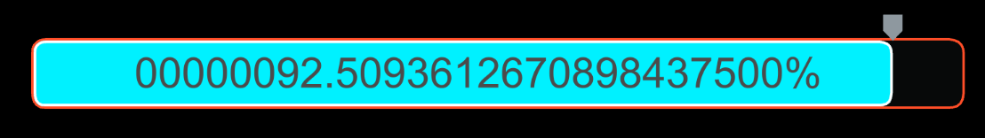
Number of Decimals
adjusts the number of decimal places to include in the output, adding zeroes to fill the number of places after the decimal when necessary.
Minimum Integer Length
adjusts the minimum number of integers to include in the output, adding zeroes before the decimal to fill the length when necessary.
The following example shows these two parameters carried to absurd lengths.
Use Commas
toggles whether commas are placed every three decimal places to the left of the decimal point.
Swap Commas/Period
switches any placement of commas with periods and vice versa.
Unit of Measure
denotes the number with whatever symbol represents the unit selected from the list (e.g., Dollar, Euro, and Degrees).
Unit Placement
determines whether the unit's symbol placement is dependent on the Unit of Measure selected (Smart)
or if it's strictly Before or After the number.
Insert Space
toggles a space between the number and unit symbol.
Time
adjusts the numerical output when Time is selected as the Number Style.
Format
adjusts the formatting of the time into 12-hour, 24-hour, or video timecode output.
Rate
controls the speed at which the time increases (positive values) or decreases (negative values).
This can be handy for appearing to "accelerate" or "decellerate" time in a video clip that shows a time indicator.
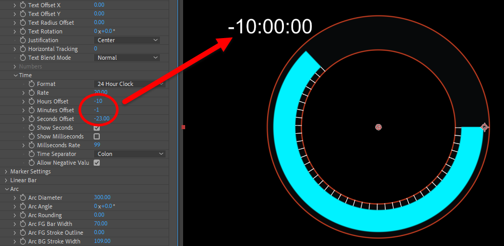
Hours/Minutes/Seconds Offset
adds or subtracts time from the indicator's current Progress value.
Show Seconds
toggles whether seconds are displayed.
Show Milliseconds
toggles whether milliseconds are displayed.
Milliseconds Rate
controls the speed at which the milliseconds advance.
Time Separator
controls the symbol used to separate hours, minutes, seconds, and milliseconds.
Allow Negative Values
toggles whether time can extend into negative values, as shown above.
Marker Settings
Draw Marker
toggles the marker element of the progress chart, which tracks on the value and position conveyed by the Progress.
Marker Shape
offers five shape choices: None, Pointer, Rectangle, Ellipse, and Triangle.
Marker Width
and
Height
define the marker element's horizontal and vertical scale.
Pointer Height
defines the Marker Shape length.
Marker Offset X/Y
adjust the marker element's location along the x and y axes in relation to its default position.
Marker Color
defines the marker element's color.
Marker Angle
rotates the marker element.
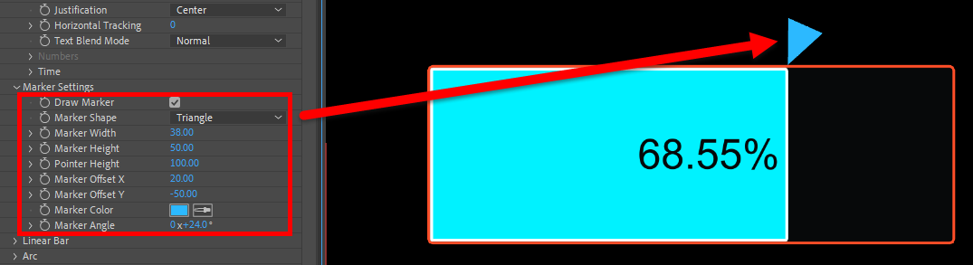
You can see how we've adjusted several of these marker controls in the following example.
Linear Bar
contains adjustments for the chart when Linear Bar is selected as the Chart Type.
Bar Width
and
Height
define the horizontal and vertical sizing of the bar.
Bar Rounding
controls the rounding of the bar edges.
Bar FG Stroke Width
defines the width of the bar's inner stroke.
Bar BG Stroke Width
defines the width of the bar's outer stroke.
Bar FG/BG Fill Opacity
controls the transparency of the foreground and background bar colors.
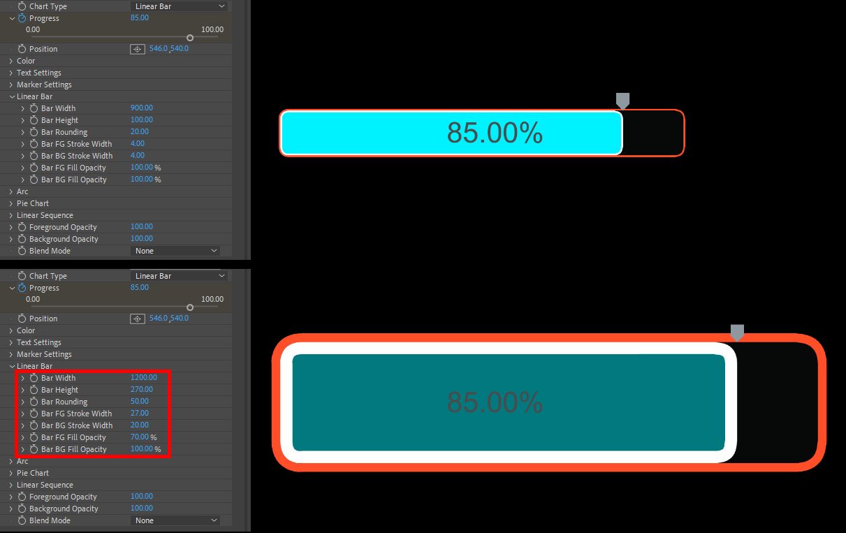
Again, you can compare the default (top) and modified (below) values below to see how Linear Bar parameters impact the indicator's appearance.
Arc
controls contain chart adjustments for when you select Arc as the Chart Type.
Arc Diameter
controls the arc's width.
Arc Angle
rotates the arc and all of its elements around its center point.
Arc Rounding
rounds the progress arc's edges.
Below, you see the default of 0 (left) compared to the maximum value of 50 (right).
Arc FG Bar Width
defines the width of the progress arc.
Arc FG Stroke Outline
defines the width of the stroke of the progress arc.
Note that if you want to change the arc foreground stroke's color, you select this with the Color > FG Stroke Color parameter.
Arc BG Stroke Width
defines the width of the stroke that creates the background arc.
Arc BG Stroke Outline
defines the width of an additional stroke, which covers the background arc.
Distinguishing between foreground (FG) and background (BG) elements can sometimes be confusing, so we thickened up the stroke elements and pointed out which were which in the following example.
Arc FG/BG Fill Opacity
controls the transparency of the foreground and background arc colors.
Segments
Draw Arc Segments
toggles whether the arc is sectioned off into segments (see image below).
Arc Segments Follow Progress
toggles whether the segments are only revealed along with the progress arc.
Deselecting this will show segments around the entire background circle.
Arc Segments
defines how many segments the arc is sectioned into.
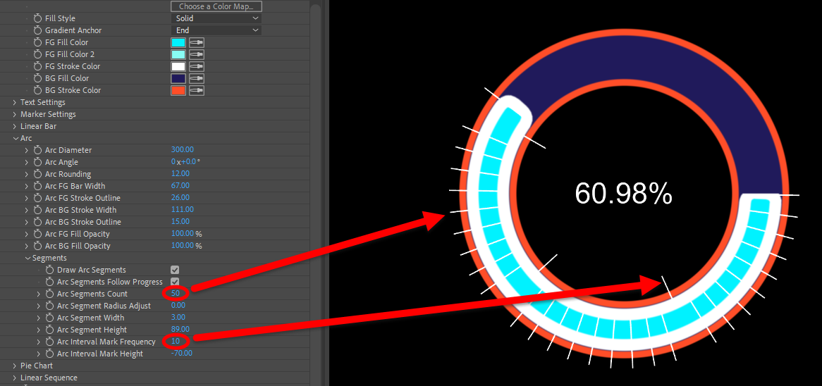
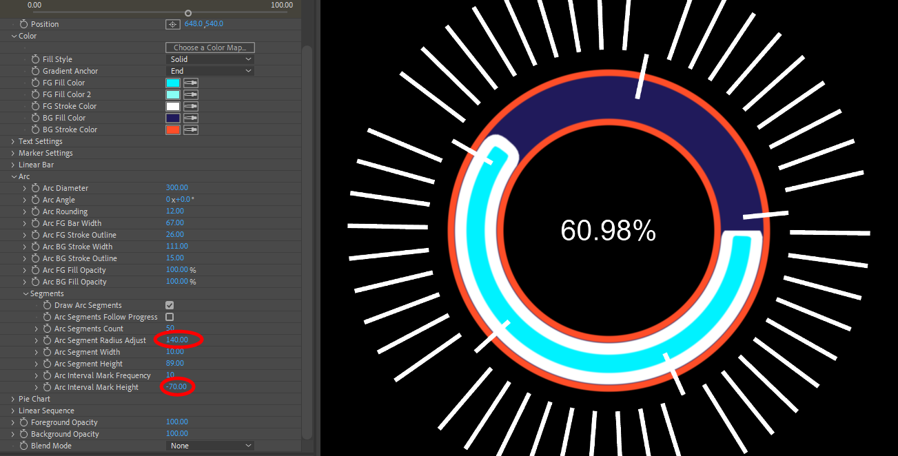
In this example, we've divided the circle into 50 segments and set an Arc Interval Mark Frequency of 10, which adds a secondary segment mark every 10 segments.
Arc Segment Radius Adjust
moves the segments outward (negative values) or inward (positive values) from the chart.
This affects all segments, including arc interval marks, and is why the interval marks in the following image are no longer within the innermost background edge. The higher Arc Segment Radius Adjust value has moved all segments outward.
Arc Segment Width
and
Height
define the horizontal and vertical sizing of the segment markers. Higher values yield the larger segments in the above image.
Arc Interval Mark Frequency
adjusts the number of segments between interval markers.
Arc Interval Mark Height
controls the length of the interval markers.
Pie Chart
contains adjustments for the chart when you select
Pie Chart as the Chart Type.
Pie FG/BG Diameter
controls the width of the pie chart's foreground and background elements.
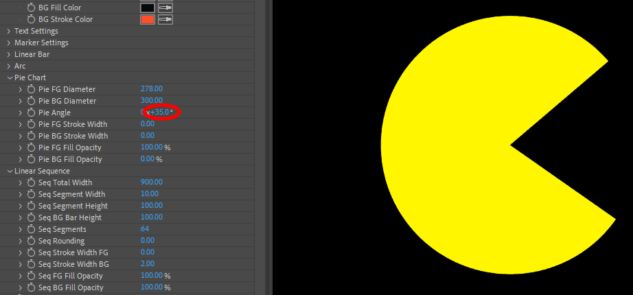
Pie Angle
rotates the pie chart and all of its elements around its center point.
Pie FG/BG Stroke Width
defines the width of the stroke around the pie chart's foreground and background elements.
Pie FG/BG Fill Opacity
controls the transparency of the foreground and background colors of the pie chart.
Linear Sequence
contains adjustments for the Linear Sequence form of Chart Type.
Seq Total Width
defines the sequence bar's lateral length.
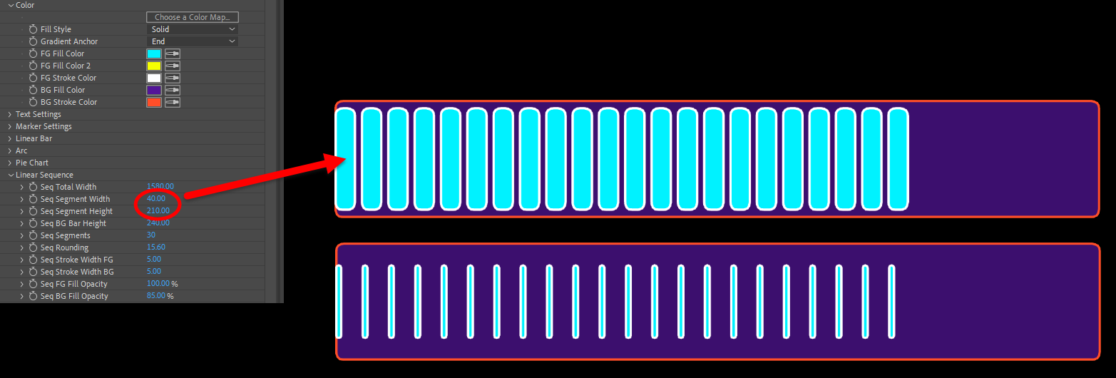
Seq Segment Width
and
Height
define the horizontal and vertical sizing of segments.
In this example, you can see how we dropped the width and height down from 40 and 210 to 10 and 150, respectively.
Seq BG Bar Height
adjusts the height of the sequence bar's background.
Seq Segments
defines how many segments the sequence is sectioned into.
Seq Rounding
rounds off the segments' edges.
Seq Stroke Width FG
defines the width of the stroke around the segment markers.
Seq Stroke Width BG
defines the width of the stroke around the linear sequence background.
Seq FG/BG Fill Opacity
controls the transparency of the linear sequence's foreground and background colors.
Foreground/Background Opacity
adjusts the foreground's and background's transparency between 0 (transparent) and 100 (opaque).
Blend Mode
includes the standard blending controls, which determine how the effect integrates into the rest of your composition.