Table of Contents
Table of Contents
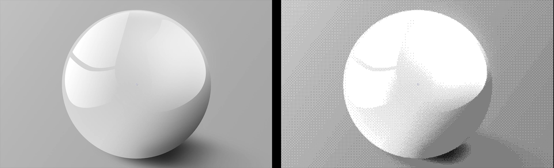
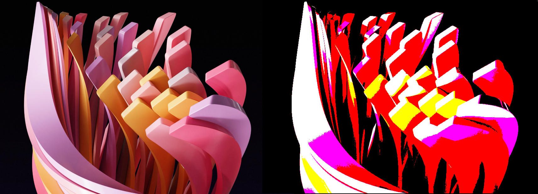
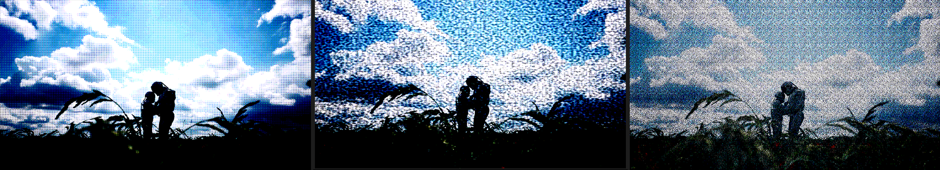
In graphics, dithering refers to various methods of mixing two colors to create the illusion of intermediate colors that add tonal depth. The simplest way to visualize this is by dithering between black and white to create the appearance of gray. This would be a two-color palette. In a three-color palette we might add a medium gray, as in the example below. Look closely and you’ll see that the shading in the right-hand version is composed only of medium gray or black dots.
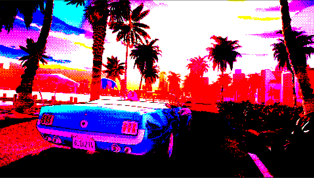
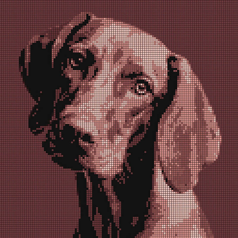
Dithering often comes into play when dealing with a restricted color palette, as in pixel art or retro 8/16-bit video games of the late ‘80s and early ‘90s. Of course, the two don’t have to go together. The curious doggo below offers a great example of pixel art with a very restricted palette. This was the de facto way of handling graphics until the 16-bit era of the Sega Genesis, Super Nintendo Entertainment System, and many other platforms.
And just as different games or platforms had specific, restricted color palettes to achieve their artistic look (see the incredible gallery at Lospec and search for your favorite console or system), so too are there many ways to go about dithering to achieve various shading outcomes.
The Dither and Palettes tools, all detailed in this one mini-guide, let you produce and reproduce whatever dithering and restricted color schemes your imagination desires. For those who want a deeper understanding of dithering and its various methods, we encourage you to explore the Resources page at Dithermark.com along with Maxime Heckel's blog post, "The Art of Dithering and Retro Shading for the Web."
How dithering deploys color and size for each dot relies on specific algorithms. For example, saying that all light colors in the source image turn white and all dark colors turn black is a very simple algorithm (and similar to thresholding). Within the scope of these dithering tools, we focus on two algorithm types: patterning and error diffusion.
Patterning applies a matrix (e.g., 4x4 or 8x8) to each dithering cell across the source image, and each cell maps to a source image pixel. Depending on the pixel’s value in relation to the underlying matrix value, a dot color results. Halftone dithering, for example, uses a pattern to mimic the old-school look of dot clustering, which can simulate shading. This was once common in black-and-white newspaper images and persists with offset printing and laser printers.
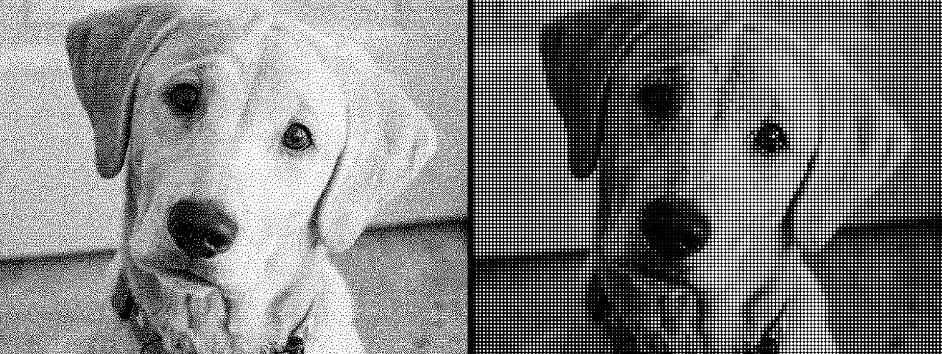
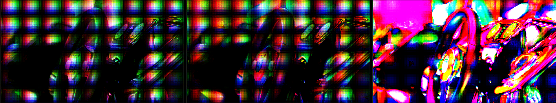
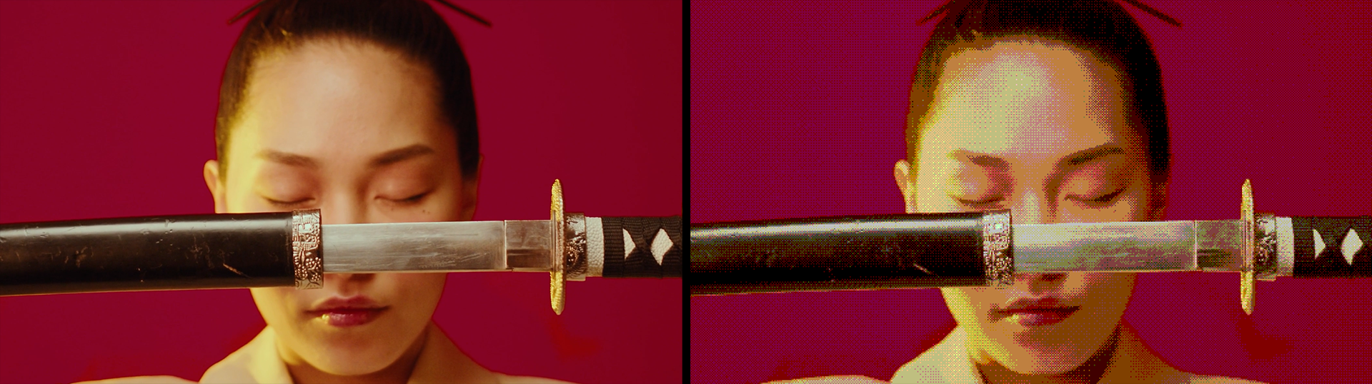
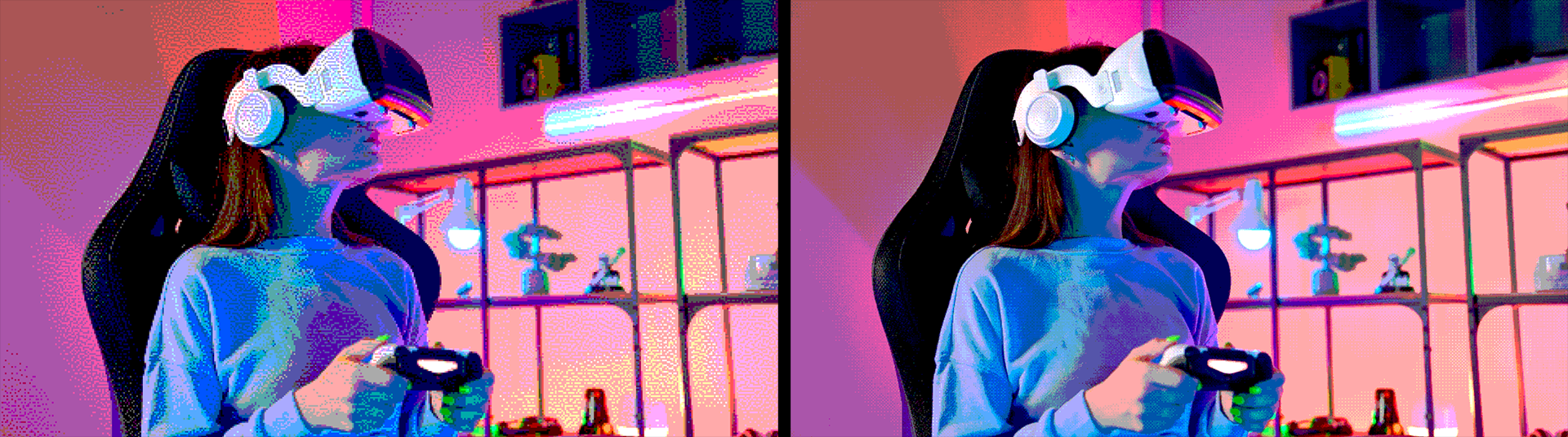
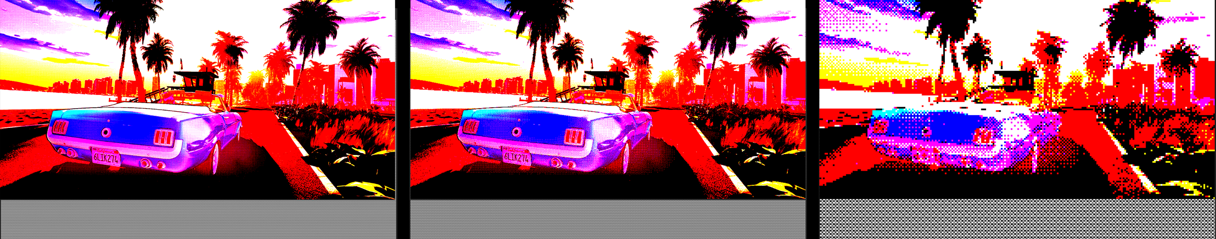
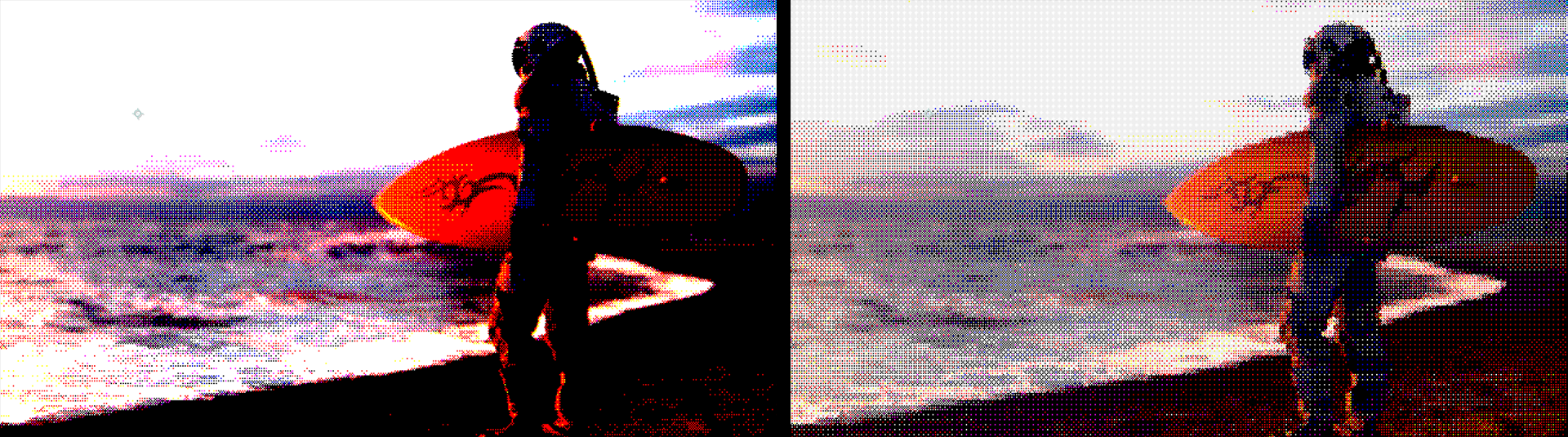
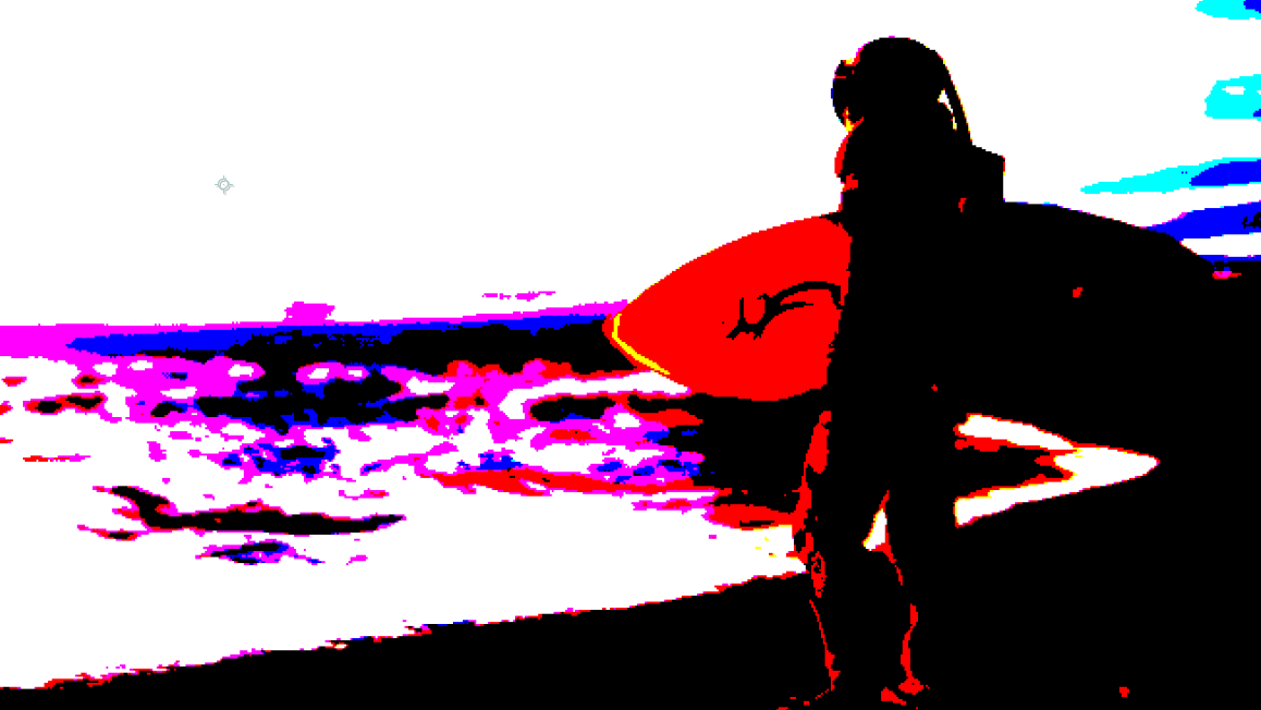
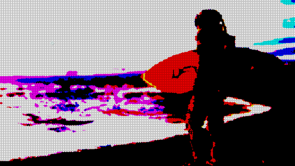
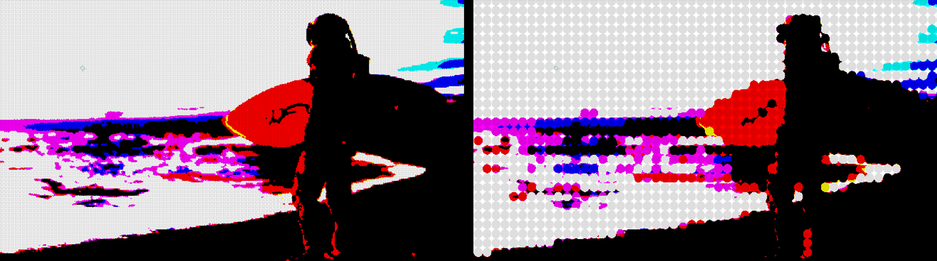
Error-diffusion dithering distributes the quantization error from each pixel to its neighboring pixels. Error diffusion techniques tend to result in smoother gradients and fewer artifacts than patterning. The following comparison between Ordered Dither (left) and Error Diffuse Dither (right), both of which use their tool’s respective defaults, illustrates this. Clearly, one approach is not “better” than another. It’s simply a matter of style and artistic need. That said, keep in mind that error-diffusion dithering is more computationally intensive.
With those basics covered, let’s dig into Red Giant’s five dithering tools.
Note: Like most Red Giant tools, the following plugins come with their own Dashboard presets and the ability to save your modifications as a custom preset. For brevity’s sake, we won’t repeat detailing the preset gallery half a dozen times here. It’s pretty self-explanatory. Just click Choose a Preset…, poke through the gallery, and let the magic begin.
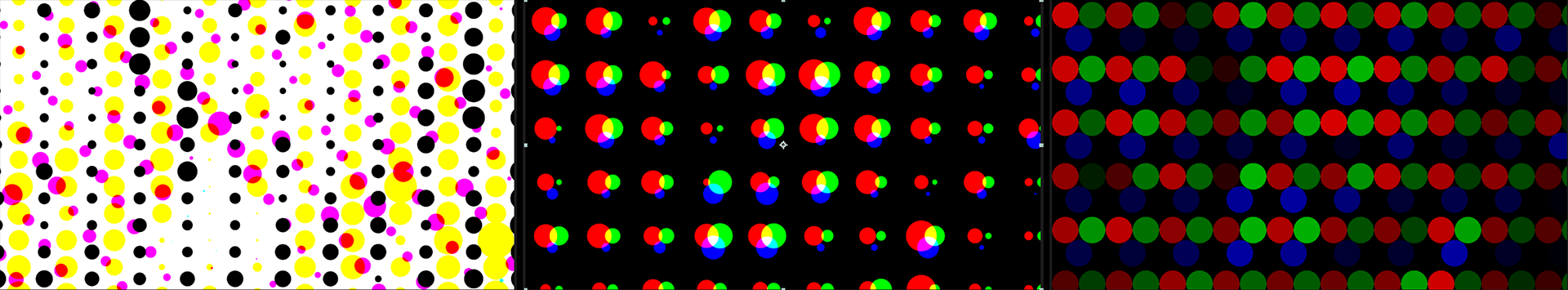
Naturally, there are different ways of displaying the dots that comprise a halftone pattern. This plugin offers three basic categories of Halftone Type dot patterns: Printer (similar to the Photoshop CMYK halftone effect), Monitor, and LED. You can see these compared, respectively, below.

To show how these types differ in their construction, here are the same three captures, except with the Dither Size blown up to 200. Observe how the three Dither Types vary in their methods.
Dither Size refers to the diameter, measured in pixels, of each dither dot. The examples below show the Printer type with Dither Size values of 5 (left), 25 (center), and 50 (right).
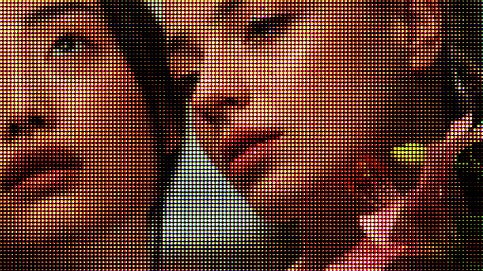
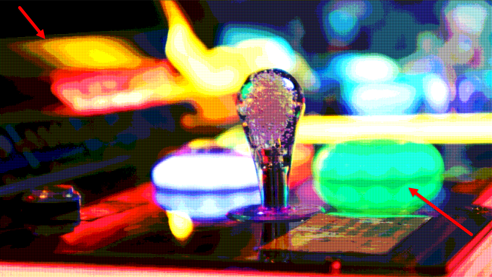
Perhaps the LED type stands out as different and curious. The clip below animates Dither Size from a value of 200 (large) down to 1 (tiny). At high values, you can see how the red, green, and blue dots (analogous to LED display subpixels) overlap and display at various brightnesses. This combination of subpixels is what, at low size values, we perceive as an image’s different colors.
Check out another take on Dither Size in our Custom Dither tool’s Preview Dither section.
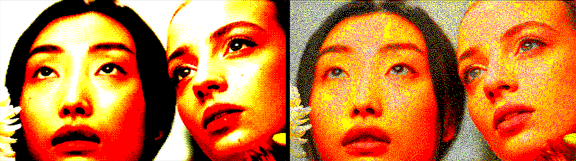
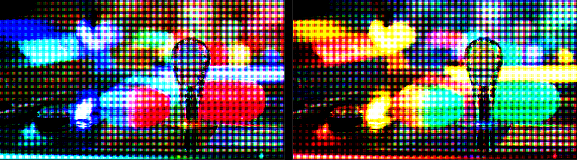
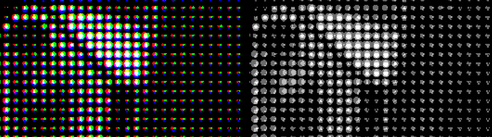
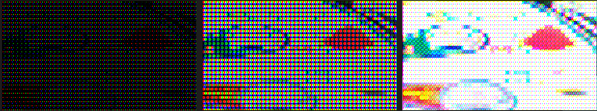
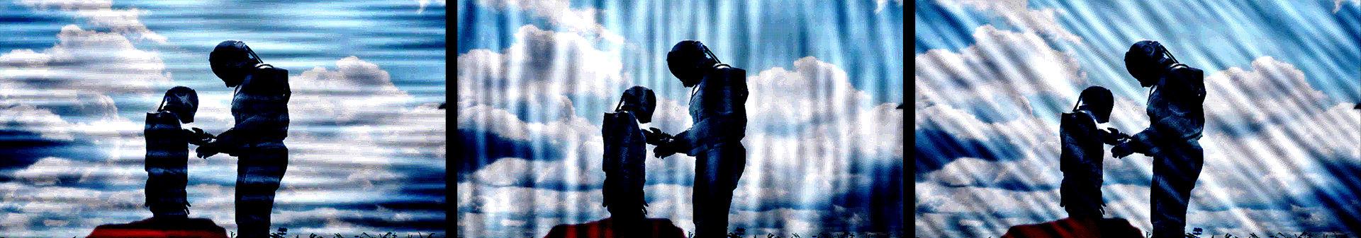
RGB Split. Recall how halftoning was originally a method for shading in otherwise black-and-white images. In all the prior illustrations, we had RGB Split enabled. This splits the monochromatic dither dot into its colored subcomponents, depending on the underlying color information in that image space. Sound confusing? Let’s take a look with Halftone Type: Monitor, Dither Size: 15, and preview magnification at 800 percent.
The above two images display the exact same preview, only with RGB Split disabled (left) and enabled (right). And if we zoom out to a 50% preview, this might look more recognizable:
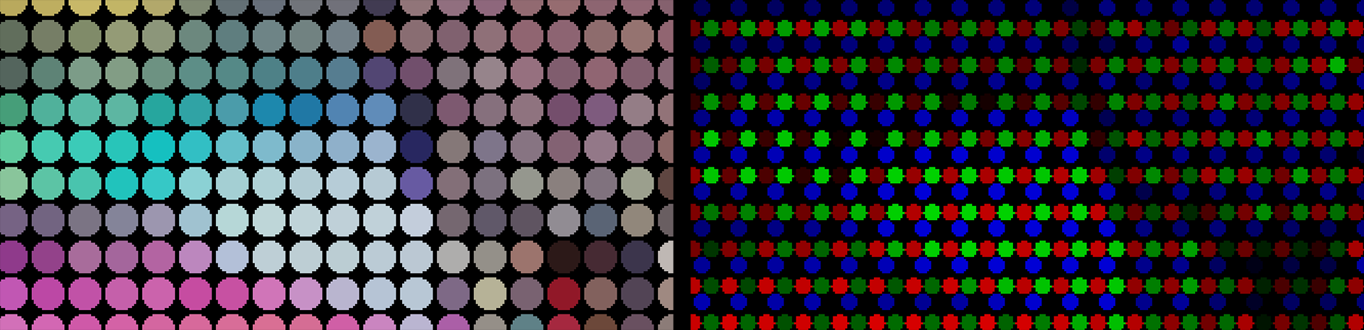
RGB Split with the LED halftone type works a bit differently. Essentially, LED with RGB Split disabled makes each dot look like a single, circular LED light representing the underlying color. With RGB Split enabled, those dots separate into their red, green, and blue subpixel components, as shown below.
Hue Offset. In contrast to RGB Split, Hue Offset is quite straightforward. Change the value to change the hue. Shown below are values of 0 (left) and 50 (right).
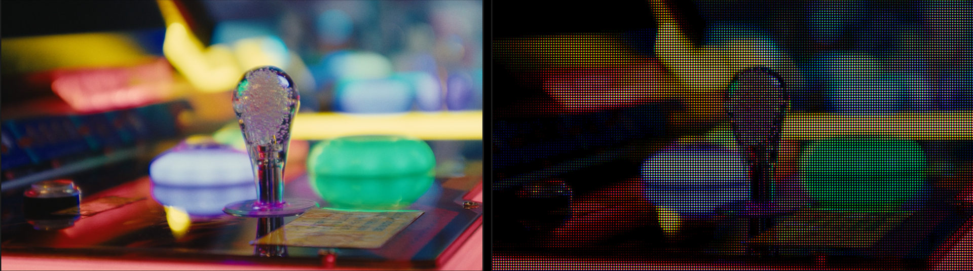
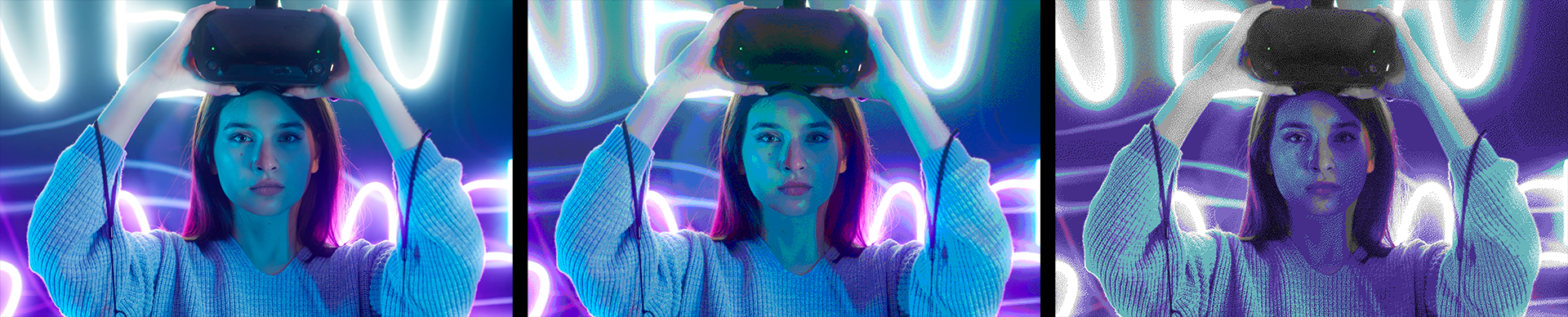
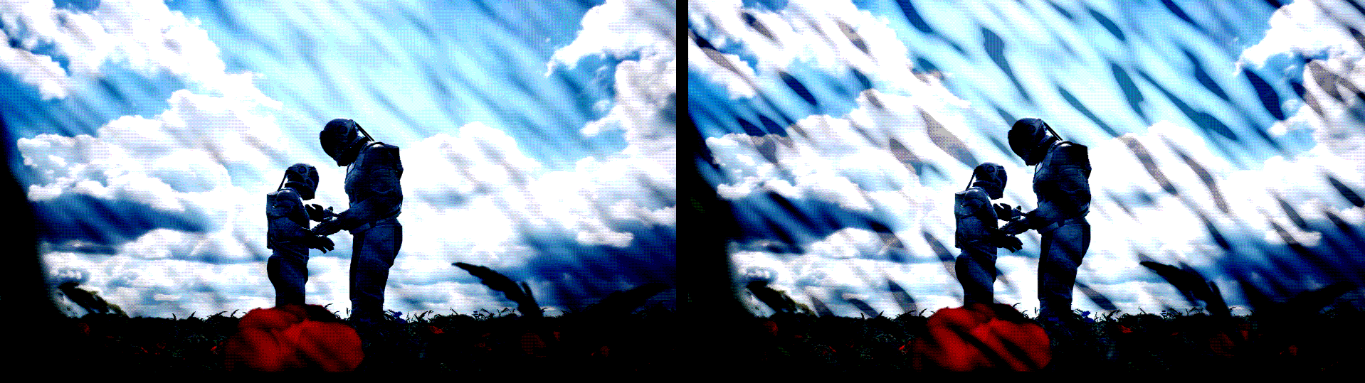
Brightness. As you’ve seen in many prior examples, by changing source image pixels to dots, you introduce a given amount of black space around each dithered dot. (This applies to Monitor and LED types. The opposite is true with the Printer type.) Not surprisingly, the addition of this black to your scene can noticeably darken the overall image. Below, compare the original image (left) with its Monitor type version using Brightness: 100 (the default, right).
Increasing Brightness can pull your scene back into the light, but keep in mind that this may introduce banding artifacts and blow out some details, shown below with the intentionally obnoxious value of 220.
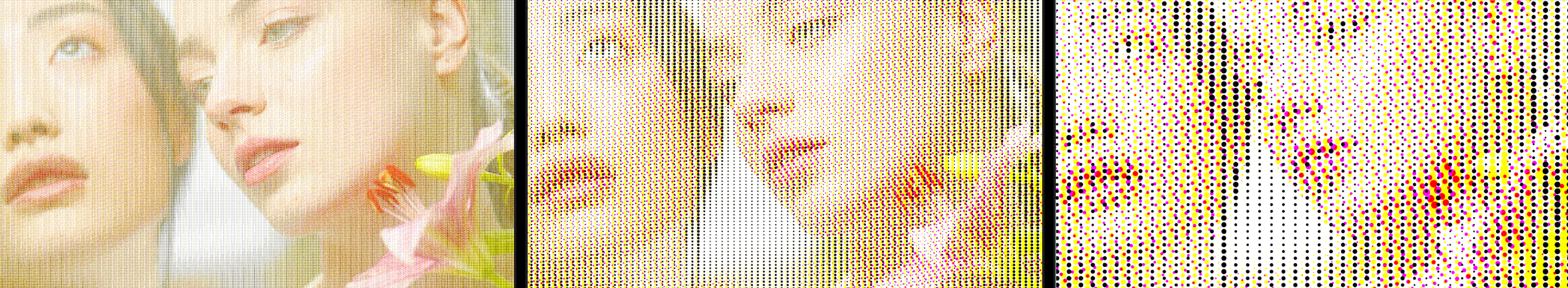
Pre/Post-Saturation. Put simply, Pre-Saturation refers to dot saturation that occurs before dithering. Post-Saturation occurs after dithering. Pre-saturation sometimes serves as a customization option for color correcting footage prior to dithering. Below, we show Pre-Saturation values of 0 (left), 100 (the default, center), and 1000 (the maximum, right).
You’ll notice that Pre-Saturation: 0 does not result in the complete elimination of color, but Post-Saturation: 0 does. This is because the dithering process (with RGB Split enabled) results in the separation of color channels after pre-saturation. Here are those two settings, respectively, shown at 800% magnification.
In general, Post-Saturation has its greatest impact on values of 100 or less. Values above 100 are for palettes with high color bit rates.
Selecting Printer for your Halftone Type enables two additional parameters.
Rotation adjusts the dithering grid used with the Printer type. This can be hard to spot when applied to moving footage, but it pops right out when you adjust it on a still image.
Spacing governs the distance between dithering dots, as seen here with examples of 25% (the minimum, left), 80% (center), and 180% (right). As you can see, dot size remains constant, but the distances between them increases.
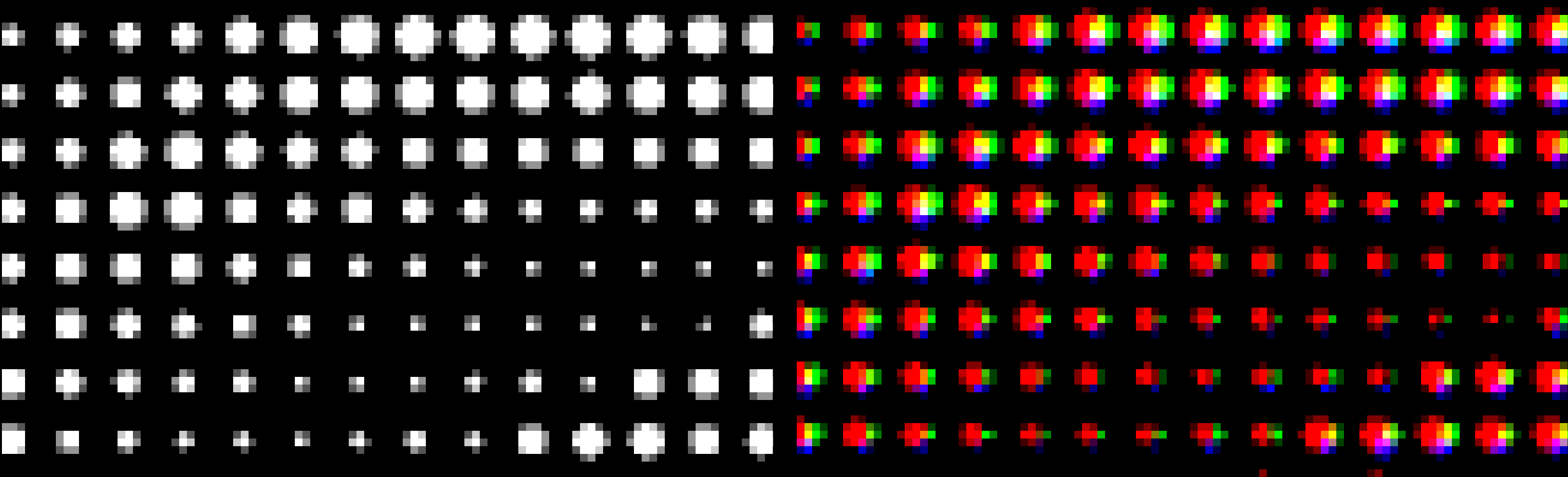
Selecting Monitor for your Halftone Type enables the Pixel Scale X/Y parameters. In the example below, we blew up our Dither Size to 40, then (in the right image) we increased Pixel Scale X from 100 to 500. This is why each dot stretches by 5x along the x axis.
![]()
Pixel Scale X/Y does the same thing here as in the Monitor Settings. However, LED Scale adjusts the size of each RGB subpixel. At lower values, such as 50 (left, below), the subpixels have gaps between them, which is why we see so much black. The center image shows the default value of 100. But by 150 (right), the RGB subpixels overlap so much that their combination yields a profusion of white in the image.
Whereas halftone dithering helps mitigate problems associated with blurry pixels due to how it clusters dots, ordered dithering isolates pixels from one another. This can prove useful in content with clean lines, such as certain types of animation. Ordered dithering relies on the value of the pattern at a certain location establishing a threshold for the source pixel at that location.
Ordered Dither contains three basic matrix pattern types, shown below: Bayer (left), Void & Cluster (center), and Random (right).

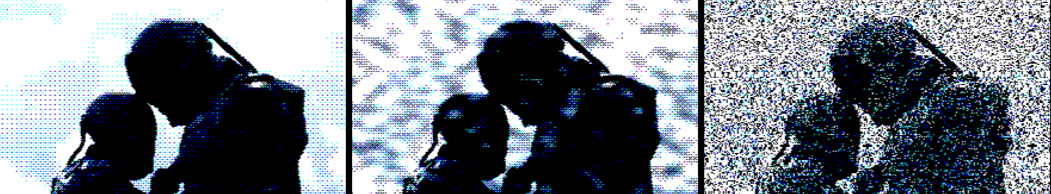
Bayer matrices are distinguished by their crosshatch pattern, but it can be tricky to spot the difference between Bayer and Random at a distance. However, a 200% zoom reveals more obvious variations between the two, especially in the green area we highlighted.

Void-and-cluster matrices tune for blue noise, which adds noise to reduce distortion. The resulting look can resemble error diffusion dithering.
We’ll proceed with our explanations using the Bayer approach, as this best matches the Ordered Dither parameters layout, then come back to Void & Cluster and Random later in this guide section.
Dither Size pertains to how far individual pixels shift or how densely they position within a certain area to achieve a desired visual effect. This can affect the perceived smoothness of gradients and the overall texture of the image. Larger values will produce a more speckled or “blocky” appearance while smaller values will deliver smoother textures.
Understanding this can be a bit counterintuitive. A smaller fraction like 1/8 implies finer adjustments compared to a larger fraction like 1/2. A 1/8 dither size will create more pronounced blocks because it attempts to spread the error over a smaller area more aggressively. This can lead to larger visible artifacts or blocks in the resulting image as the dithering algorithm tries to compensate for the limited color depth. In contrast, a 1/2 dither size produces less noticeable patterns because it allows for broader shifts, leading to smoother transitions and less pronounced blockiness.
In the 200% previews below, we show the source image (left), a Dither Size of None (center), and Dither Size: 1/2. You’ll note how even the None setting still implements the (in this case) Bayer algorithm, resulting in a curtailed color palette and that fine cross-hatching in the red shadows. Stepping up to 1/2 makes the yellow speckling in those red shadows, as well as the pixelation in the eyes and brows, much more pronounced.
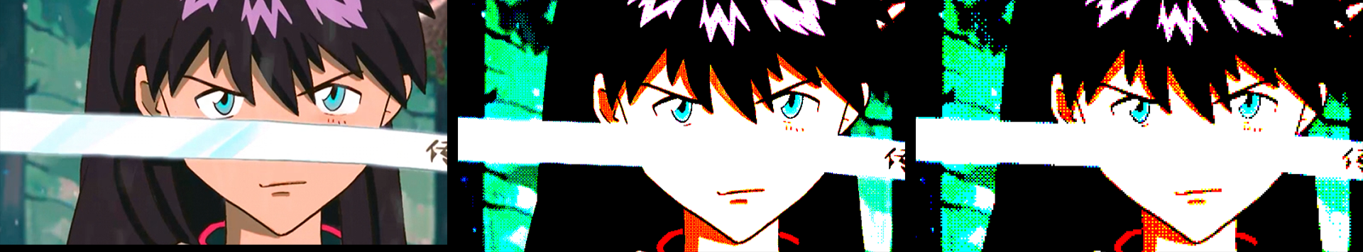
Dither Intensity controls how much noise Red Giant adds to the original signal during the dithering process. Remember, this noise helps to randomize quantization errors and thus prevent artifacts like color banding. This is why a lower setting of 25 (below, left) tends to blow out details like the green background foliage texture compared to the default setting of 50 (center). Notice how a higher setting, such as the 80 shown in the right image, brings back even more of that original foliage texture along with the original coloring in the girl’s skin and tunic.
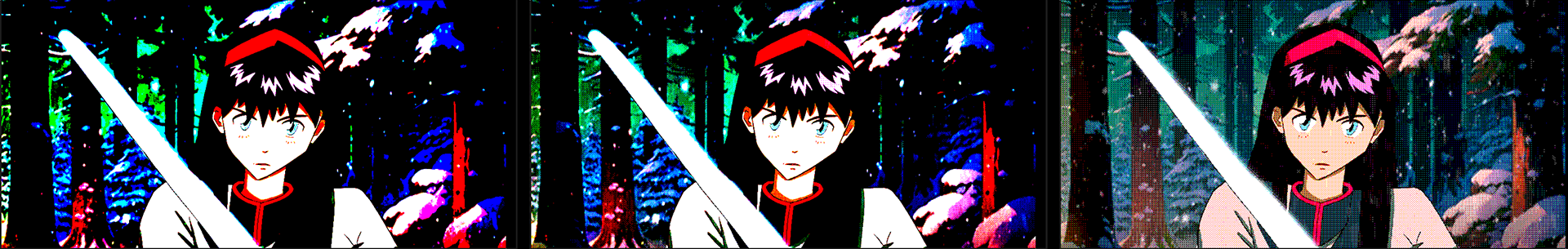
Dither Bias introduces an error factor into the noise added to random quantization errors during the dithering process. The neutral default value is 50 (shown at center, below). A lower value like 25 (left) may not effectively distribute the error across neighboring pixels. This can lead to a situation where darker tones dominate, causing extensive areas of the image to appear black. A higher value like 80 (right) often leads to a greater proportion of pixels quantizing into lighter colors. This happens because the dithering adds noise that can push pixel values upward, particularly in regions where original colors are already light.
The Color Palette subgroup begins by offering a pull-down menu with four options. We’ll cover each of these below.
Posterize. This color approach reduces the number of colors in an image by converting continuous tones into distinct regions of uniform color. The effect creates a stylized appearance, often resembling poster art. Below, you see how posterizing takes our original image (left) and remains true to the original main colors while significantly reducing the number of colors, relying on dithering to help fill in some perceived shading.
In the above example (right), we use Posterization Level of 4. Below, you see how the minimum of 1 (left) katana slices our color count down to a very low level. However, even by 10 (right), we’re tonally much closer to our original image.
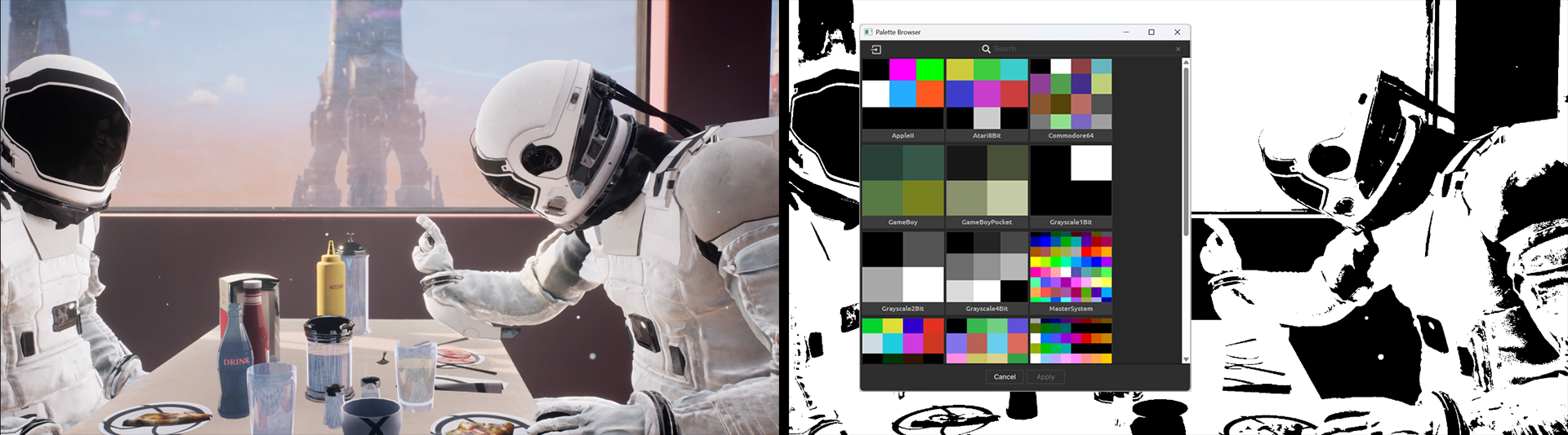
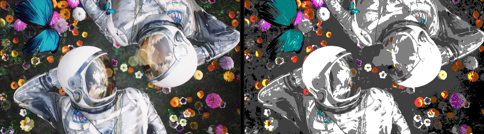
Palette Browser. With Posterize, we saw how Ordered Dither restricts the color palette based on the native colors in the source content. Palette Browser lets you customize the color palette according to your choice of color scheme.
Remember how we said earlier you could go to Lospec and search for the color palette of your favorite gaming device or system? Well, click the Browse Palettes button here to spawn Red Giant’s own collection of basic and retro palettes. Compare the earlier Posterize palette against the Commodore VIC-20 palette shown below. (Useless trivia: The VIC-20 was this author’s first computer in grade school. You do the math.)
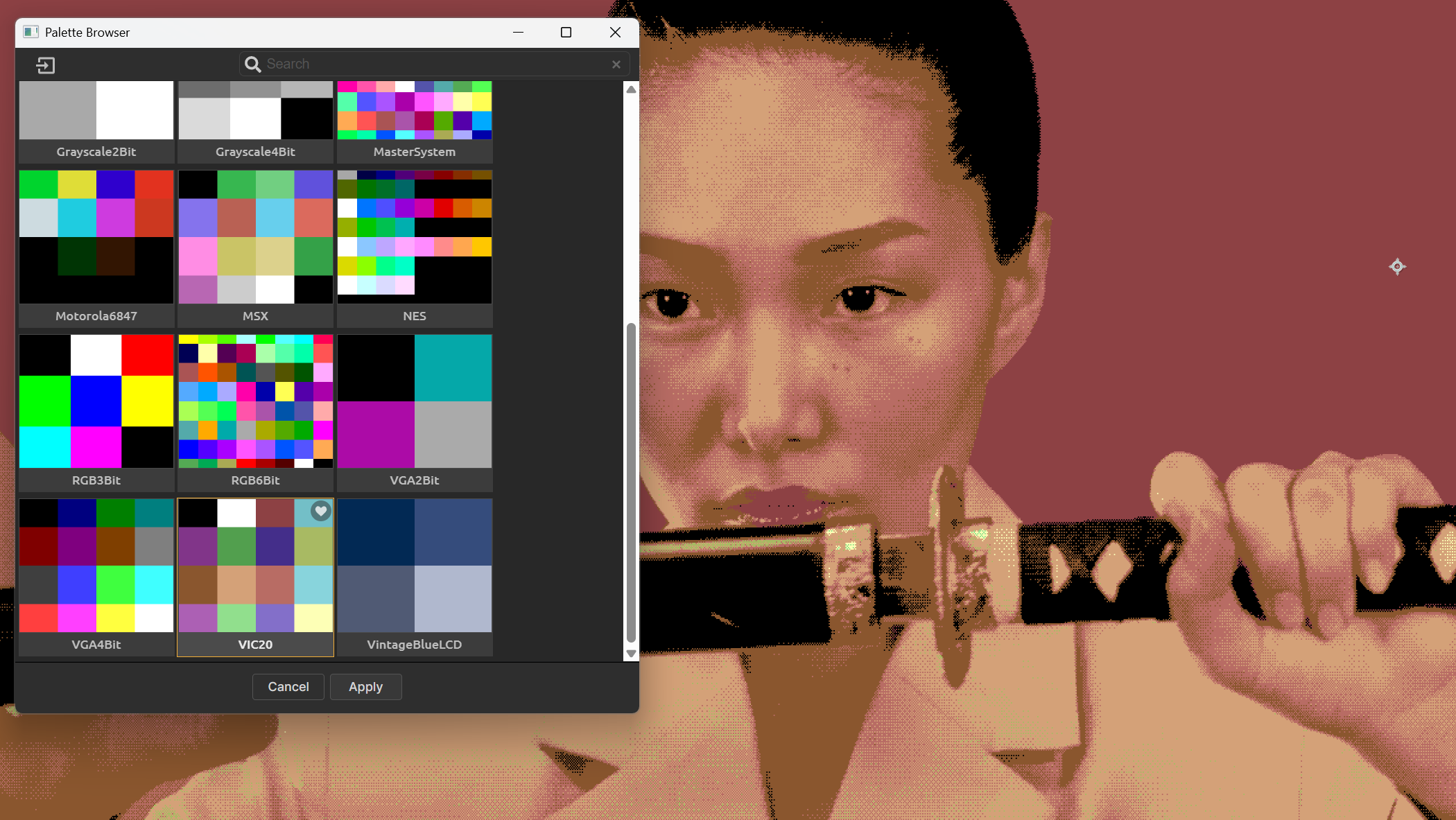
Note that the Palette Browser window features a small import icon in the top-left corner (see image below). Click this to select any premade palette files you might have standing by. If you ultimately gather so many palettes that they get cumbersome to manage, use the Search bar atop the browser window to filter them quickly by name.
Note that a palette imported into the Palette Browser for one Red Giant dithering tool becomes available to all Red Giant dithering tools.
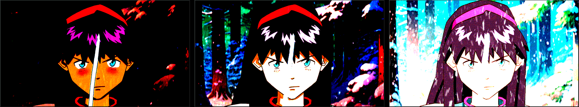
Bi-Color. To properly understand the Bi-Color palette, we need to back up and bring a couple of other parameters into the discussion. The first of these is Ordered Type. In the 200% preview triptych below, we start with Bayer, the plugin’s default. With the Bi-Color palette selected, and Color 1 and Color 2 set to white and black, respectively, we feel safe in saying that Bayer looks the most photo-realistic when compared to Void & Cluster (center) or Random (right).
That said, it’s clear that Bayer displays gray pixels while Void & Cluster does not. An extreme close-up with Random reveals gray specks, but these don’t give the same impression of a broad, gray texture. Given that you would intuitively expect only black and white output from this bi-color scheme, what’s going on here?
Let’s return to Dither Bias. The default value, which we show in all three cases above, is 50 percent. Below is the same Bayer-based, bi-color image with Dither Bias values of 40 (left) and 60 (right). This aligns with our earlier examples in showing how lower values skew toward black and higher values toward white.
Here’s the key: Bayer patterning averages colors during its dithering process. Bias weights this averaging toward dark or light. The average of black and white, of course, is gray, and that’s how you get mid-tones from a bi-color palette scheme.
Tri-Color. Once you’ve grasped how Bi-Color works, Tri-Color becomes a snap. Here’s Dither Bias at 35 (left) and 65 (right) under the Tri-Color palette of white, gray, and black.
We encourage experimenting with various tri-color combinations, but just know that mixing very different tones, such as bright red, green, and blue, may prove a bit…wild.
We promised low repetition in this guide, so please refer to our Halftone Dither section on Color Correction to understand this subgroup’s parameters. For now, we’ll leave you with this example of the MasterSystem color palette applied to a Random-type image with default values (left), Pre-Saturation: 200 (center), and Hue: -27 (right).

Earlier, we discussed how patterning applies a matrix to each dithering cell throughout an image. This matrix comprises a number of squares across and down, such as 2x2, 4x4, or 8x8.
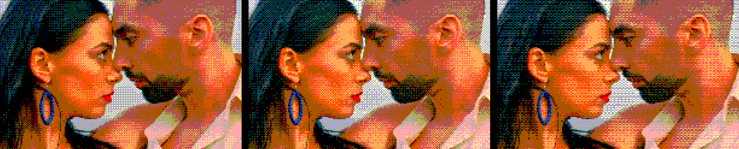
Matrix Size X/Y establishes the dimensions of that matrix grid for Bayer patterning. Below, you can see how 2x2 (left) and 8x8 (center) yield similar results. An unusual setting like 3x7 (right) might yield a less common look. (If these images seem the same at first glance, focus on the gray gap between the dancers’ mouths.)
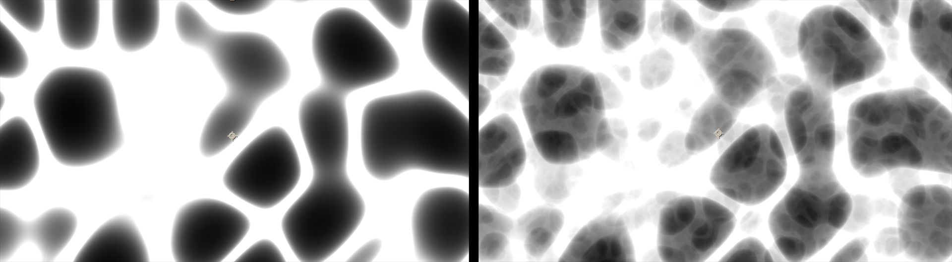
Filter Scale determines how much of the surrounding area (in pixels) a filter considers when analyzing each point in an image. With higher values, the algorithm examines more surrounding pixels to evaluate if an area is a void or cluster. This area expansion significantly influences how the algorithm detects both densely packed pixel groups and empty spaces, helping to create even value distribution in dithered output. Below, we show values of 45% (left), 100% (the default, center), and 300% (right).

Filter Ratio measures how strongly a filter reacts to pixel density changes within its range, specifically to identify clusters versus voids. This ratio helps balance the filter’s sensitivity to both dense pixel groupings and empty areas. The impact of Filter Ratio on void areas in particular can be significant. Consider the differences between 10% (below, left), 13%, and 30% (right).

Filter Rotation simply rotates that Void and Cluster filter. This image zooms in on the center image above and applies a 20-degree rotation.

As in many other Red Giant tools, the Seed value is a variable in the randomness equation that determines the appearance of noise in an image. It’s hard to spot the differences in Seed values in a side-by-side comparison, but slide the Seed value and you’ll see random dithering specks dance like old CRT static.
Soft Noise adjusts the distribution and intensity of the noise added to the pixel values, essentially smoothing the noise results. See this in action disabled (left) and enabled (right) below.
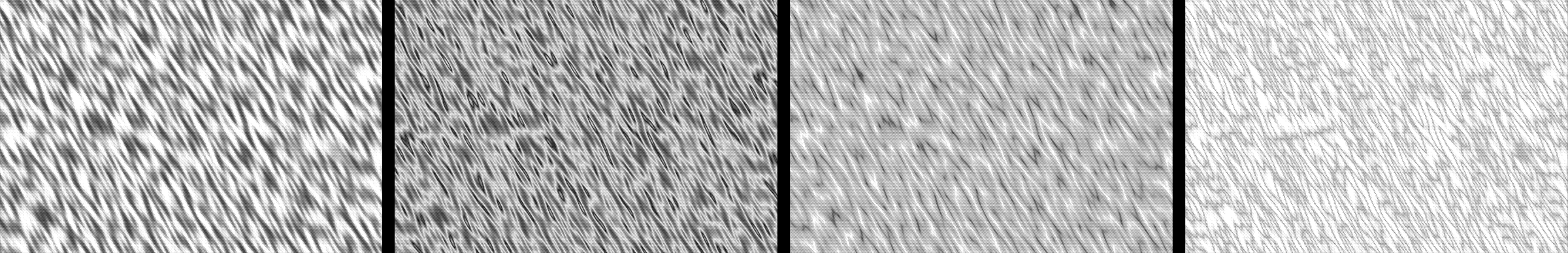
As you can see in the below comparison of 100% (left) and 1000% (right) values, Filter Scale adjusts the size of the Random filter mesh, resulting in (in this case) larger dithering specks.

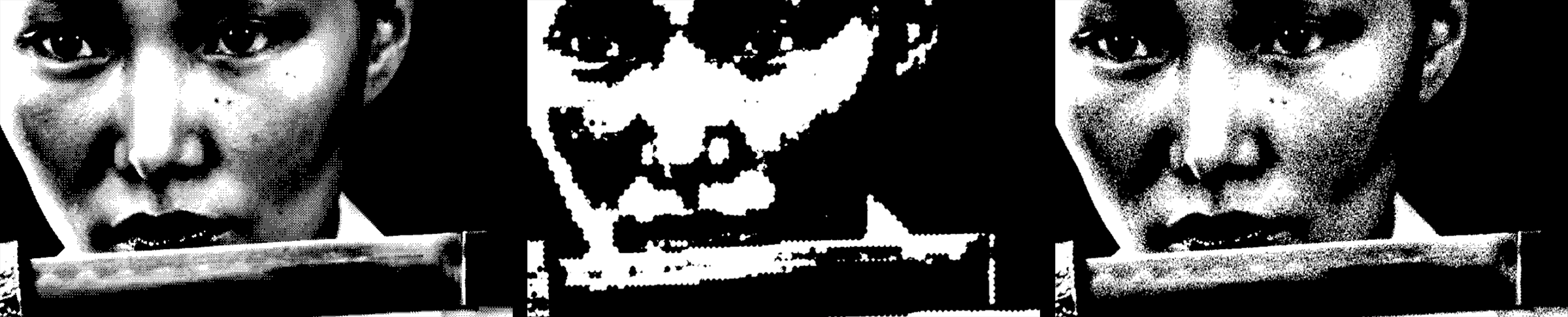
Threshold is the simplest form of dithering and is thus very quick to process. Each image pixel compares against a fixed threshold value. In the most basic case, if the pixel’s value is above the threshold, it’s set to white; if it’s below, it becomes black. Beyond that, threshold dithering gets more interesting, as you’ll see in our brief list of parameters.
Threshold Dither offers four threshold types, and they all follow the same basic concept, although the outcomes may appear significantly different.
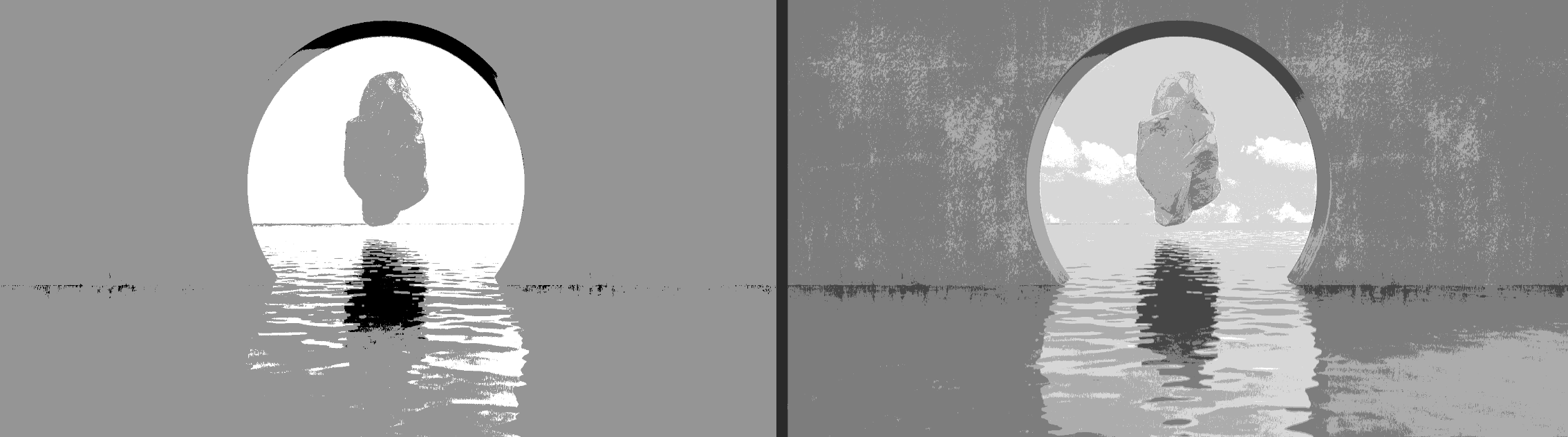
Luminance exemplifies our just-mentioned simple case. As shown below, brighter pixels turn white and darker pixels turn black…when Posterization Level (see below) is set to 1. Recall from Ordered Dither > Color Correction that posterizing “reduces the number of colors in an image by converting continuous tones into distinct regions of uniform color.”
The higher the Posterization Level, the more color regions you create. We show this below with values of 2 (left) and 5 (right). At high enough values, Luminance thresholding looks like grayscale.
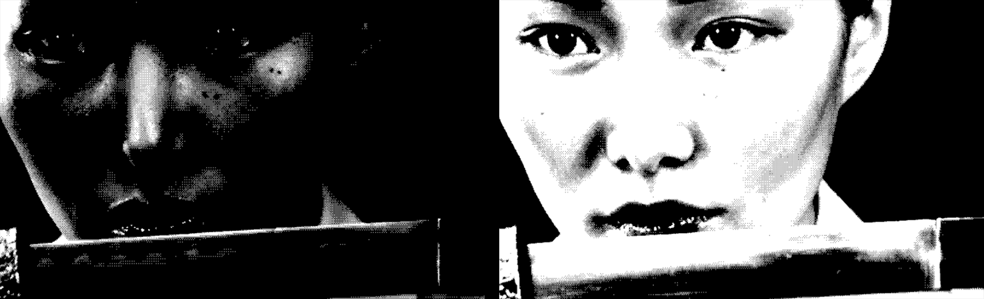
RGB follows suit, except here the source image’s coloring determines the threshold values and tones. Consider our blue-based image with a Posterization Level of 1:
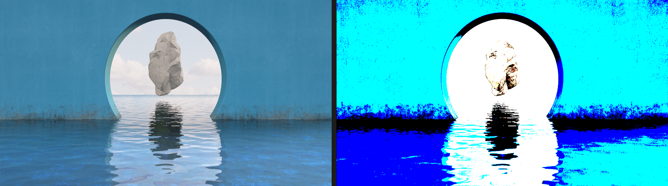
Again, as with Posterize in Ordered Dither, the Threshold Dither color palette depends on the palette of the source image. Compare the above image pair with the following, based on the same parameter settings:
The Saturation type performs much like Luminance, except it uses…you know…saturation. This shows Saturation with a Posterization Level of 10:
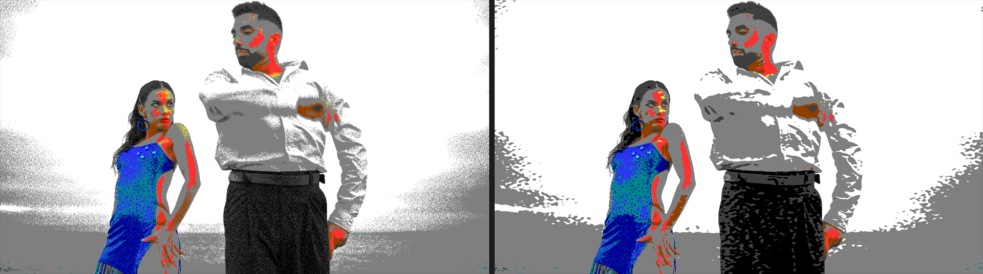
The Alpha type relies on using alpha (transparency) data from your source as the basis for threshold dithering. In the following triptych, we begin with the source image (left) and apply Unmult to it with a Tolerance of 25 (center). We then apply Threshold Dither, select the Alpha type, and give it a Posterization Level of 1 (right).
These controls work the same as in prior Red Giant dithering tools. Nothing unexpected here.
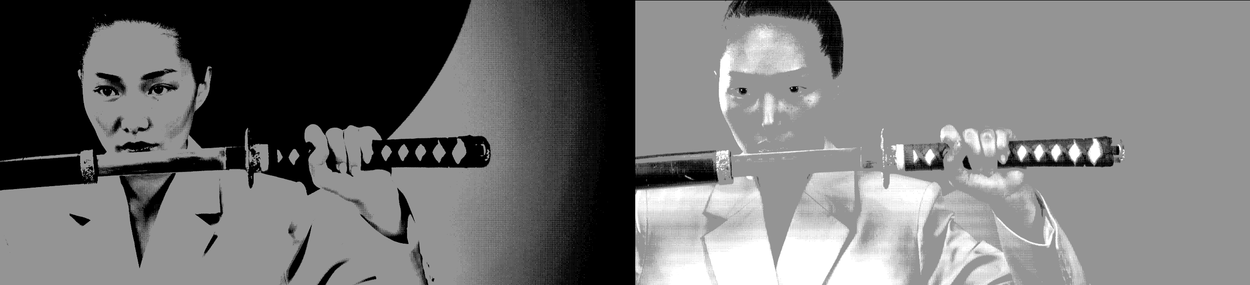
This subgroup contains only two controls: Invert and Blend with Original. Invert is a common control and does the same thing here as in other Red Giant tools. For a quick example, below we pushed the RGB type’s Posterization Level up to 35 for a photo-like appearance.
What could you do with such a thing? Maybe consider using it with Blend with Original. In this clip, we have Invert enabled the whole time, but we begin with Blend with Original at 100%, then keyframe it down to 0 percent. Kinda cool, right?
Error-diffusion dithering involves scanning an image pixel by pixel. The difference between the original pixel value and its threshold (a delta known as the quantization error) then distributes to adjacent pixels. Thus, if a pixel is forced to black due to its threshold, the error-diffusion algorithm notes how far it was from black (the quantization error) and spreads this error to nearby pixels according to predefined weights. There are many error diffusion algorithms, but, as a group, they generally yield images with fewer visible artifacts and more natural shading at lower bit depths.
This plugin offers seven various error diffusion types. Upon flipping through them, your first reaction might be to think that the dither dots simply changed position slightly. Honestly, that’s pretty accurate. The differences are subtle. To illustrate, here are Floyd-Steinberg (left), Stucki (center), and Sierra-Lite (right), all using a Posterization Level of 3. Don’t feel bad if you can’t spot the differences.

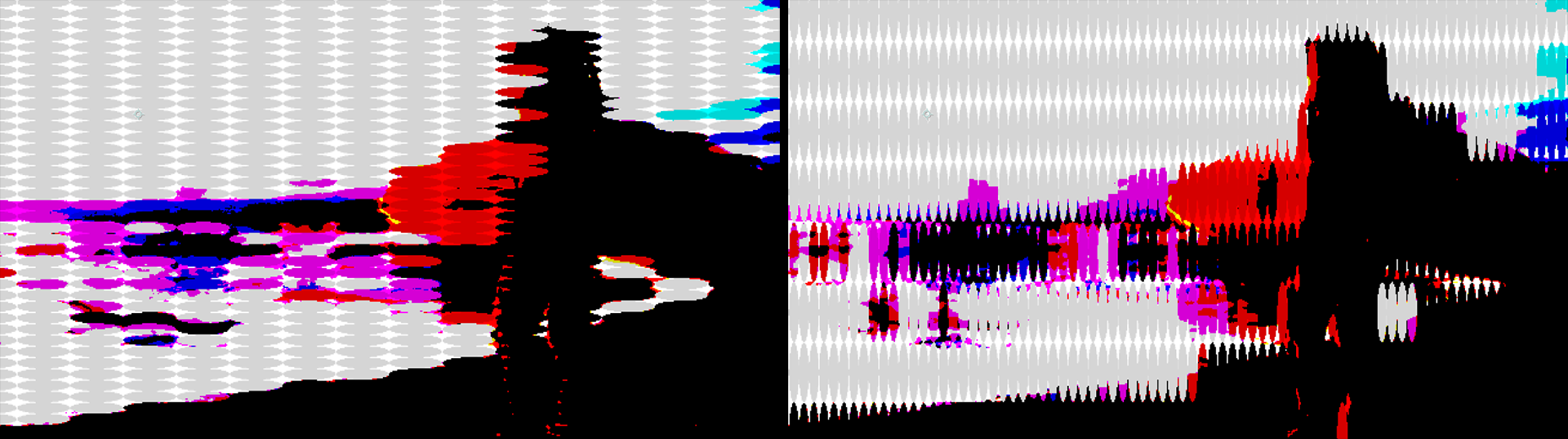
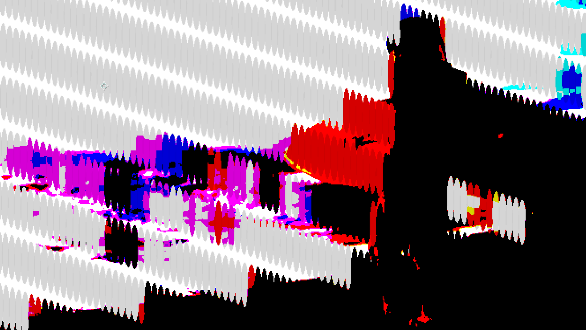
To be clear, when evaluating error diffusion (below, left) against pattern diffusion (Ordered Dither, right), the overall look is noticeably different. One isn’t necessarily better than the other; they just result in different looks.
These controls work the same as in prior tool discussions. See the Ordered Dither section for details. That said, here’s an example of Floyd-Steinberg diffusion with Dither Size set to None (left) and 1/4 (right).
Interestingly, Dither Bias has far less impact here than in our pattern-based models, as you can see in this comparison of 0% (left) and 100% (right).
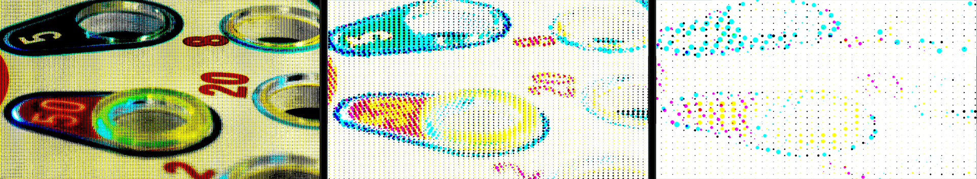
We covered this subgroup at length in Ordered Dither, and the functionality is identical here. The Color Palette pull-down menu offers you a choice of Posterize (below, center), Palette Browser, Bi-Color, and Tri-Color. In the following triptych, we provide the source image (left) as well as the Commodore64 color palette (right), because that was this author’s second computer.
We picked the above example for its limited color range. With a Posterization Level of 5 in our two dithered images, you can see how Color Palette: Posterize results in obvious banding around the neon sign while Color Palette: Palette Browser produces significantly more pronounced "dotting." Again, neither is better than the other, only different. We spotlight this to encourage you to experiment with these tools' various parameters and get familiar with their outcomes.
By now, you won’t be surprised to hear that we’ve covered all of this subgroup’s parameters — RGB Split, Hue Offset, Brightness, and Pre/Post-Saturation — in depth earlier in the Halftone Dither section. Bounce back there for the full treatment.
Custom Dither is your chance to get under the hood with some key dithering elements. By now, several of the subgroups in this tool will be very familiar. We’ve seen Dither Size, Dither Intensity, and Dither Bias in Ordered Dither, along with Color Palette and Color Correction. Hence, we’ll skip all of that here and begin with...
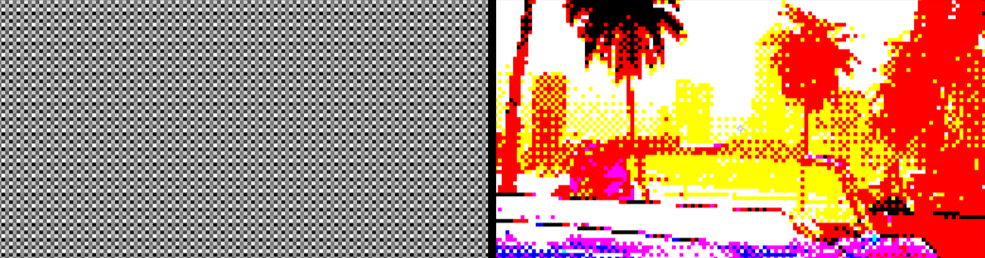
When you check Preview Dither, you might encounter a default display like this:
What may seem like a boring, gray slab is actually a preview of the texture pattern that underlies many of your dithering operations. (This pattern can include Bayer matrices.) Consider this juxtaposition of the dither map at Dither Size: 1/8 (left) alongside that same Dither Size applied to an image (right).
When you change Dither Size, you change the cell dimensions within the dither map. We show a sample image with its corresponding dither map below, at settings of None (left), 1/2 (center), and 1/8 (right).
As we address the following parameter subgroups, check back in with the Preview Dither function to see how your value changes affect the map.
For a technical overview of Bayer dithering and how Bayer matrices work, we recommend Kaetemi’s excellent blog post, “A Practical Explanation of Bayer Dithering.” For now, let's just say that the Bayer matrix functions as a threshold map that dictates how pixel values get adjusted during the dithering process. Custom Dither compares each pixel’s brightness against the corresponding value in the Bayer matrix to decide whether it should display as black, white, or a given color, depending on your parameter selections.
We talked about Matrix Size X/Y controls back in Ordered Dither. Beyond that, Custom Dither adds a new parameter: Bayer. The Bayer value affects how much the Bayer matrix impacts the resulting image. At the same time, lowering Bayer can cause a loss of detail. You see this play out below with values of 5% (left), 50% (center), and the default of 100% (right).
The stippling technique uses dots to simulate shading. Stippling can add texture to images, especially with a low-color palette. Sometimes, this is easier to see than describe.
Let’s start with 0% Stippling (below, left), then compare with 100% (right).
You can see that we still have dots in the left image. Why? Enable the Preview Dither and you’ll see a clear dithering texture — that’s why. If we slide both Stippling and Bayer down to 0%, then we get this:
Bayer is the pattern, and Stippling is an additional texture. If we slide Stippling up to 70%, you see that texture come to life.
The above examples have Stippling Scale, which governs the size of those texture dots, at 100 percent. Let’s see how those dots look at 50% (below, left) and 250% (right).
You’ll notice how our dots are circular. This is because we set our Stippling Ratio to the neutral value of 50 percent. Moving off neutral stretches the dots, as you can see in our examples of 20% (below, left) and 80% (right).
The last Stippling control is Stippling Rotation. Now, you may remember back in Ordered Dither > Void & Cluster Settings when we encountered Filter Rotation. This is going to look very familiar. However, while Filter Rotation rotated the dots in unison, Stippling Rotation rotates the rows of dots, like so:
Just as Stippling Settings introduced a texture layer into the Custom Dithering effect, Noise Settings introduce a layer of customizable noise. Rather than reinvent the wheel here, we encourage you to review the user guide for Turbulence Noise, which does a fair job of explaining different noise types and what happens when you manipulate them.
Custom Dither defaults to having noise turned off. We show a starting image with these defaults below at left. Then we show Soft Noise at 100% (center) followed by Soft Noise off and Hard Noise at 100% (right).
Don’t get too hung up on the relationship between the names “soft” and “hard” and how they appear. They’re simply different noise types. That said, if you’d like to see these three images at 400% zoom for a little better idea of what’s happening, here you go:
Seed is a variable in the equation that determines the randomized noise pattern. Change the Seed value and you change the pattern.
Noise Scale changes the size of the noise pattern. Again, this is a tough one to describe or show in still images, but it becomes obvious if you manually increase the control from, say, 50% into the hundreds, as we show here with Soft Noise: 100. You might think of the noise pattern as a rubber film you are stretching or retracting over the source.
You can probably guess about Noise Ratio and Noise Rotation by now, but, just as with Strippling Settings, these noise controls stretch the noise pattern as you move away from neutral 50%, then rotate that pattern across the scene. Shown below is the same image we used in Noise Scale above, but with a Noise Ratio of 10% (left) and 90% (center), followed by a Noise Rotation of 30 degrees.
Noise Amplitude changes the brightness of the noise pattern. At the minimum of 1, it will turn your scene nearly black. Beyond a value of 200, expect your image to turn mostly, if not entirely, white.
Bias here works like glow amplitude for your noise field. Increase the value to make the noise more noticeable.
Offset X/Y shifts your noise field along the x or y axis, including into negative values. When keyframed, these controls can provide some cool atmospheric effects, such as heat haze or fumes on the wind.
Just as Bias brightens the dense areas of your noise field, Dissipation enhances the gaps, or less dense, noise areas. Below, we show the default value of 0 (left) compared to 100 (right).
Complexity, as you’d expect, increases the complexity of the noise. Here’s an example borrowed from Turbulence Noise that shows the difference between minimum and maximum complexity in a noise field.
Finally, we come to three checkboxes that introduce any of three noise pattern algorithms: Ridged, Exponential, and Absolute. You can modify these patterns with the other Noise Settings parameters. For clarity, we enabled Preview Dither to better expose these patterns without the obscuration of a source image. Below, we show our original Soft Noise pattern (left) followed by Ridged, Exponential, and Absolute, respectively. Note that you can select multiple patterns to combine them.
We covered the Palette Browser back in Ordered Dither, but come on. The Palette Browser is too cool to be hidden away like that. Sometimes, you just want a simple, powerful palette tool without all the dithering functionality on top of it. Hence, Palettes.
When you first place Palettes onto your source clip, it defaults to a simple black-and-white monochrome scheme. Click the Browse Palettes button to bring up the browser window.
This author can’t recall the specifics of the 286-based computer that succeeded his Commodore 64, but it would have run either EGA or VGA graphics, which were 4- and 8-bit color systems, respectively. When nostalgia strikes, Palettes makes recreating these looks point-and-click easy…sometimes.
Keep in mind that dropping from full color into a very restricted palette is likely to yield some interesting results. For example, below we show a source image (left) against the VGA4Bit palette. The colors that approximately match the palette come through, but those that don’t get dropped.
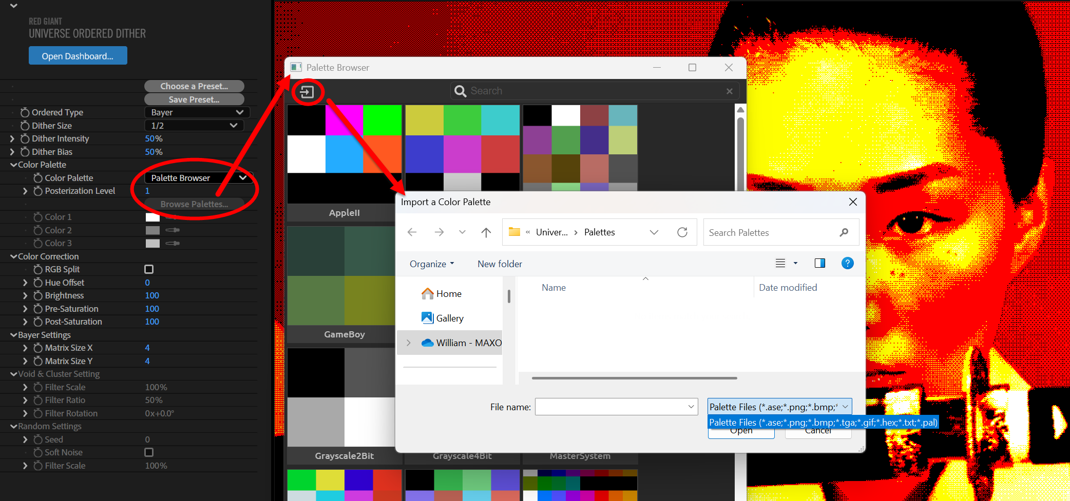
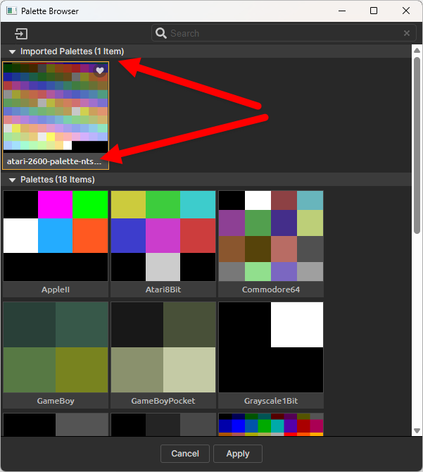
Say you want to emulate the look of an old Atari 2600 console, but Palettes doesn’t offer an Atari palette. (Ahem, a note to devs for some future update…) No worries. Visit Lospec, go to the Palettes tab, and search for Atari 2600. Therein, you’ll find this:
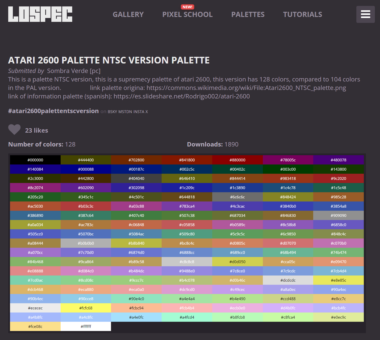
Scroll down a bit and download the palette in your choice of format. We selected Photoshop ASE. Then click the Palette Browser’s Import button and bring your new palette into Red Giant.
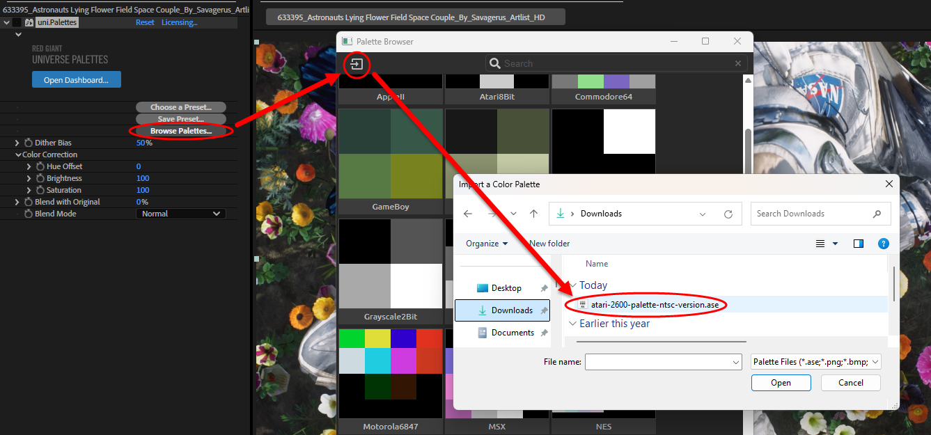
Your new palette should now appear in a new Imported Palettes section at the top of the browser.
Of course, you don’t have to use Lospec. It was simply our favorite resource as of this writing. Coloors is another excellent site.
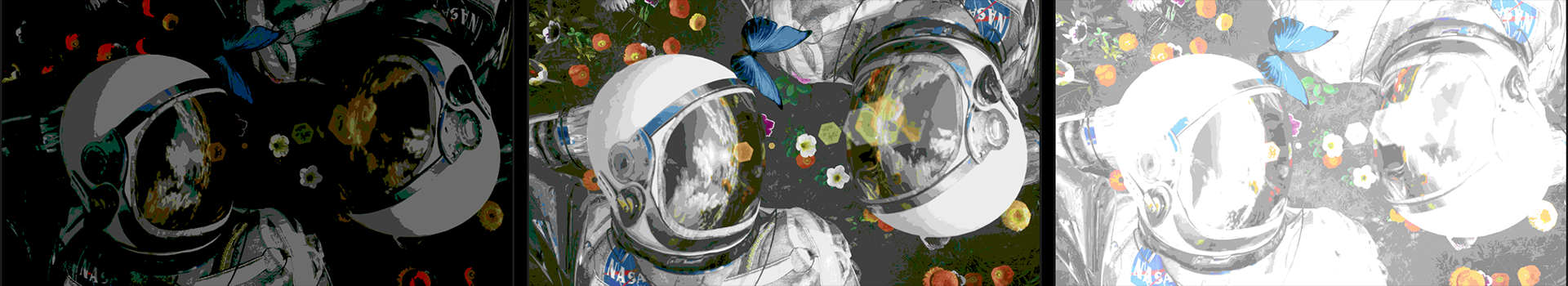
Getting into the parameters, Dither Bias behaves as per usual with our earlier tools. Below, we show values of 0% (left), 50% (the default, center), and 100% (right). And yes, that’s the Atari 2600 palette in action.
We’ve seen the three Color Correction parameters — Hue Offset, Brightness, and Saturation — before, so we won’t repeat their details here. Still, we want to put out one more plea for you to play with these parameters and explore their creative potential. For example, hue adjustment is normally a fairly bland affair. But pick the right palette and keyframe it from -50 to 50 over a few seconds, and suddenly the control takes on a fresh appeal.
Blend with Original offers another chance to bend reality to your liking. At 100%, you’re looking at your source image. At 0%, the effect has overtaken the entire source. You might apply a moderate value to strike an intriguing blend of the two, then pick a different Blend Mode to cultivate an even more unique appearance in how the source and effect combine. Or you could keyframe the two parameters, as we’ve done here.
In the above clip, we created a four-second transition from Blend with Original: 100 to Blend with Original: 0 and Blend Mode: Normal to Blend Mode: Hard Light.
And that brings us to the end of Dither and Palettes. We can’t wait to see what pixelated, patterned, and creatively pigmented creations you craft with these tools. Now, stop your dithering and...um, start dithering!