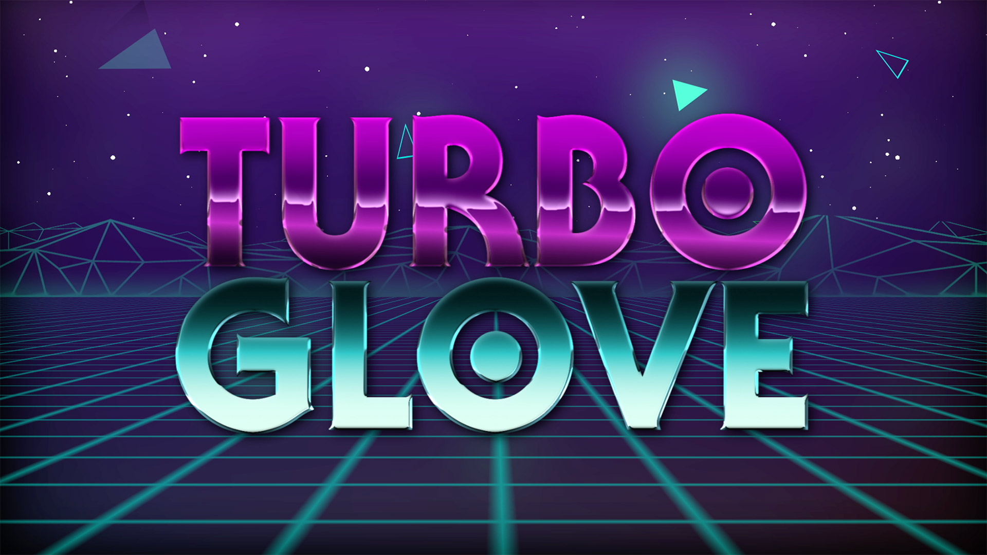
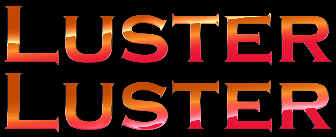
Universe Luster gives text a smooth, reflective appearance, with controls for bevel, highlights, gradients, and reflective maps.
Getting Started
In Premiere, After Effects, Final Cut Pro X, Motion, Sony Vegas Pro, and Hit Film, drag the
uni.Luster effect onto your clip.
In Resolve, you'll need to follow a few extra steps:
Have your text on a video track above your footage's video track.
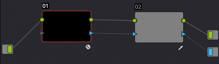
Create a Compound Clip from your text, select it, and head into the Color view of Resolve's interface.
Within the Node window of Resolve, sever the default link between the text's node and the output.
Add a new Corrector node and Alpha output within the Node interface.
Create links from the Text's RGB and Alpha outputs to the newly created Corrector Node's RGB and alpha inputs.
Then create links from the Corrector node's RGB and Alpha outputs to the final outputs for RGB and alpha, respectively.
With your Corrector node selected, key out the black background from your text, and click Invert
to flip the key around.
Right-click in the Node interface and select Use OFX Alpha.
Apply Luster to your Text node.
Presets
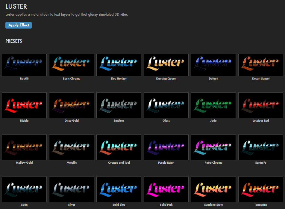
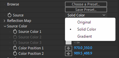
Save time by applying any of Luster's many striking presets to your text. Find these via the blue Open Dashboard... button or the Choose a Preset... button below it.
As with all other Universe tools, you can modify or create a Luster look and then save it under its own name by pressing the Save Preset... button.
Core Concepts
Important Note:
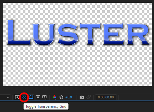
You'll see optimal Luster results when working with text on an alpha channel. This greatly helps with how Luster interacts with text edges.
To confirm you're working with an alpha channel, you should be able to toggle your background on and off to reveal
the transparency under the text layer, as we show here in After Effects.
To better grasp how Luster functions, it might be helpful to reflect, if you will, on the tool's terminology. Terms like "bevel" and "drop shadow" are conventional and fairly self-explanatory. "Source" and "highlight" might benefit from some explanation.
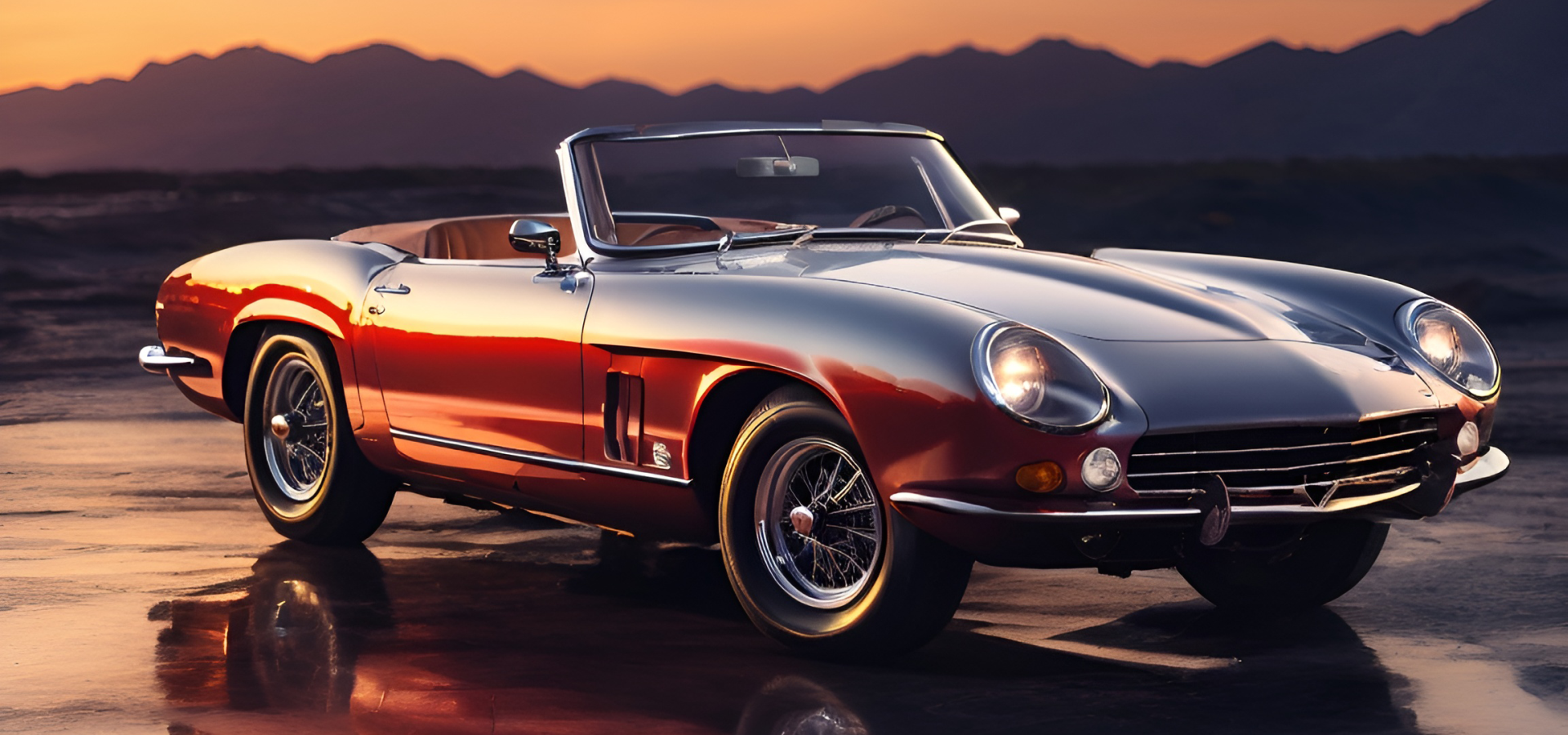
Luster was designed to mimic the look of a highly polished surface, such as metal or glass, reflecting foreground and background colors. Arguably, the perfect scenario might be the side of a car on a flat plain reflecting the ground, horizon, and sky. Sometimes, the sun might be just under the horizon, creating that high-contrast glow along the distant hills that bleeds into the adjacent sky. Something like this...
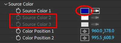
To carry those ideas into Luster, the car — and also each letter in your text layer — is the source. As we'll see, the Source Color parameters govern (up to) three colors that comprise your source's surface. Our sportscar above has only one color as a source, a dark blue or gray. Thus, its Source Color controls in the ECP might look like this:
You'll notice how Source Colors 2 and 3 are grayed out. This is because we selected Solid Color from the Source menu. If we wanted all three colors enabled, we'd pick Gradient. Solid Color works well in this example because our sportscar is, all reflections aside, a single solid color.
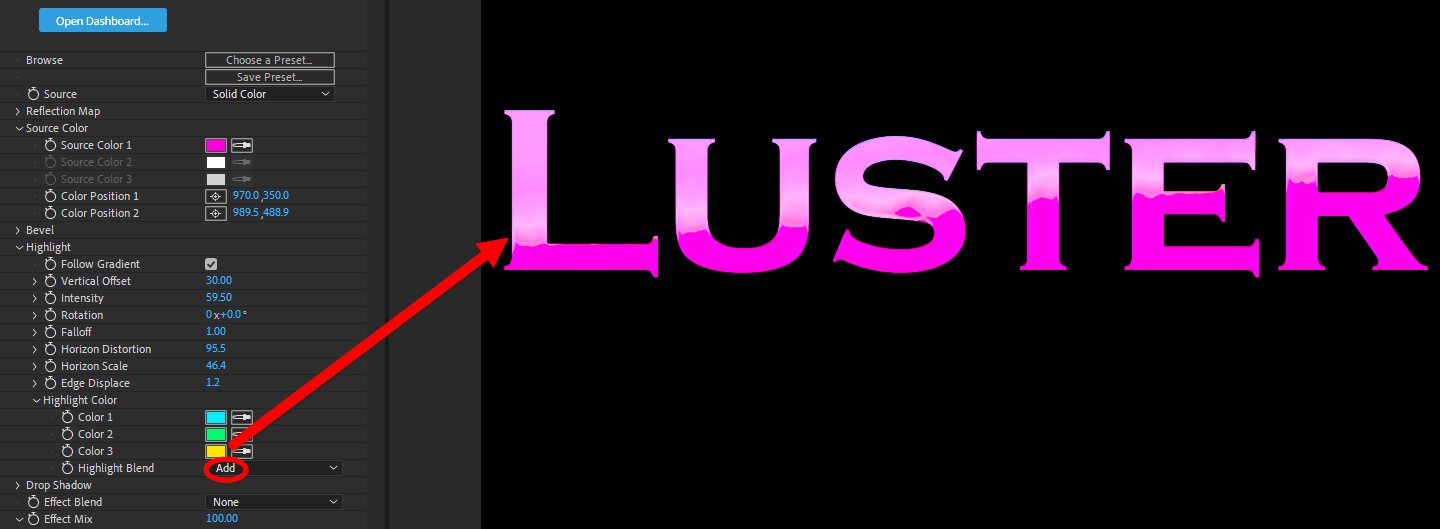
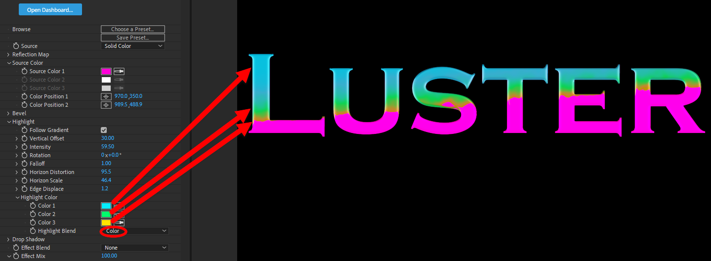
You might think of "Highlight" as "the reflection on the source." You'll find that the Highlight Blend mode is critical for if an how that reflection appears. Let's illustrate with some gaudy colors to make the point clear. First, here's a single-color source with three very different Highlight colors using the Add blend mode. The blue and green are effectively invisible. Only orange, our Color 3, registers as a blended glow above the simulated horizon.
When we change the blend mode to Color, suddenly the Highlight Color progression pops out.
You can adjust highlight colors' relative positions through a combination of blend mode selection and source color positioning, but you can't directly change individual highlight color positions.
Keep in mind that Luster builds its effect from the top down, meaning (if you follow the ECP groups) it begins with the source, adds any Reflection Map controls, moves on to implementing Source Color(s), and so on.
With that conceptual foundation set, let's move on to the tool's parameters.
Modify the Effect
As we've seen, Source refers to where coloring comes from. There are three sub-menu options. Original
selects the text's original color. In our car example, the original color is dark blue, although we can
artificially change that with the next two options. Solid Color and Gradient Color are both
picked from under the Source Color parameters below.
The Reflection Map (only in AE, Premiere, and FCP) allows you to "reflect" the contents of a
referenced map in your source. Again, imagine the side of our sportscar, only this time reflecting
distant wave crests, passing people, or flickering flames. Normally, you would select Source (meaning the reflection source) from the right pull-down menu, but Luster also provides for Masks or Effects & Masks. For example, with Effects & Masks, you could put bright teal tint ocean waves, making them appear almost bioluminescent.
Reflection Source determines the reflection's origin. This must
be another layer within your timeline. Be careful not to mix up the Reflection Source with the main Source.
Reflection Mix adjusts how much reflection is overlaid onto your source. If you're having trouble seeing the reflection, try starting with Reflection Mix set to 100.
Reflection Blur controls the degree of blurriness or sharpness in your reflection.
Center dictates the reflection's center position.
Scale adjusts how large or small your reflective source is portrayed across the main source.
Angle controls the angle of your reflection on a 360 axis.
Screen sets your reflection to blend over your main source using the Screen
setting, often resulting in a brighter appearance.
Source Color contains controls for each color applied to the main source. If you selected
Gradient Color for Source, each of your three colors will blend smoothly into the next
(unless you apply a blending mode that enforces firm color edges).
Source Color 1/2/3 determine the three colors used in Luster's main gradient.
Color Position 1/2 determine which positions each color maps to. You cannot position Color 3.
Bevel contains various parameters controlling the appearance of the bevel effect. If you've
worked with bevels in Photoshop or a similar editor, this should be quite familiar.
As we move through these controls, we'll start with some text using the Default preset and then modify as we go.
Angle controls which angle the text is beveled in.
Size adjusts how large of a bevel is overlaid onto the source.
Soften affects the contrast between where the bevel ends and begins, giving it a softer or
harder appearance. In the following images, we show our beginning image (left), then increase
Size to 20 for better visibility while also raising Soften from 6 to 50.
Highlight determines the prominence of the bevel effect. Its color is determined in
the Bevel color swatch below. In the next comparison, we continue to evolve our effect.
We bump the default Highlight value of 0.60 down to 0.20 (left), then raise it to 0.90.
Shadow controls how dark the bevel is. We're going to leave this at the maximum value for now, as low values tend to flatten the text, which isn't the look we're after here.
Bevel affects the color of the bevel’s Highlight parameter above using a
color swatch as a reference.
Glassiness controls the intensity of your shadows and highlights, giving the
effect a more "glassy" or reflective appearance. We dropped the default value of 30 to 0 (left), then raised it to 80 (right).
Refraction X/Y/Z control the angle at which light from the Bevel settings
refracts off the bevel along the axis, relative to the source. Negative numbers
result in left, down, and back, respectively. Positive numbers result in right,
up, and forward.
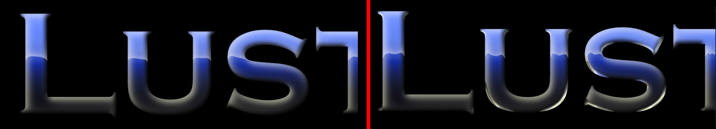
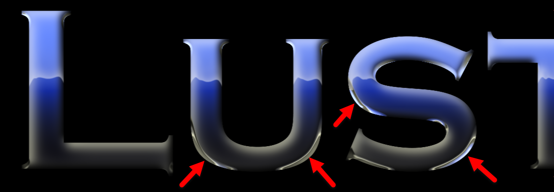
Glass Distortion adjusts how much the shadows and highlights from your bevel
distort by way of an invisible fractal field. Notice how raising the parameter's value to 50 warps some of our more pronounced edges, even resulting in bringing back some blue into the bottom curve of that s.
Highlight controls affect how the source is highlighted from the bevel.
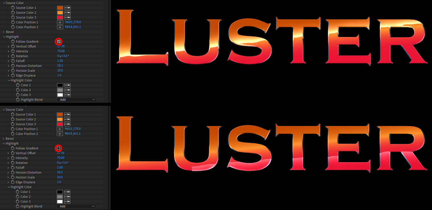
Follow Gradient toggles whether the bevel’s highlights follow the gradient
dictated above under Source. As you see below with our use of the Tangerine preset, the impact of disabling this checkbox can be substantial.
Vertical Offset controls where the highlight’s gradient appears on the effect along the y axis. A little bump makes a big difference here. Our preset defaults to 27.36 (shown at top, above). Following are value of -40 (top) and 135.
Intensity adjusts how much the highlight’s overlay affects the source's brightness. Our default value of 70 gives a bright pop, as if the sun had just set behind the horizon. But for more dramatic effects, watch what happens when we slide down to -65 (top) and then back up to 90.
Rotation rotates the highlight’s effect relative to the source. Think of it as tilting the horizon.
Falloff adjusts the distance between the highlight’s range of colors. You may observe that lower values seem to stretch how wide Color 3 appears.
Horizontal Distortion adjusts how distorted the reflection appears on the source along the
x axis using an invisible fractal field.
Horizon Scale affects the grid of the distorting fractal. Higher numbers mean more
distortion. To see an impact,
Horizontal Distortion must be greater than 0. These horizon controls really sizzle with the Backlit preset. In the example triptych below, we move from default values of Horizontal Distortion: 50 and Horizon Scale: 50 (left) to 10 and 10 (middle), then up to 90 and 90 (right).
Edge Displace shifts the distortion along the gradient’s edges.
Highlight Color contains three color swatches for you to dictate the colors
of the highlight (only when Follow Gradient is disabled), with a Highlight Blend
drop-down list containing the standard overlay parameters that determine how the
highlight integrates over the other colors beneath it. See our examples in the Core Concepts section above for an example of Highlight Color in action.
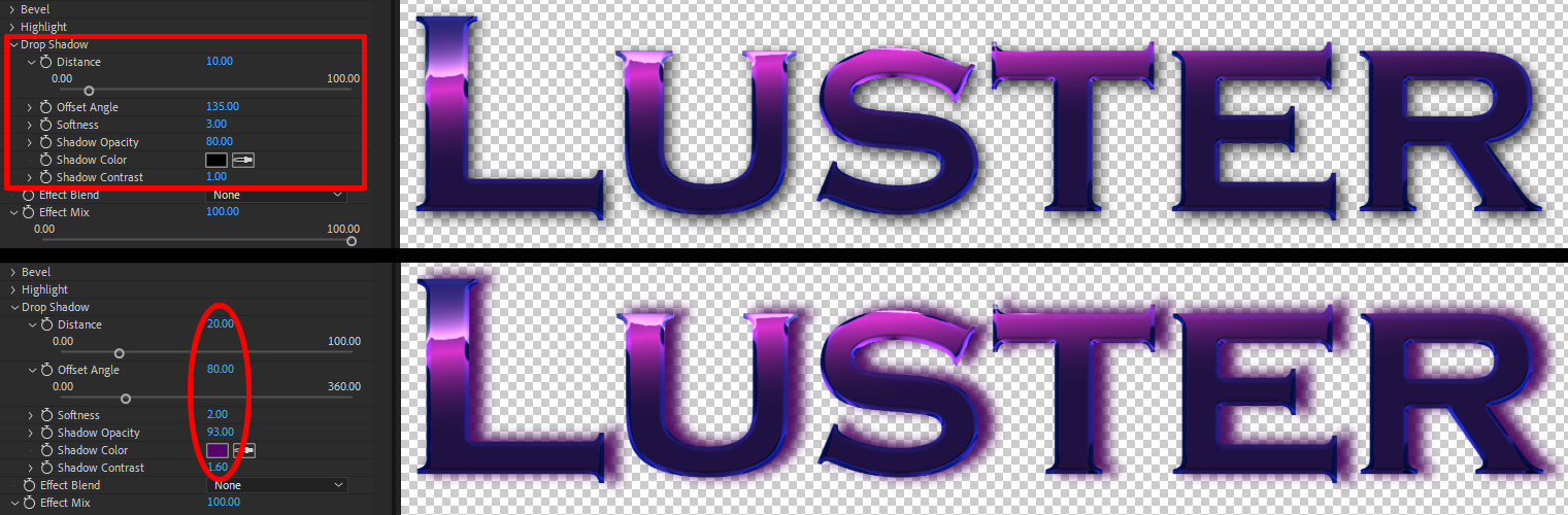
Drop Shadow twirls down a list of controls affecting the drop shadow behind your source.
Again, for anyone familiar with photo editing or graphic design, this is likely to be comfortably familiar. We tinkered with the below controls to illustrate the difference between the default drop shadow (top) and several changes (bottom).
Distance determines how far away your shadow is from the source based on its current angle.
Offset Angle controls the angle at which your shadow moves away from the source.
Softness adjusts the shadow's blur.
Shadow Opacity affects the shadow’s transparency over the background.
Shadow Color changes the color of the shadow using a color swatch as a reference.
Shadow Contrast controls the range of shades between the shadow’s darkest and lightest areas.
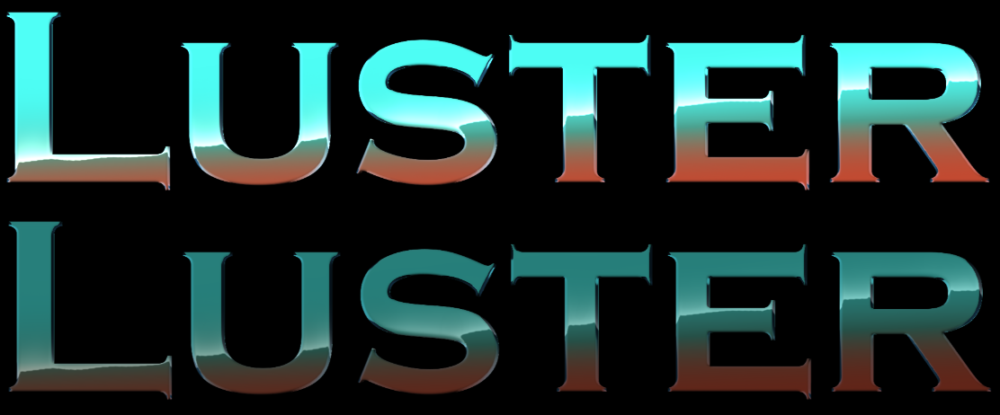
Effect Blend adjusts through standard blending controls how the effect overlays onto the source.
Effect Mix adjusts how much the effect overlays the source. A 0 value effectively erases the effect layer to nothing (although the drop shadow will remain). The comparison below shows the default value of 100 (top) and a value of 50 (bottom).