Easily generate and customize animated text and motion graphics.
Presets & Video Walk-Through
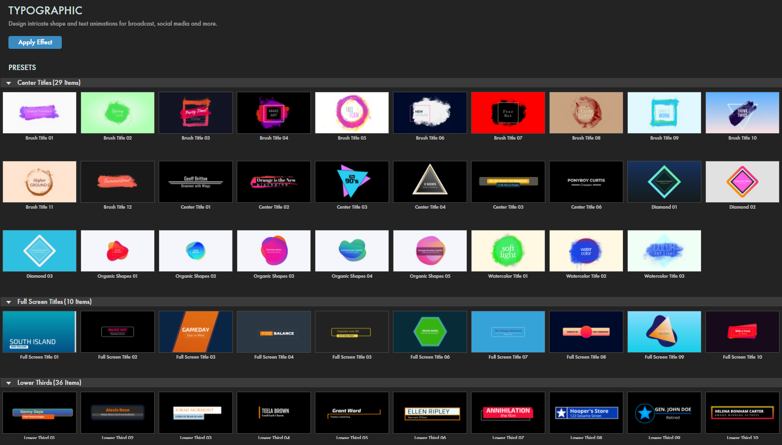
Typographic provides a host of presets spanning full-screen, centered, lower-thirds, banner, panel, and other typographical overlays. Find our presets via the blue Open Dashboard... button or the Choose a Preset... button below it.
Important:
When you first apply a Typographic preset, you may find that your comp immediately goes black.
Two factors likely contribute to this. 1) The Blend with Original control, found at the bottom of Typographic's ECP interface, defaults to None. Selecting Normal or another suitable blend mode should bring back your source layer. 2) Many presets animate into the scene, meaning your first frame may have no Typographic overlay present yet. Advance your playhead into the effect to make sure your text and shapes will be visible.
As with all other Universe tools, you can modify or create a Typographic look and then save it under its own name by pressing the Save Preset... button.
If you'd like a visual overview of Typographic before diving into this guide, we recommend giving our Cineversity tutorial a watch.
Intro to Typographic Concepts
Typographic can create fun, engaging overlays comprised of shapes underlying text. Once you get accustomed to the plugin's controls, crafting these overlays becomes easy. At first glance, though, the sheer number of controls may be daunting, but really it all comes down to this:
Animation governs how the entire Typographic effect behaves, not necessarily how it looks. How does text animate in and out of position? How long do different parts of the animation appear, and when do they happen?
Source allows you to copy the layer on which Typographic is applied and manipulate it as another background beneath your text and shape.
Text is all about your two lines of characters — what they look like and how they move.
Shape is whatever form underlies your text. You get up to two shapes to work with, and these can be anything from basic circles and squares to icons and paint splashes from Typographic's shape library. Once you select a shape, controls let you fine tune its appearance.
Background controls let you establish a blank color or gradient to sit under your effect rather than having a source layer visible.
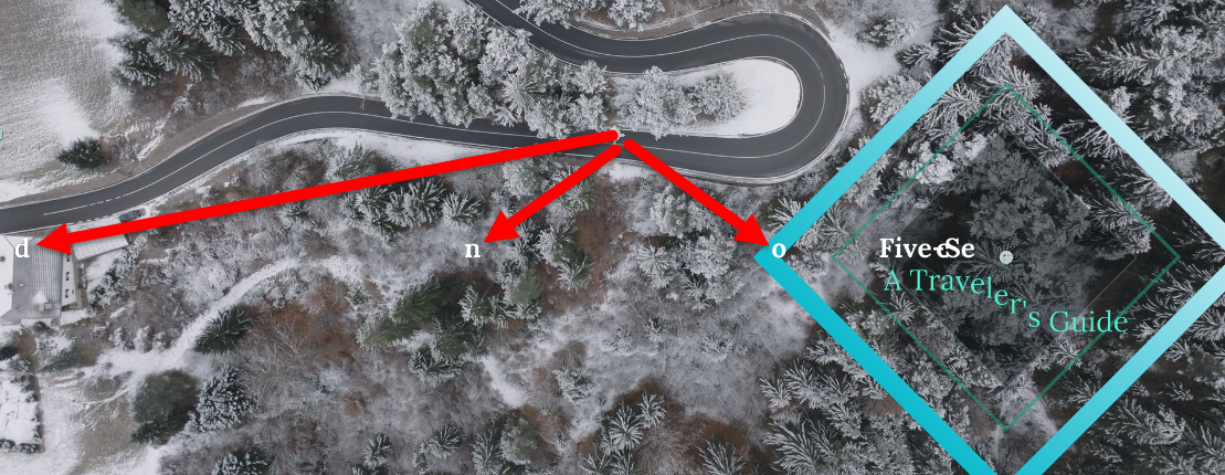
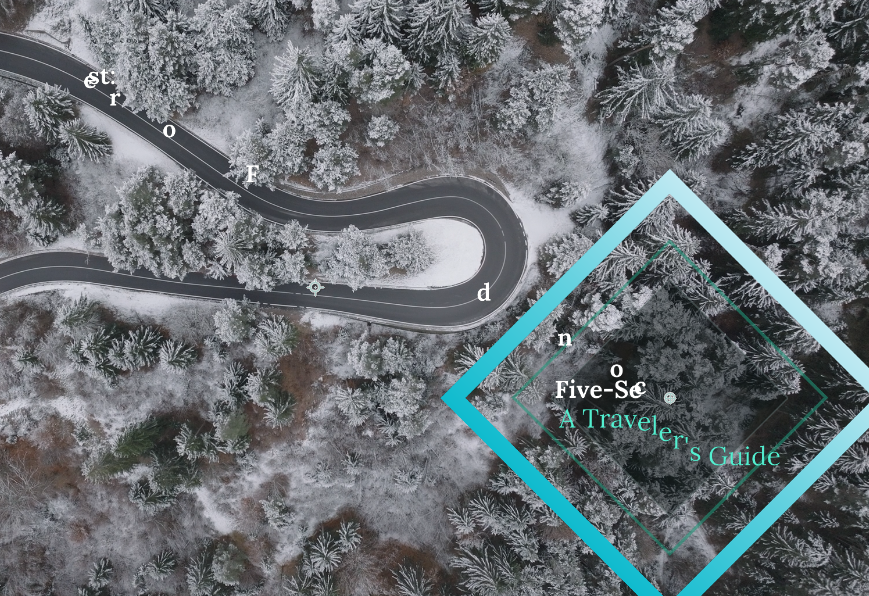
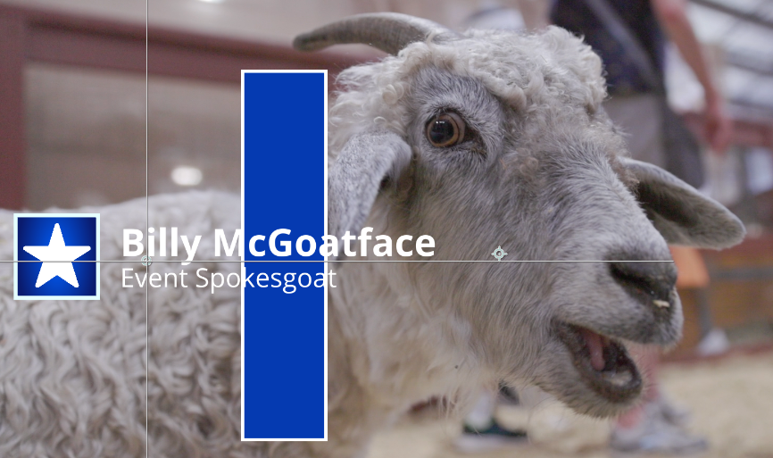
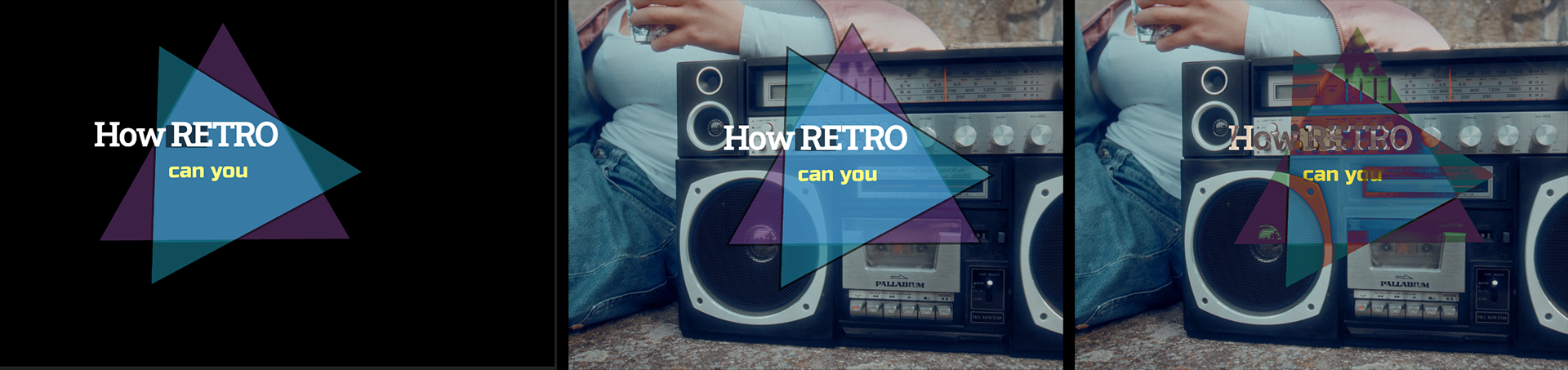
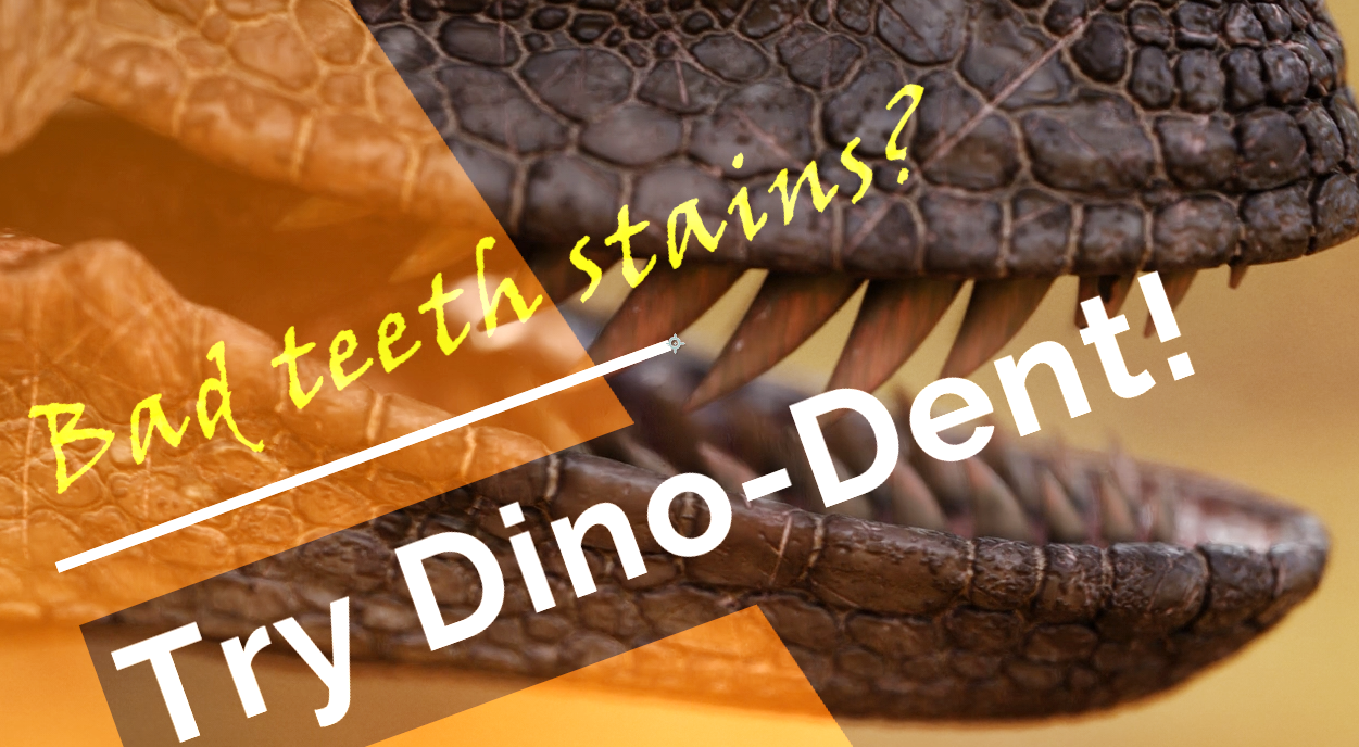
1: Original layer. 2: Shape 1. 3: Text (Line 1). 4: Text (Line 2). 5: Shape 2. 6: Source.
And that's it. We strongly suggest playing with some of Typographic's presets to get acquainted with these basic elements. After that, you'll be ready to jump into the deep end of the plugin pool with the following parameters.
Modify the Effect
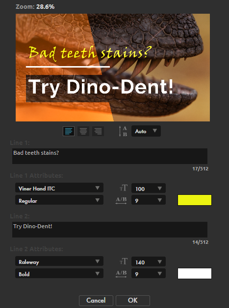
Edit Text
launches a modular window with options to customize the effect's text input, including the font, size, color, emphasis (e.g., bold and italic), character spacing, and line spacing.
Note that the text for Line 1 and Line 2, has separate customization options under the
Text 1 and Text 2
parameter groups (see below).
Position
provides coordinates and controls that define where within the frame the text effect appears.
This is a handy control for moving all of your effect's text and shapes in unison rather than offsetting them individually.
Rotation
adjusts the angle of the effect. Notice in the below example how a value of 20 rotates the entire effect, not just the text, but the original layer (our dinosaur clip) stays unchanged.
Animation
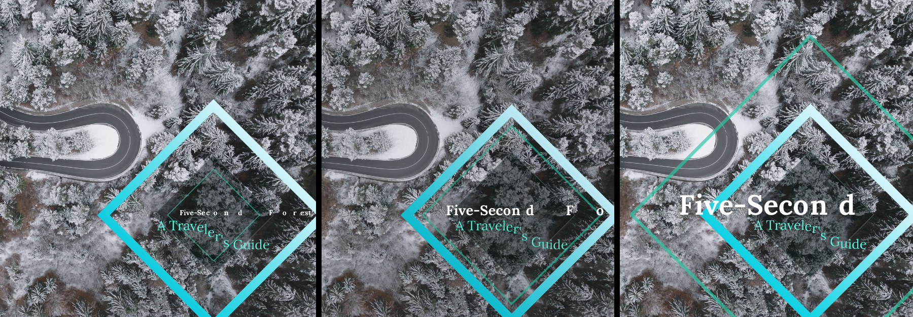
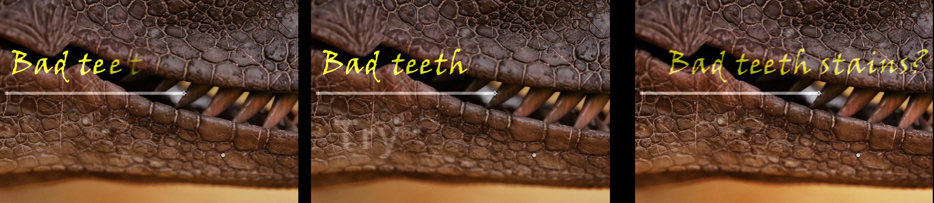
Text Grouping
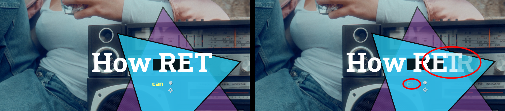
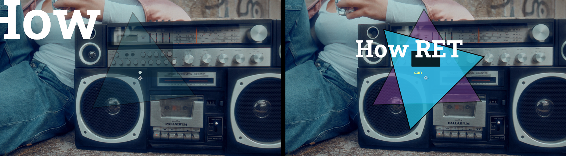
determines whether animation adjustments are applied to individual Characters, Words, or Lines. In the below comparison of the same clip frame, you can see how Characters (left) has characters animate into place individually and how the last visible "t" still has fairly low opacity in that frame. With Words (center), entire words transition into place at once. You might notice how "teeth" still lacks the 100% opacity of "Bad," and the word "Try" is just starting to appear as the start of Text 2. Finally, Lines (right) brings in the entire text line at once.
Transition Width
adjusts the offset range of the text's starting position before it animates into place. Higher values will appear to "cram" text closer together.
Transition Width is most apparent with Characters grouping, as shown below in the comparison of 0 (left) and 100 (right) values.
Delay Behavior works with other animation parameters to affect whether your text lines display the intro and outro in the same order (Progressive) or opposite order (Mirrored). Notice in these examples how the Progressive scheme (left) intros with the order Text 1 then Text 2 followed by an outro of Text 1 then Text 2. The Mirrored example (right) intros with Text 1 then Text 2 but outros with Text 2 then Text 1. We only switched the Delay Behavior to obtain this change.
Duration
adjusts how long it takes for an effect transition to progress from from start to end.
Note that Duration reflects seconds only if project frame rate is 30 fps. If your frame rate is 15 or 60 fps, for example, Duration will compress or expand relative to 30 fps.
Intro Animation
toggles whether the text effect animates into place.
If disabled, your effect will begin in its "home" (post-intro) position without any animation.
Intro Start
sets how many seconds pass before the text effect begins to animate.
An Intro Start of 0.50 combined with a Duration of 1.00 results in the effect beginning to animate half a second into your comp and complete at the 1.5-second mark (assuming a 30 fps project).
Outro Animation
toggles whether the text effect animates from its home position to off screen.
Outro Start
sets the time at which the effect begins to animate off screen.
Duration then determines when the outro will complete.
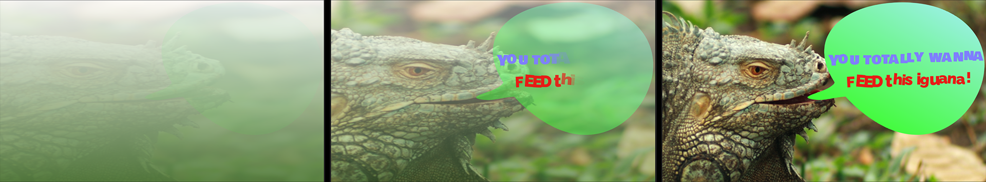
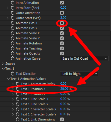
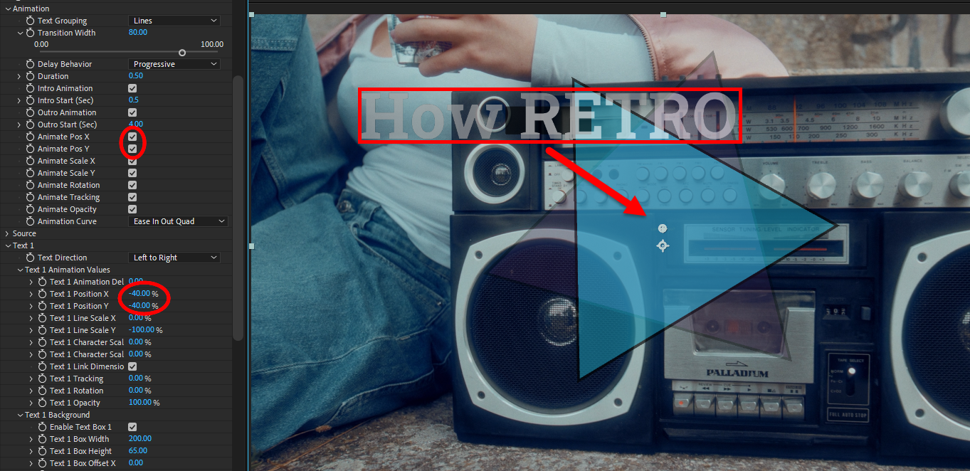
Animate Pos X/Y
toggles whether the text effect moves into place along the x or y axis during the transition.
Note that these controls work in tandem with the Text 1/2 Animation Values > Text 1/2 Position X/Y controls (see below). We illustrate this in the following image. With both X and Y boxes enabled, this instructs Typographic to reference the starting position noted for each axis in the Text Animation Values subgroup position parameters. In both cases, we set this to -40%, which is why you see our still-semi-opaque Text 1 animating in from the top-left and moving toward the center. If we disable Animate Pos X and run the animation again, the text still begins -40% above center (y axis), but now it's centered on the x axis and simply drops into home position.
Animate Scale X/Y
toggles whether the text effect scales along the x or y axis during the transition.
As with Animate Pos X/Y, this control works cooperatively with the Text 1/2 Line Scale X/Y parameters. When we max out both of the Line Scale controls to 400%, the effect begins with the below-left image, then gradually shrinks (right) as it approaches its post-intro home position. Alternatively, negative numbers may yield a flipped appearance. For example, the following shows Text 1 in transition based on Text 1 Line Scale values of X: -300 and Y: 400.
Animate Rotation
toggles whether the text effect components rotate into place during the transition.
The appropriate animation controls in the Text 1/2 and Shape 1/2 groups will also require non-zero values for this checked box to have an impact.
Animate Tracking
toggles whether the text spacing is affected during the transition.
Below, you see the effect enabled (left) and disabled (right) half way through an intro transition. Note that we have a Text 1/2 Tracking (see below) value of 50% specified.
Animate Opacity
toggles whether Text 1/2 and Shape1/2 transparency changes during the transition, provided Text/Shape Animation Values for opacity contain non-zero values.
Animation Curve
provides multiple interpolation style choices for Typographic's animations. See
Animation Tween Examples for more information.
Source
Enable Source
toggles whether Typographic's source clip manifests as its own animated part of the effect.
Refer to the image in this guide's introductory section. See how the Source (noted as #6) appears as a separate item from the main background? This can allow you to animate the Source on top of the main clip, which serves as a background, or it can replace the main clip completely. This becomes useful when employing the Background tools covered below and shown in the following images, where we start with a simple graded background, then animate the Source into place with various position, scale, and opacity parameters. Shown here are the 00:05 (left), 00:12 (center) and 01:00 (right) frames across a one-second intro.
Source Animation Values
contains parameters that adjust the starting position, size, and rotation values of the source before it animates into place.
Source Animation Delay
sets how many seconds pass before the source imagery animates.
Setting this value beyond the clip length results in no Source displaying.
Source Position X/Y
offsets the source's starting position along the x and y axes before it animates into place.
Source Link X/Y Animation
toggles whether the x and y properties animate in together (enabled) or separately (disabled).
Source Scale X/Y.
When Source Link X/Y Animation is disabled, then Source Scale X is active. When Source Link X/Y Animation is enabled, the Source Scale X value governs in unison across both the x and y axes.
Source Rotation
offsets the source's starting rotation angle before it rotates into place.
Source Offset X/Y
moves the source along the x and y axes in relation to its original values.
Unlike Source Animation Values, these parameters govern the Source's "home" position that the Source occupies following the intro.
Source Scale, Rotation, Opacity
offset the Source's size, angle,
and transparency, respectively,
in relation to their original values.
To illustrate, consider the following two images. On the left, we have something of a default setup, with no offset or rotation and Source Scale at 60. On the right, we change to Source Offset X: -250, Source Offset Y: 40, Source Scale: 80, and Source Rotation: 0x+10 degrees.
Source Sorting
determines whether the source is
In Front
or
Behind the text.
Text 1/2
groups
contain parameters that adjust Typographic's two text lines.
In the following descriptions, we'll reference Text 1 controls, but these also apply to their copies in the Text 2 group.
Text Direction
(only found in Text 1 but applies to both Text 1 and Text 2)
sets whether the text characters are arranged from
Left to Right (below, left) or Right to Left (as for Chinese, Hebrew, etc.).
Text 1 Animation Values
adjusts the text's animation. If you survived the previous Source section,
the following controls will look reassuringly familiar. Note that only components that have been toggled
for animation under the Animation parameters (above) will be affected by these controls.
For example, as shown in the following image, if Animate Pos X is unchecked,
no amount of adjusting or pleading with the Text 1 Position X control will result in the characters,
words, or line of Text 1's position animating.
Text 1 Animation Delay sets how many seconds pass before the text animates.
Text 1 Position X/Y offsets the text's starting position along the x and y axes
before it animates into place. Note that the specific behavior caused by this control will vary
depending on your Text Grouping method. For example, the following comparison occurs 70% of the way
through our intro transition. We set Text 1 Position X to 50 percent. Character
(Left) and Word (center) behave similarly, but Line (right) pulls the Text 1 Box Stroke
along with the text. You can also achieve an unusual effect with negative values. Below, we disabled Animate Opacity
and set Text 1 Position X to -264%, which extended the effect beyond the comp's left border.
In contrast, a positive value has characters from the right edge. You'll obtain similar results with Text 1 Position Y. Here, we use Text 1 Position X: -60 and Text 1
Position Y: -50.
Text 1 Line Scale X/Y offsets the line of text's starting size, along with its box stroke, along the x and y axes
before it scales into place. Below, see example values of -40 (left), 40 (center), and 400 (right).
Text 1 Character Scale X/Y offsets the character's starting size along the x and y
axes before they scale into place. Below, we use values of Text 1 Character Scale X: -400 and Text 1 Character Scale Y: 400. The former is why characters are both large and reversed as they transition into place. The latter is why characters begin so tall. If we were to switch the Y parameter to negative, characters would begin upside-down.
Text 1 Link Dimensions
toggles whether the x and y dimensions animate together (enabled) or separately (disabled).
When enabled, the X control becomes the x/y pair's "master" and the Y control ceases to have any effect.
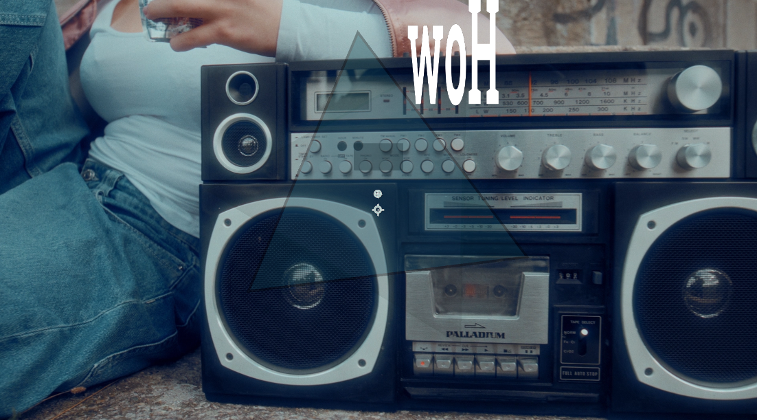
Text 1 Tracking
offsets spacing between characters before they animate into place. Negative values will reverse character order and extend the distance between those characters.
Text 1 Rotation
offsets the angle of the text before it rotates into place.
Below, we set this parameter to 250%, giving characters a wild, tumbling action as they transition into place.
Text 1 Opacity
offsets the text's transparency before it fades into place.
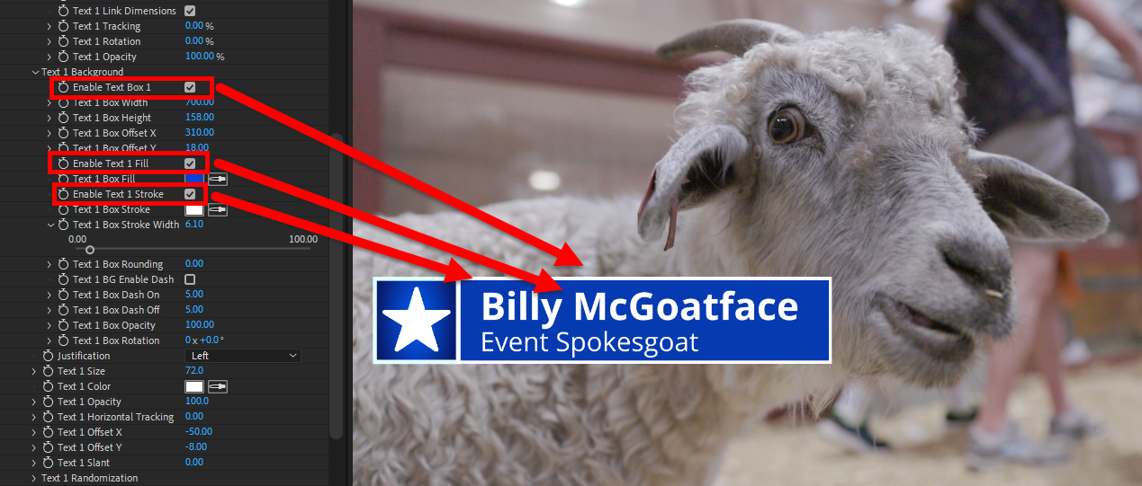
Text 1 Background
Enable Text Box 1
toggles whether a box appears behind the text.
In the above example, Text Box 1 is the rectangular form around Text 1.
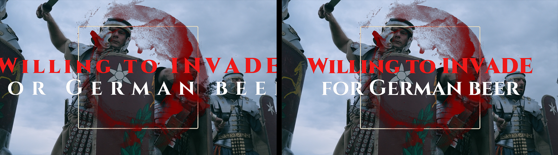
Text 1 Box Width/Height
adjusts the size of the background along the horizontal or vertical axis.
Here, we reduce Text 1 Box Width from the Lower Third 08's preset value of 700 to 640. This change is sufficient to separate Text Box 1 from Shape 2, which is the white-outlined blue square surrounding the white star.
Text 1 Box Offset X/Y
offsets the position of the background along the x and y axes in relation to the Position control point. Changing the Text Box 1/2 Offset can yield a similar appearance to Text Box 1/2 Width/Height adjustment, but note how the background box dimensions remain unchanged. Only the shape's location moves.
Enable Text 1 Fill
toggles whether the background's shape has a fill color.
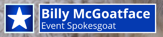
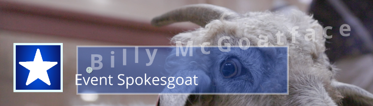
Given the above example, unchecking this would remove the blue surrounding our text, exposing more of our spokesgoat's beautiful coat.
Text 1 Box Fill
sets the text background's fill color.
Enable Text 1 Stroke
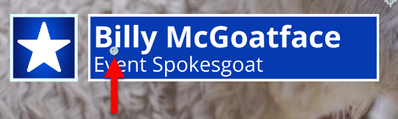
toggles whether the background's shape has an outline. Unchecking this yields the below image.
Text 1 Box Stroke
sets the color of the background's stroke.
Text 1 Box Stroke Width
adjusts the thickness of the background's stroke.
Text 1 Box Rounding
adjusts the curve of the background's corners.
A 0 value displays as 90-degree corners. Below, we use a value of 40 and increase Text 1 Box Stroke Width to 15.
Text 1 BG Enable Dash
toggles whether the background's stroke is dashed.
Text 1 Box Dash On
sets the distance of the stroke's dashes
Text 1 Box Dash Off
sets the distance between the stroke's dashes.
Text 1 Box Opacity
sets the transparency of the background.
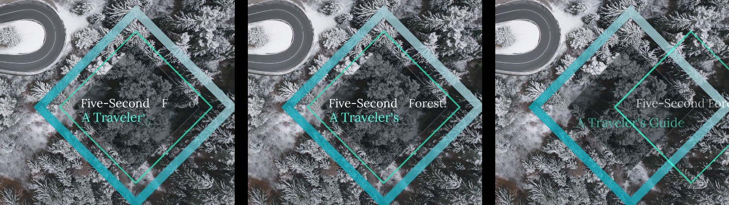
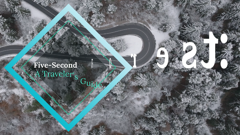
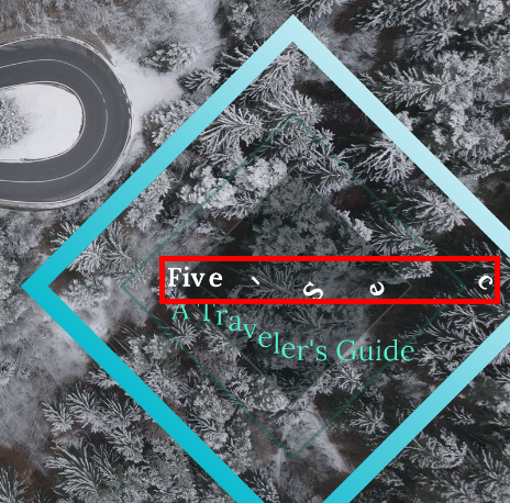
In our earlier "Five-Second Forest" examples, we used a Text 1 Box Opacity value of 50, allowing some of the landscape to come through without impairing text legibility.
Text 1 Box Rotation
adjusts the angle of the background. Here, you see we changed the value from 0 to 90. We've also left the Position control point visible to spotlight how the background shape is not centered on the text. Rather, its location depends on the Text 1 Box Offset X/Y parameters.
Justification
determines if the text is aligned to the Left, Center, or Right relative to the Position control point.
Text 1 Size
adjusts how large or small the text appears.
Text 1 Color
defines the text color.
Text 1 Opacity
sets the text transparency.
Text 1 Horizontal Tracking
controls the spacing between characters.
Text 1 Offset X/Y
adjusts the text along the x and y axes in relation to their original position.
Text 1 Slant
controls the slope of the text.
The following image illustrates several of these parameters. The most obvious is Text 1 Slant, which we set to 75 and is why you see the characters from Text 1 lifting from their starting position. We also cranked Text 1 Horizontal Tracking up from 0 to 36, resulting in the characters spilling well beyond the background's right edge. We dropped Text 1 Opacity from 100 to 40 and zeroed out Text 1 Offset X and Y while leaving Text 2 Offset untouched. This is why our left-justified Text 1 now rests right on our Position mark, whereas previously the preset's negative value had "Billy" starting to the mark's left. Also note the Text 1 Background's position shift while the Text 2 Background remains unchanged relative to the Position mark.
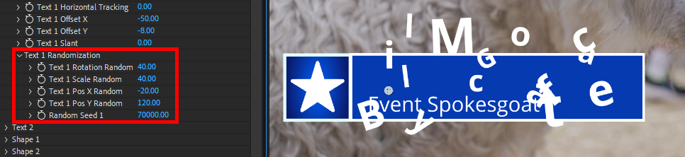
Text 1 Randomization
Text 1 Rotation Random
randomizes the rotation of the characters.
Below, we used a value of 40.
Text 1 Scale Random
randomizes the size of the characters.
Again, we used a value of 40 below.
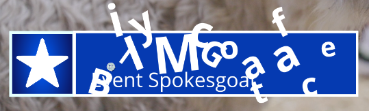
Text 1 Pos X/Y Random
randomizes the x and y positions of the characters. In the following image, we used values of -20 and 120, respectively. Note that, without keyframing, these random parameters do not animate into place. What you see below is what you get at the intro transition's end.
Random Seed 1
adjusts the equation used to create the randomized pattern. This is useful for differentiating other effects with similar randomized selections.
Compare the above image, which used a Random Seed 1 of 70000 with the following, which used 70001. Any value change essentially shuffles the randomization deck.
Shape 1/2
contain parameters that adjust the shapes of the effect.
As with the Text 1/2 groups, expect our descriptions of Shape 1 parameters also to apply to Shape 2 (and vice versa). Expect much of the following to echo our Text 1/2 descriptions. As such, we won't dive into as much detail unless needed.
Enable Shape 1
toggles whether the shape appears behind the text.
When applying a preset, simply unchecking this box is the easiest way to tell which Shape is which. With Enable Shape 1 unchecked, we get:
Shape 1 Animation Values
Shape 1 Animation Delay
sets how many seconds pass before the shape animates.
Shape 1 Position X/Y
offsets the shape's starting position along the x and y axes before it animates into place.
S1 Link X/Y Animation
toggles whether the x and y dimensions animate together (enabled) or separately (disabled).
Shape 1 Scale X/Y
offsets the shape's starting size along the x and y axes before it transitions into place. Note that Star and Polygon shapes (see below) scale both axes in unison with Shape 1/2 Scale X.
Shape 1 Rotation
offsets the angle of the shape before it rotates into place.
Below, we have a rotation of 40 percent. This rotation, along with the text, will scale into place throughout the transition. (We disabled Animate Opacity in this example for easier clarity.)
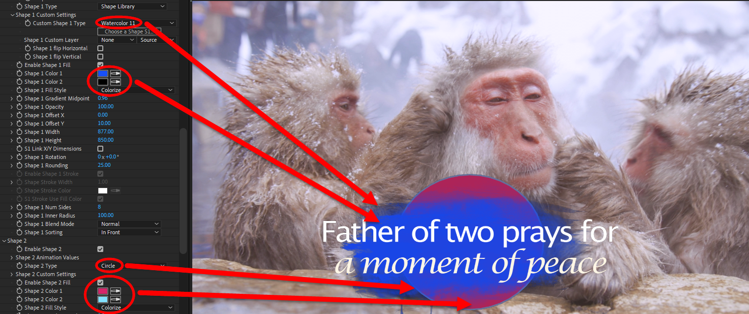
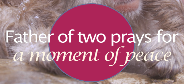
Shape 1 Type
determines the shape used: None, Rectangle, Circle, Star, or Polygon.
Here's an example of Star, which we modified with five points via the Shape 1 Num Sides control (below).
Shape Library and Custom Layer both have their own set of parameters under Shape 1 Custom Settings.
Shape 1 Custom Settings
provide options for when you select Shape Library or Custom Layer as the Shape Type.
Custom Shape 1 Type
provides a drop-down list of dozens of shape presets built into Typographic.
Shape 1 Custom Layer
maps the shape source to another timeline layer.
Enable Shape 1 Fill
toggles whether the shape has a fill color.
Below, you see this control disabled (left) and enabled (right) with preset default values. Note the blue shape stroke left behind with the fill absent.
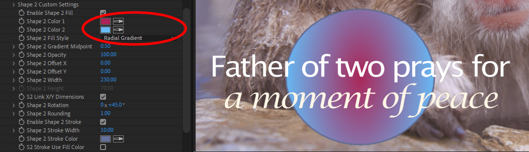
Shape 1 Color 1
and
2
define the color(s) used for the shape.
With a Radial Gradient, Color 1 will be at the shape's center.
Shape 1 Fill Style
determines how one or both of your color selections fill the shape. With Colorize, for instance, Color 1 occupies the entire shape.
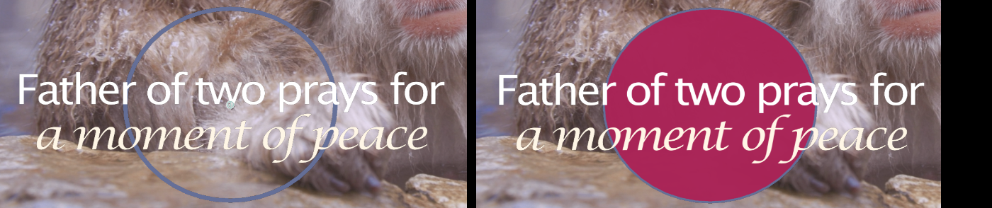
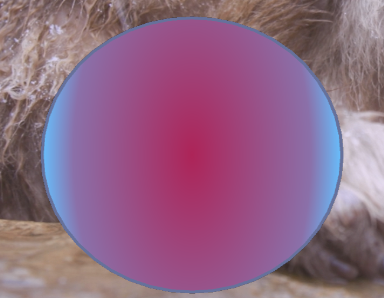
Shape 1 Gradient Midpoint
adjusts where the Linear Gradient or Radial Gradient transfers from one color to the next.
The image above shows a value of 0.50. A value of, say, 0.15 lets blue dominate all but a small red dot in the center. In contrast, 0.80 yields this:
Shape 1 Opacity
sets the shape's transparency.
Shape 1 Offset X/Y
adjusts the shape along the x and y axes in relation to its original position.
Here is a Shape 1 Offset X of -300:
Shape 1 Width/Height
adjusts the size of the shape along the horizontal or vertical axis. Star and Polygon
shapes scale both axes in unison with Shape Width.
S1 Link X/Y Dimensions
toggles whether the x and y dimensions adjust together (enabled) or separately (disabled).
When checked, Shape 1/2 Height will be grayed out.
Shape 1 Rotation
adjusts the shape's angle.
Shape 1 Rounding
adjusts the curve of the shape's corners.
In this example, we replaced the preset's default Shape 2 Type (a Circle) with a Rectangle, altered Shape Width and Height, set Shape 2 Rotation to 7 degrees, and changed Shape 2 Rounding to 65 (from the default square corners of 0).
Enable Shape 1 Stroke
toggles whether the shape has an outline, as shown in earlier examples.
Shape 1 Stroke Width
adjusts the size of the shape's stroke.
Shape 1 Stroke Color
sets the shape's stroke color.
S1 Stroke Use Fill Color
toggles whether the shape's stroke uses the same color as the shape's fill (enabled) or Shape 1 Stroke Color
(disabled).
Shape 1 Num Sides
sets the number of shape sides when you select Star or Polygon as the Shape Type.
Shape 1 Inner Radius
controls the size of the shape's radius in relation to its default size.
Shape 1 Blend Mode
provides standard blend options that determine how the shape colors interact with the colors behind it.
Shape 1 Sorting
(only available for Shape 1)
determines whether the shape is Behind or In Front
of Shape 2.
Background
contains parameters that adjust the appearance of the background behind Typographic's text and shapes.
Enable Background
toggles a background comprised of colors defined below.
Background Color Style
determines whether the first color fills the background (Solid) or if both colors are used for a Linear or Radial Gradient.
Background Color 1
and
2
defines the color(s) used for the background.
Background Opacity
sets the transparency of the background colors.
In the following comparison, we show Background Opacity at 100 (left), 60 (center), and 0 (right). You can see how this might offer a creative way of transitioning in or out of scenes.
Motion Blur mimics how, with real cameras, the shutter stays open for a brief time. During this period, a fast-moving object will shift slightly during frame capture, creating a blur in the motion’s direction. You can set the Motion Blur pull-down menu to Off, Low, Medium, or High.
Motion Blur Shutter sets how long the virtual camera shutter stays open. This controls the “streak length” or “blur length” of elements. A value of 0 means no motion blur. Low values set a short streak. The default value of 180 simulates a half-second of motion information being recorded on film. High values set a longer streak. A value of 720 (the maximum) simulates two seconds of blurring.
Motion Blur Phase offsets the point in time when the virtual camera shutter opens. A value of 0 means the shutter is synchronized to the current frame. A negative value causes motion that occurs before the current frame to be recorded. A positive value causes motion that occurs after the current frame to be recorded. To create motion streaks with the current frame in focus, use a Shutter Phase negative value equal to the Motion Blur Shutter.
Blend with Original sets the blend mode for how your effect's colors interact with underlying layer colors in your comp. Shown below are None (left), Normal (center), and Difference (right).
