Working with Colors
Cameras, lights, and materials have settings that require color values to be entered. Maxon Redshift for Archviz offers extensive options for determining color values numerically, using a pipette, by sampling linked images, or using classic mixing fields. We will therefore take a look at all the options available for this task.
Quick Navigation
Accessing and using the Color Chooser
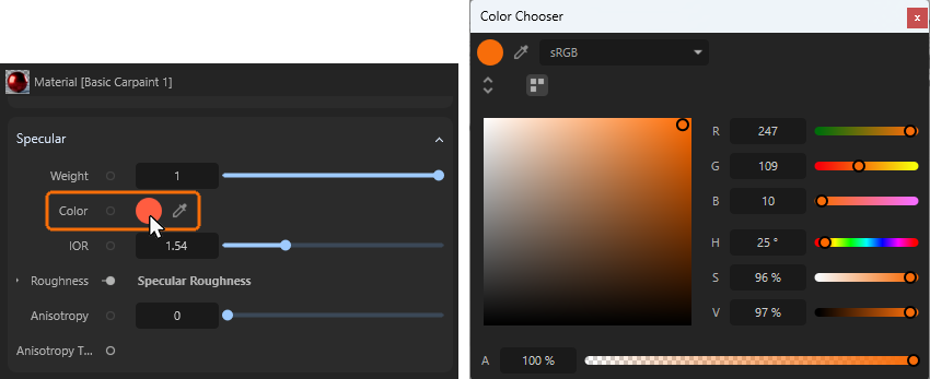
As shown in the illustration above on the left, parameters that require color values to be entered offer a circular color field that opens the Color Chooser dialog when clicked. Alternatively, you can click on the eyedropper icon. This activates a mode in which you can click anywhere on the screen to select the color value there.
By default, the Color Chooser opens in a mode that offers several color selection systems.
On the right-hand side, you will find the classic sliders for the red, green, and blue components of the desired color (RGB), as well as sliders for the hue value (H), saturation (S), and black value (V). In some cases, an alpha slider (A) is also provided at the bottom of the Color Chooser, which can be used to control the opacity or transparency of the color. However, not all parameters can use an alpha value, so this setting may be missing in some cases.
On the left side of the input window, there is a mixed field in which a circular marker can be moved with the mouse to intuitively adjust the saturation and brightness of the color value. This is particularly helpful when colors are mainly defined by RGB values, as otherwise saturation and brightness would have to be adjusted laboriously by correcting all three color values.
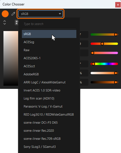
At the top of the dialog, there is also an option for selecting the color space to be used for the input of color values (see Figure 2). This offers OpenColorIO and its production-proven color spaces, some of which can also be used to configure color values outside the range that can be displayed by normal monitors. By default, Maxon Redshift uses such large color spaces for image rendering in order to open up additional scope for post-production of images, provided that appropriate file formats are used for saving that do not crop the color values (e.g., OpenEXR).
In most cases, however, it makes sense to use the sRGB color space for entering color values, especially if color values are to be defined according to standard RGB/HSV values or captured directly from the screen using the eyedropper color picker. Only if you want to use HDR color values, for example, it can be worth to switch to larger color spaces, such as ACEScg. However, please note that when switching back to a smaller color space, the defined colors will be cropped and may change accordingly.
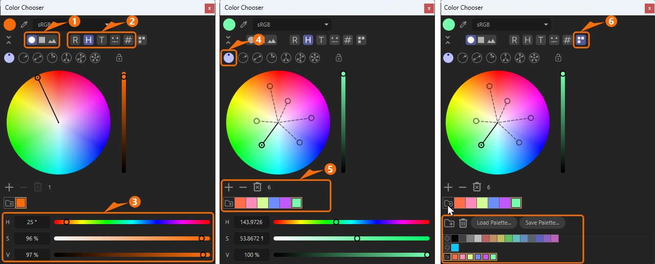
Save and manage Colors
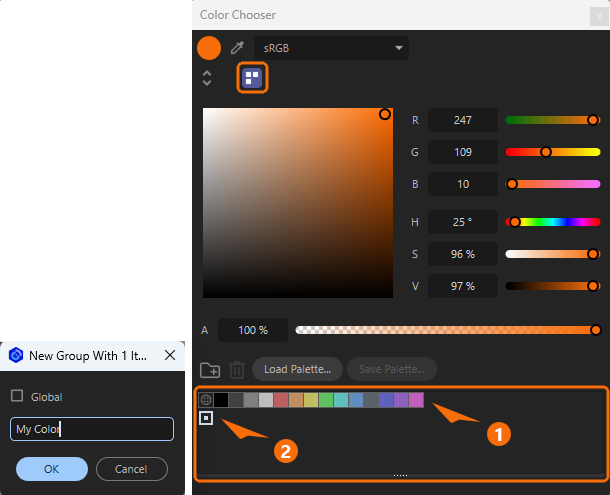
The icon at the top of the Color Chooser (see marking at the top in Figure 3) can be used to open a special Color Swatches area at the bottom of the dialog box, where you can recall previously saved colors by double-clicking on the small color fields or save new colors individually.
To save your color, simply drag the color from the circular area at the top left to the Color Swatches area. Dropping the color behind an existing color palette will add it there (see 1 in Figure 3). Dropping the color in an empty area below (see 2 in Figure 3) will add the color to a new color palette.
A name for the new color palette can be selected via a small dialog box (see left side of Figure 3). There you'll also find a Global option for this newly created palette.
Palettes defined as Global are automatically available to other projects that are opened. If Global is deactivated, this color palette will only be available within this project.
Global palettes are easily recognizable by their globe icon.
New color palettes can also be created using the Folder icon to the left of the buttons for loading and saving palettes. The classic Trash can icon for removing selected palettes can also be found there.
Finally, right-clicking on the color fields opens a context menu that allows you to change the display size of the color fields, the name of the palettes and to remove or edit previously saved color values.
In any case, the color swatches are saved together with the scene. To be able to exchange your color palettes between different projects, they can also be saved using the Save Palette... buttons and loaded using Load Palette....
Advanced Color Chooser Modes
The double arrow icon directly below the circular color area can be used to switch between Compact and Advanced modes for the Color Chooser.
In Advanced mode, additional color tools are available, including tools for defining entire color worlds (see following Figure 4).
For the following explanations, we refer to the numbers in Figure 4 above:
- 1: Use these three icons to switch between the color wheel, a color mixing field, or reading an assigned image as the input method for color values.
- 2: These buttons activate different sliders and input options for individual color values, which are then displayed at the bottom of the Color Chooser. Please not that several of these options can be active at the same time when shift-clicking on these icons. From left to right, these are:
-
R: This activates the default RGB sliders and input fields for red, green and blue color values.
-
H: This activates the default HSV sliders and input fields for hue, saturation and black level values.
-
T: In thermophysics, Temperatures can also be assigned color values. Think, for example, of glowing metal, which undergoes various color changes as it cools. Particularly in the case of light sources, a color temperature measured in the unit Kelvin is often indicated on the packaging in order to distinguish between warm white (lower Kelvin value) and cold white light (higher Kelvin value), for example. In this mode, this Kelvin color temperature can be entered directly after the letter K. However, since not all colors can be set using these Kelvin values, the T value is also offered, which can then also address green and violet tones. The additional controls T, M, and I are offered as options below:
- T: (Temperature): Here you can adjust the color temperature between red and blue tones.
- M: (Magenta): This setting defines the mix between green and magenta.
- I: (Intensity): Intensity can be used to brighten or dull a color (similar to the V setting in the HSV color model).
-
Color Mixer: Two color fields are provided, which can be configured as desired by clicking on them. A Mix value can then be used to set the desired color mix value on this color gradient.
-
#: In HTML web design in particular, color values are often set using hexadecimal values. The value #FF0000, for example, sets a perfect red. Such hex values can be entered directly in this setting.
-
3: The color sliders and color selection systems as they have been selected at number 2 in Figure 4 are displayed here.
-
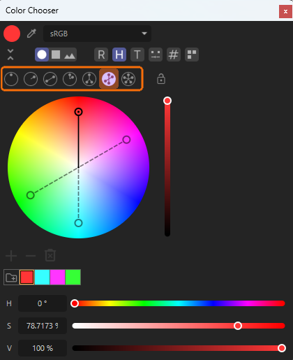
4: Clicking on the left circle icon at number 1 activates a color selection wheel. It displays all available colors and their saturation levels (center=0% saturation, outer border=100% saturation). The brightness of the colors can be set by the vertical slider on the right side of the color wheel.
The icons in the row at number 4 can be used to activate various modes, e.g., to automatically select pairs of complementary colors. However, for now, we will activate the first icon on the left, which allows you to place any number of color pickers in any position by ctrl or cmd-clicking on the color wheel. The position of the color pickers can be adjusted at any time using the mouse. The colors selected in this way are listed as color fields below the color wheel (see number 5 in Figure 4). The color pickers can be selected by clicking on them and then also deleted again by using backspace. -
5: This section lists the created color values. Using the + and - buttons increases or decreases the number of color pickers. However, it is often more practical to ctrl/cmd-click directly on the color wheel, as this creates the new color picker directly at the desired position.
A click on the trash can icon deletes all color pickers but the selected one. Clicking on the folder icon in this section saves the taken color samples to a new color palette. Just open the Color Swatches category (see number 6 in Figure 4) to find all stored colors (see also this section). -
6: Activate this Color Swatches icon the display the already discussed color palettes. This part also offers the buttons to Load and Save such color palettes for a possible use in other projects. See this section for more info about color palettes.
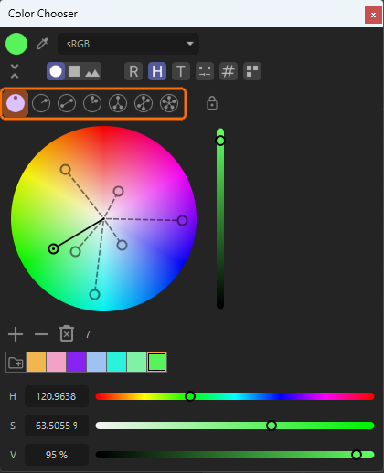
The Color Wheel Modes
Let's take a quick look at the available modes for the color wheel. In general, the Free mode on the far left, which we already discussed above, is the most versatile because it has no restrictions on color selection or the number of color pickers that can be used. The other modes are more restrictive in this regard, but can be helpful when creating color gradients or precisely selecting complementary colors, for example. Even if you use these more restrictive modes, you can always return to Free mode to add more colors to the same palette later.
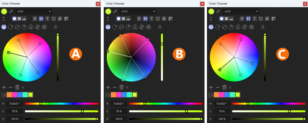
The mode and display type of the color gradients in the color wheel can be customized by right-clicking on the color wheel. By default, the color wheel displays a mathematically exact, linear representation of all color angles (see also HSV color system). The saturation of the colors decreases evenly towards the center of the circle. The missing brightness component of the colors can be found to the right of the color wheel as a vertical slider (see A in Figure 5).
Alternatively, a saturation slider can be displayed instead via the context menu of the color wheel. The color brightnesses can then be selected directly within the color wheel. The closer the colors are marked to the center, the darker they get (see B in Figure 5).
Finally, an artistic mode is also available via the context menu, which gives the more commonly used shades of yellow, orange, and red more space on the color wheel (see C in Figure 5). Please note that this means that some other colors opposite the red and yellow tones on the color wheel can no longer be displayed, as that area is displayed compressed.
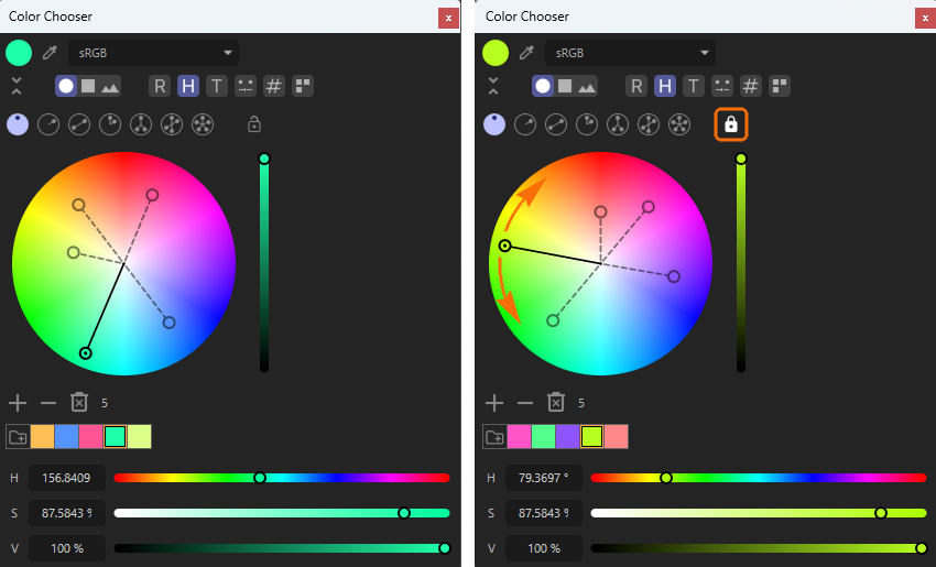
If you want to fix the position of several color pickers relative to each other, you can activate the U-lock icon (see right side of Figure 6). The color pickers can then still be moved clockwise or counterclockwise, but their distance from the center (corresponding to brightness or saturation) and their angular distance from their neighbors remain constant.
Free Mode
As shown in the figure above, in Free mode, you can select any number of colors by ctrl/cmd-clicking on the color wheel and compile them in a palette.
Monochromatic Mode
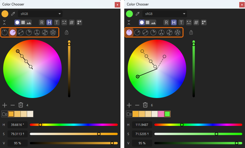
In Monochromatic mode, only one color angle is offered for all colors, the angle of which can be selected as desired using the color picker with the additional dot (see left side of the the illustration above). By ctrl/cmd-clicking on the line running between the center of the color wheel and the outer color angle picker, any number of additional color variants with correspondingly reduced saturation can be added. The + symbol below the color wheel can also be used for this purpose. All color pickers along the color angle can be moved freely with the mouse at any time. No longer needed color pickers can be deleted by clicking on them and pressing the backspace key. If you ctrl/cmd-click next to the color angle line, the color wheel automatically switches to Free mode, in which you can freely add additional colors (see right side of Figure 8). This also allows individual changes to saturation and brightness for all colors.
Complementary Mode
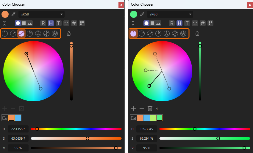
So-called complementary colors are located directly opposite each other on the color wheel and therefore represent the greatest possible color contrast. Ctrl/Cmd-clicking on the color wheel automatically creates two color pickers located opposite each other. In this mode, only these two complementary colors can be created. Each additional ctrl/cmd-click automatically switches back to Free mode, in which any number of additional color pickers can be freely placed. This also allows individual changes to saturation and brightness for all colors.
Analogous Mode
In Analogous mode, color pickers can be placed at regular angular intervals. Just use the + button or ctrl/cmd-click on the color wheel to place the number of pickers you need. The angular interval can be selected between 15° and 30° by right-clicking on the color wheel and choosing from the context menu. Freely placeable colors can be added later by switching back to Free mode. This also allows individual changes to saturation and brightness for all colors.
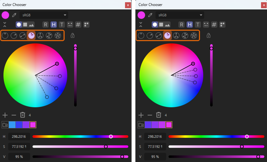
Split Complementary Mode
Split Complementary mode is quite similar to Complementary mode, but in this case two colors are selected directly opposite a placed color picker. This means that their color contrast is not quite as strong as with classic complementary colors. In this mode, only these three colors can be selected. If you need more freely chosen colors within a palette or if you want to adjust the saturation and brightness individually, simply switch to Free mode.
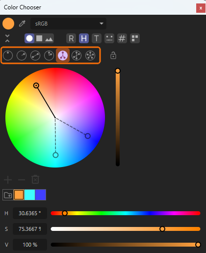
Tetrad Mode
In Tetrad mode a placed color picker automatically creates two pairs of complementary colors that are offset from each other by 60° on the color wheel. To add more colors to the palette or edit the saturation and brightness of the colors independently, simply switch to Free mode.
Equiangular Mode
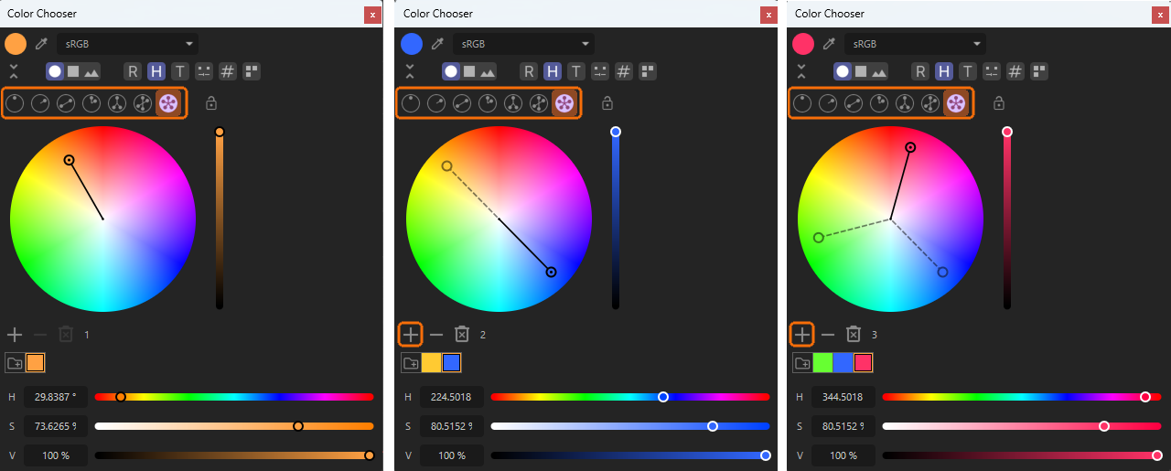
In Equiangular mode, all existing color pickers are distributed across the color wheel at equal angular intervals. To add additional colors, use the + button below the color wheel. Otherwise, using ctrl/cmd-clicks on the color wheel will switch directly to Free mode, in which the color pickers can be placed independently of each other as usual.
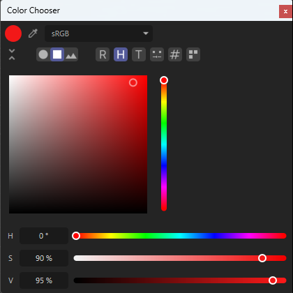
The Spectrum Mode
The next option after the color wheel is labled Spectrum and offers a mixing field with a circular handle, that can be moved with the mouse to control the brightness and saturation of a chosen color. The color itself is adjustable via the vertical slider to the right side of the mixing field. By right-clicking on the mixing field you can choose between different sizes for the input elements.
The same mixing field is also available in the Compact Color Chooser mode that is offered by default when clicking on a color input field in a manager. There you can use the H slider for the hue value of a color and then use the mixing field to adjust saturation and brightness. This is often more convenient compared to using the separate S and V sliders of the HSV color system.
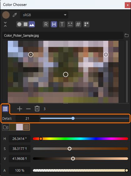
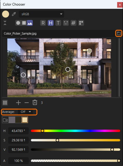
The Color form Picture Mode
The last mode is called Color from Picture and allows you to load an image file (via the folder icon; see red mark in the following illustration), on which color pickers can then be placed by clicking ctrl/cmd. Alternatively, you can use the + and - buttons and the trash can icon below the loaded image area to adjust the number of pickers. This allows you to select colors from any part of the image and compile them in a palette at the bottom of the dialog box. The color palette can then be permanently saved as explained here so that it is also available in other projects.
The accuracy of the color selections can be set using the Average menu. There, you can specify the radius in which the color values are read and, if necessary, interpolated at each color picker.
As an alternative to enlarging the color sampling radius via the Average menu, you can also switch to Mosaic Mode using a separate icon (see Figure 16). There, an additional Detail slider allows you to coarsen the image display. The loaded image appears broken down into regular color areas, each representing the mixed color of the underlying image area. This makes it even easier to identify the basic colors of a loaded image and select them with the appropriate color pickers. While moving the color pickers with the mouse, they will automatically snap to the centers of the color tiles.