 Character Component Basic Tag Insertion Mirroring Include Materials Layers Selection Bind Adjustments Hotspots Notes Animate Walk Python Advanced
Tag Properties
Specifies what the type of component tag the selected tag will be. The type drop-down is rather long, but can be broken up into manageable groups. There are the anatomical types, helper types, and the character type.
None, Pelvis, Limb, Spine, Hand, Foot, Digit, Head
Tail, Wing, Custom
The anatomical types are all essentially the same but provide different default icons. This makes it easier to define the components for each of the key anatomical types. When using the anatomical types, it's important to understand that you are not necessarily limited to creating them in an anatomically correct way. For instance, if you have a rig that has a spine with a head you do not have to use the Spine or Head component for those components. You can set it to Wing or Tail and it would be fine. So from a template standpoint, all the anatomical types are the same. The only other difference is that the Hand and Foot types will also display any user data pertaining to child digits.
The helper type components are meant to aid in the building process. They themselves cannot be built. A common rigging technique known as "broken hierarchy” involves creating a rig made from separate hierarchies joined via expressions and constraints. In such a rig you need more control over where those objects should be placed and inserted. Using the Component type, you're able to set a custom insertion point for that object rather than using what is set in the main component tag. You can do the same for the Controller types, the main difference between them is that if you have a Controller type set, that object will show up when you set the Character Object's Object Manager display to Controllers.
The Type chosen will affect which other parameters and tabs are shown or modifiable within the Component tag.
This becomes editable if Type is set to Custom. Allows you to name your custom Component type.
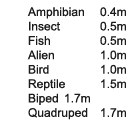
Specifies the type of Character this template defines. The character type defines the default icon and automatic sizing for the Character. This option is only available if the Type is set to Character.
This becomes editable if Type is set to Custom. Allows you to name your custom Component Type.
This sets the name which is used when displaying the component in the Object Manager. If Type is set to one of the anatomical types and this field is left blank, the component name will be inserted automatically. If the name is blank for non-anatomical types, the name field will be left blank. The name is not as important for non-anatomical types, as they do not show up in the Object Manager unless you change the Display of the Character object to Full Hierarchy or Component Hierarchy.
This name is the string shown in the Button for the Character object. If it is empty, it will use the Name field. If that is empty, it will use the Object's name. This option is only available to anatomical types.
The Subtype setting allows you to define multiple components for a single anatomical type. The subtypes will be displayed as a drop-down button which can be chosen during the build process. For example, if you have separate IK, FK and IK/FK arm components, you can specify each as a separate subtype of a component called "Arm” and allow the user to choose which subtype they want during the build process. So instead of seeing three separate buttons for IK, FK, and IK/FK, you would see one button drop-down that lists all three subtypes. This option is only available for anatomical types.
If loaded, it will use your own custom Icon instead of the default Cinema 4D Component Icon.
 Controls
Specify the main controller for an anatomical component in this slot. This controller will be selected automatically when selecting the component while the user is in Animate mode.
Allows you to specify which object or objects in your component contain user data. This gives the user an easy way to access all relevant user data for a component when animating the rig.
Axes
Defines which axis your character is facing. This option is only available when the Type is set to Character. This parameter is used to define the direction of forward motion when using CMotion with character's built from the template. Whatever is set here will correspond with the Forward setting found in the Pose tab of the CMotion object.
Defines which axis is up for your character. This option is only available when Type is set to Character. This parameter is used to define the up direction when using CMotion with character's built from the template. Whatever is set here will correspond with the Vertical setting found in the Pose tab of the CMotion object.
This parameter defines the size for the character template. This size is used by the Character object to determine what size a rig should be built. In general, the Size in the Component tag should reflect the actual height of the rig, and can be calculated automatically or be defined manually.
When users build a rig based on the template, the Character object will by default automatically scale the rig to a default size based on the Character Type specified (see below). Users can also set a custom height via the Size parameter in the Basic tab of the Character object. In either case, the template's components are scaled using the ratio between the Size stored in the Component tag and the target build Size in the Character object.
Character Type Auto-Sizing:
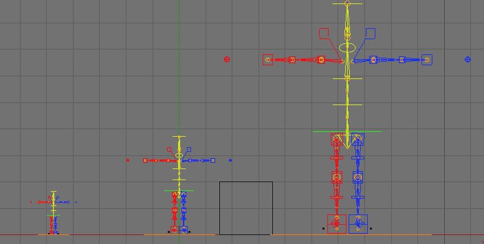 L-R: Size set to Auto, Custom 400, Undefined
If the size is set to Undefined, that means the character will be built at the current size in the template and no scaling will happen.
Auto means the Component tag (set to Character type) will calculate the maximum dimension of the entire character and uses that value when scaling it down to the size specified in the Character object.
Custom allows you to specify a custom dimension of the character that is then used in conjunction with the Size settings in the Character object.
If Size is set to Custom, this field will become editable. This field is the custom value for the size of your rig.
The Character object automatically displays the name of objects, components or controllers while mousing over each element. When this option is checked, the displayed name is simplified based on some typical naming conventions. For instance, "Name_jnt” is simply displayed as "Name” and "Name_con+” is displayed as "Name
Transform
Allows you to offset the Position, Scale, or Rotation of each created component. For example, each finger can be offset automatically from the previous one as it is created.