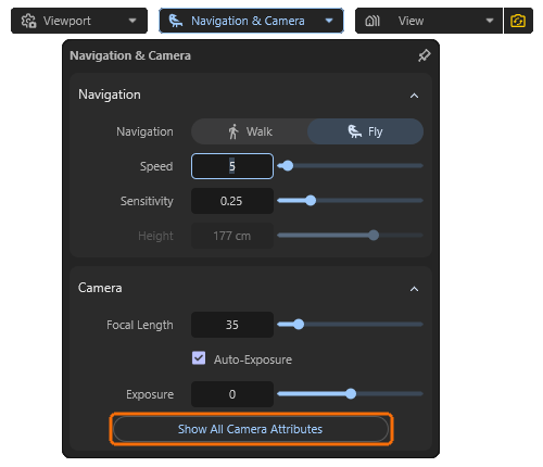
The Camera Settings
Some of the camera settings that are important for the perspective of the display can be accessed directly via the Camera & Navigation menu in the viewport. We have already covered these in the overview of the interface. Further camera settings can be accessed from there by clicking on the Show All Camera Attributes button and are then displayed in the Attribute Manager on the right-hand side.
Quick Navigation
Camera Settings
This section repeats most of the settings that were already available directly via Camera & Navigation. However, it also includes some design settings that are also available on real cameras or are part of the natural characteristics of lens systems.
Projection
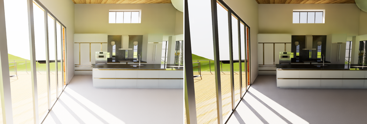
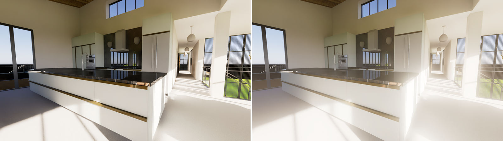
The Focal Length value indirectly determines the aperture angle of the lens, i.e., how much of the area in front of the camera you can see. Short Focal Lengths widen the Angle of View, allowing you to capture many elements even in small indoor spaces. Long Focal Lengths reduce the camera's Angle of View, meaning that only a small section of the surroundings is visible through the camera. As a result, long Focal Lengths allow you to zoom in on distant elements.
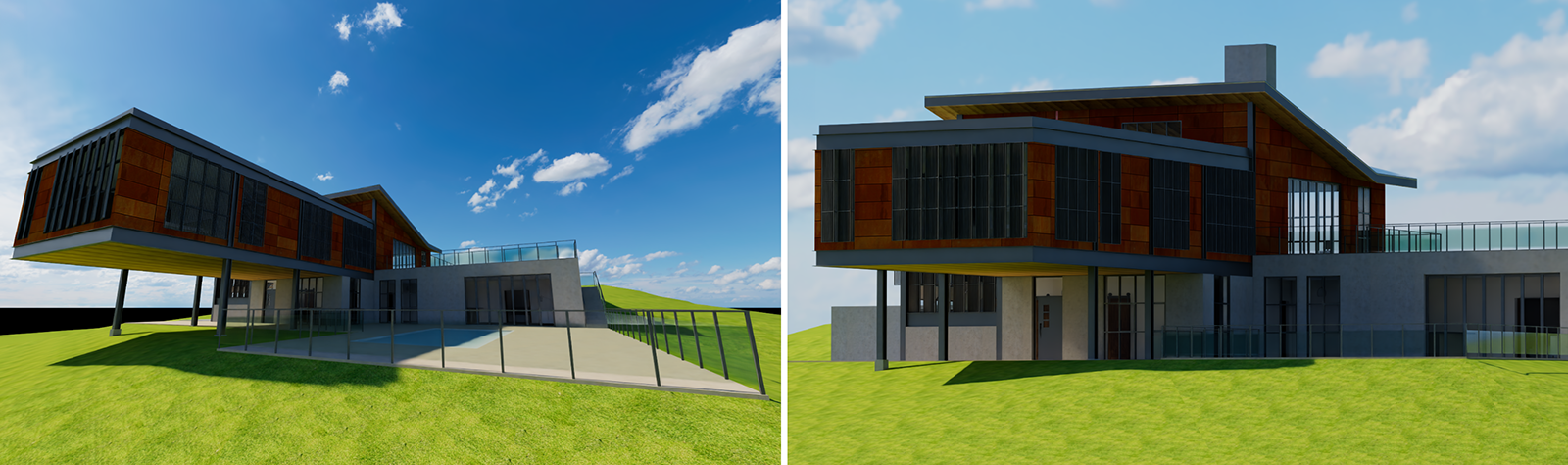
However, the Focal Length value not only changes the zoom level of the lens, but also the perspective of an object (see Figure 1). With short Focal Lengths, perspective distortions can increase, especially near the edges of the rendered image. With long Focal Lengths, the distances between objects are optically shortened and perspective distortions are reduced. The view becomes more technical than realistic.
If you prefer, you can also edit the desired camera Angle of View directly. The Focal Length value will adjust automatically accordingly.
It should also be noted that subsequent changes of the Focal Length often require the camera to be repositioned in order to keep the same objects in the frame. The focal length should therefore be selected as early as possible before the camera is finally positioned.
To minimize perspective distortion, try to keep the horizon of your surroundings running horizontally through the center of the frame. This will ensure that vertical straight lines always appear vertical and parallel to each other.
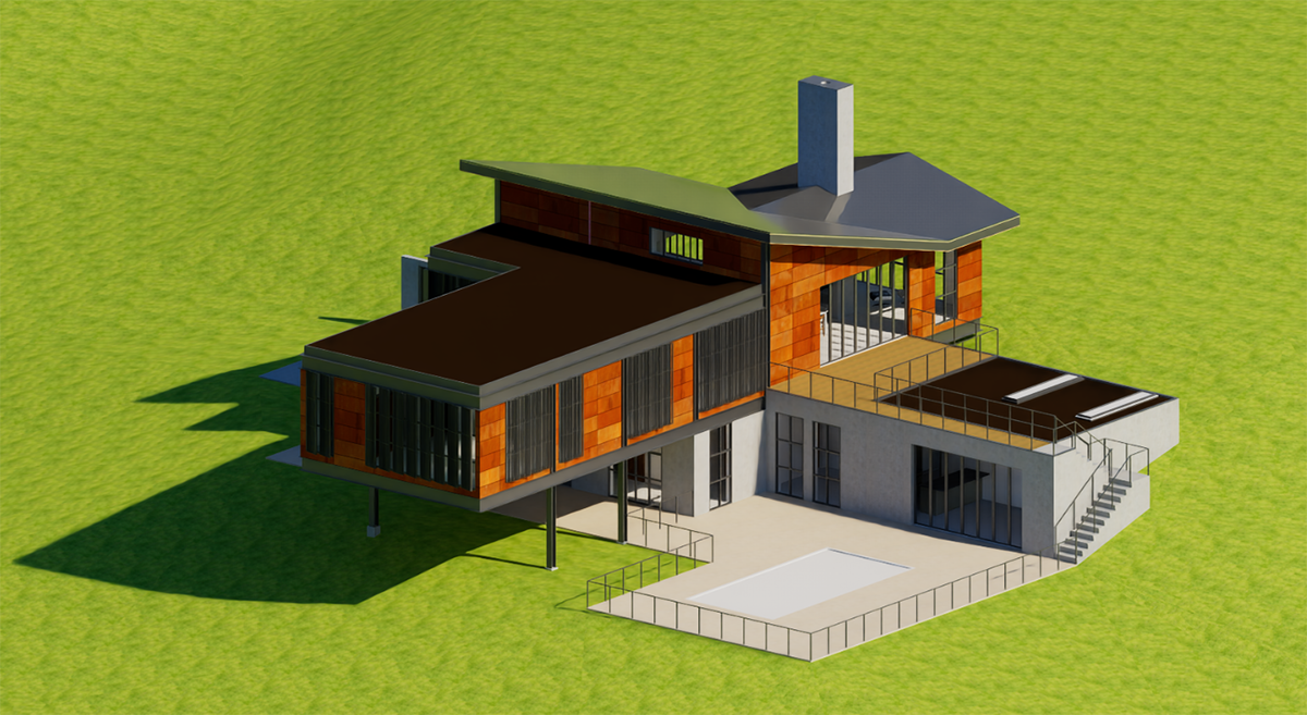
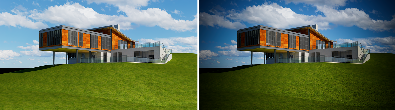
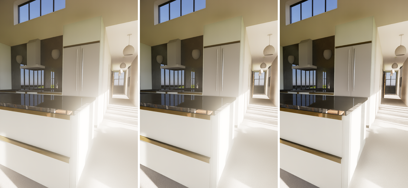
Another way to eliminate perspective distortions is to use the Projection menu and switch from Perspective to Orthographic. Instead of a central perspective, this calculates a parallel perspective that corresponds to classic technical drawings (see Figure 2). Elements at a greater distance retain their size, which means that all lines running parallel to each other on the model remain parallel to each other in the view. This is therefore a good alternative to using the Perspective Projection mode in combination with very long Focal Lengths.
There are just some downsides to be aware of when using Orthographic Projection:
- The Environment, no matter if the Sky or a loaded HDRI are activated, is no longer visible. However, the lighting generated by the environment used and the reflections based on it remain part of the rendering.
- The free placement of the camera is severely restricted. The Orthographic Perspective only offers a view of the scene from the outside as standard and is therefore only suitable for the external representation of buildings or other objects placed “outdoors,” for example. The camera can no longer be placed inside a closed room.
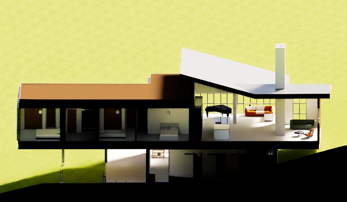
Besides these possible downsides of the Orthographic Projection there is also an interesting side effect. If the camera is first placed in Projection Perspective mode within a room and then switched to Orthographic mode, all objects that lie completely behind the camera, i.e., behind its XY plane on the negative Z axis of the camera, are automatically ignored for image calculation. In some cases, this can be used to calculate simple cuts through the geometry during rendering.
However, this useful ‘hack’ may become obsolete in future versions due to an integrated cutting algorithm for the displayed geometry.
Exposure
Some of these settings are already familiar from the Viewport & Camera settings and control, for example, how the brightness of the materials and light sources in the scene influence the final image brightness. A balanced brightness distribution can be calculated automatically, or you can adjust it manually. Other settings in this section relate to White Balance, i.e., which color value should be displayed as neutral white, and Vignetting, which simulates a reduction in light transmission at the edges of lens systems.
Exposure Type
The Exposure Type mode corresponds to the Auto Exposure option in the Viewport & Camera settings, which can be accessed directly via the viewport. In Manual mode, image brightness is not filtered and the image is initially displayed as it results from the intensities of the light sources. However, the Exposure value can still be adjusted manually to darken or lighten the result individually. With an Exposure value of 0, however, it is guaranteed that there will be no burnt-out bright areas in the image. This is helpful for any kind of post-processing in image or video editing programs.
With Exposure Type Manual, you take full control of the resulting image brightness and must adjust it using the Exposure value in every case.
Exposure Value
Regardless of the Exposure Type used, Exposure values below 0 reduce image brightness, while values above 0 brighten the image accordingly. Since this calculation can access the original values of your materials and light sources during rendering, the results are much more realistic compared to a subsequent brightness adjustment to the saved image. You should therefore always try to configure the desired brightness and contrast of the subject here using the Exposure settings before rendering.
White Point
The perception of colors depends heavily on lighting conditions. For example, a white sheet of paper may appear slightly yellowish in sunlight. Although such color changes are realistic, they are not always desirable. In such cases, real cameras can also be counteracted with a so-called White Balance.
Redshift simplifies this setting by providing a color picker that allows you to simply click on the surface in the viewport that has a white material and should therefore only appear in shades of gray. In summary, you should set the color in White Point or take it directly from the viewport if you want to see it desaturated in the rendering. With the default setting, which uses white for the White Point, all other surfaces are displayed exactly as they appear in the light falling on them.
For more information about how to set or pick colors, please see this page about Working with Colors.
Vignetting
A vignette usually appears as a darkening of a photo at the edges, as less light is transmitted through photographic lenses there compared to the center of the lens. Normally, attempts are made to minimize this effect on real lenses by coating them, but it can also be used intentionally and creatively to draw the viewer's eye to the center of the image.
Depth of Field
These settings allow you to simulate natural depth of field. This simulates focusing on a specific Distance or on a designated object (Auto Focus). The degree of blur and the size of the in-focus area are determined by the Aperture value. A large Aperture (for example, values between 8 and 16) reduces the amount of blur. Smaller Aperture values (for example, between 1 and 3.5) increase the blur and reduce the depth of field.
Otherwise, the settings are exactly the same as those in the Camera & Navigation dialog, which has already been described here.
The following settings are found in the FX tab of the Camera dialog
LUT - Lookup Table
A LUT (short for Lookup Table) is a definition that includes a predefined table of color transformations that maps input colors to output colors, adjusting brightness, contrast, and color grading of the rendered image. This section allows to read such LUT files and apply them directly to your rendered output. The resulting color changes can be mixed with the original rendering on a percentage basis.
LUT
If you want to load a LUT file and apply it to the rendering, you must activate On here. When the setting is Off, LUT profiles cannot be used.
File
To the right of the File path field, you will find a button with a folder icon. Clicking on it opens a file dialog where you can select the desired LUT file. LUT files with the extension .cube or .3dl are generally recognized. It is advantageous to create a directory where all available LUT files are collected. The following LUTs menu then allows you to browse and select all of the LUT files within the directory where the file specified in File is located.
LUTs
If the LUT file specified in File is located in a directory together with other .cube or .3dl LUT files, you can select the desired file from this directory here.
Intensity
The loaded LUT file changes the original RGB values during rendering. However, the Intensity value can be used to mix between the original rendering and the modified LUT rendering as desired. With a value of 0%, the original rendering remains unchanged; at 100%, the LUT conversion is fully implemented.
A click on the small triangle to the left of the parameter shows additional options about how to process the LUT during rendering.
Convert to Log-Space before LUT
When enabled your rendered image will be converted to the logarithmic color space before the LUT is applied. Converting an image to logarithmic color space means that the stored pixel values no longer represent light linearly. Instead, they represent the logarithm of the radiance or luminance. This means that bright areas appear less blown out, because high intensities are squeezed closer together. This is similar to photographing with log profiles (S-Log, C-Log, V-Log).
At the same time darker areas of the rendering and shadows can show more details. Black levels appear “washed out” unless corrected later. Overall a log‑encoded image looks low saturation and low contrast until a proper tone‑mapping or LUT is applied. An image converted to log space is therefore not suitable for direct viewing, but only shows its advantages during post-processing, e.g., through the loaded LUT.
Apply Color Management before LUT
When enabled your Redshift color corrections will be applied to the rendered image before the LUT is applied. Otherwise, the color corrections are applied to the image modified by the LUT. If in doubt, simply try out which result you prefer.
Color Controls
The Color Controls in this section lets you make overall color and brightness adjustments to your rendered image. You may already be familiar with such controls from other image or video programs, e.g., for customizing gamma curves. The functionality is the same here.
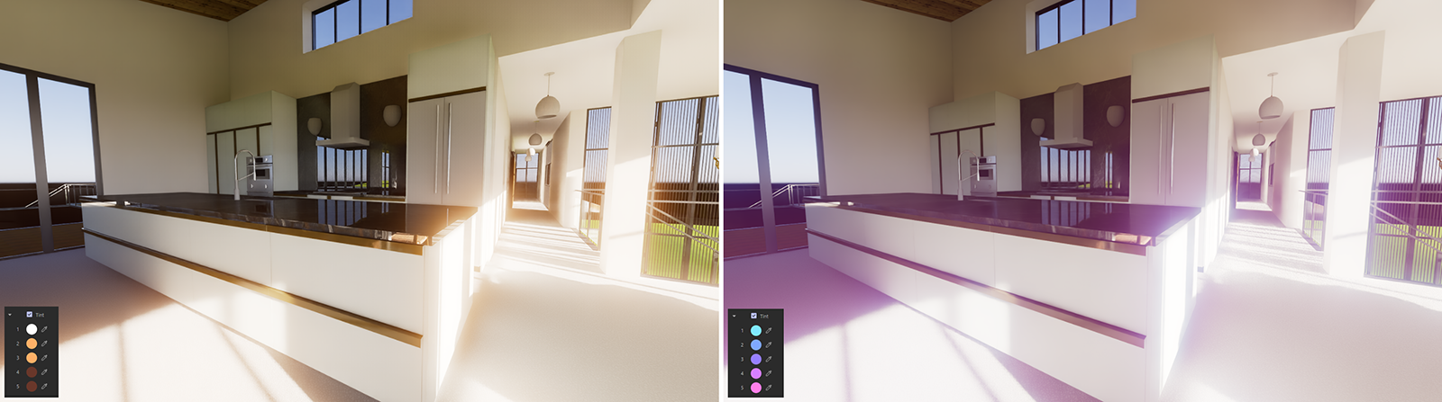
The left edge of each graph represents the dark tones in the image, while the right edge represents the light tones. The height of the curve corresponds to the new target intensity. A curve running linearly from the bottom left (black or 0% intensity of the color value) to the top right (white or 100% intensity of the color value) therefore leaves all intensities unchanged.
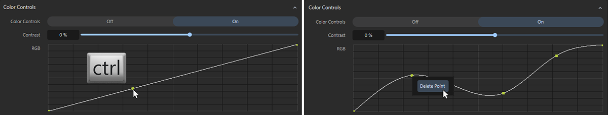
The curves can be manipulated with the mouse. Existing points can be moved directly with the mouse. Additional points can be created by Ctrl-clicking on the curve. Surplus points can be removed by right-clicking on them and selecting Delete Point (see also Figure 6).
Color Controls
Select the On setting here if you want to use the subsequent correction of contrast or RGB values.
Contrast
Contrast adjustment changes the difference between light and dark areas of the rendering, making shadows darker and highlights brighter, to alter visual separation between tones. With negative values this effect is reversed. The differences between the light and dark areas in the rendering are then reduced.
RGB Curves
The RGB curve can be used to change the brightness of the rendering. The color angles of the color values remain unchanged and only their brightness is altered. To edit the colors themselves, use the individual R, G, and B curves for the red, green, and blue color components in the rendering.
In this section, you will learn everything you need to know about operating the curve elements.
Bloom
This is an effect that simulates the scattering of light within the lenses of a camera lens. The effect is particularly noticeable in areas of the image with particularly bright pixels, such as those that can be caused by direct sunlight. A glow can then be applied to these areas of the image, softening the transition to neighboring areas.
This effect is therefore suitable for making a rendering appear more natural and softer, compared to renderings that are otherwise often too precise and super sharp.
Bloom
If you want to apply the Bloom effect to the rendering, switch the mode to On here.
Intensity
This Intensity value controls the overall strength of the Bloom effect. In this context, also note the Softness value, as this can be used to control the size of the effect, which can have a similar effect.
Threshold
This Threshold value determines which areas of the image are recognized as having sufficient brightness to be affected by the bloom effect. The lower the Threshold, the more dark areas are included in the effect. With higher Threshold settings, however, the effect is concentrated only on extremely bright pixels. Also note the separate Softness value, that can be used to scale the blooming effect so it covers larger areas.
Softness
The Softness value can be used to control the size of the blooming effect. It also makes the blooming appear softer and covers additional areas of the image. When using very high values, the rendering may appear as if it were taken through a fogged lens or as if the scene were filled with fog.
Tint
By default, blooming takes over the coloring of the bright areas of the image that triggered the effect. However, by activating this option you can also assign your own colors, like up to five, to color the blooming gradient from the inside to the outside. Tint 1 colors the bright center and Tint 5 the border area of the blooming effect. Only when all five Tint colors are perfectly white are the original colors of the highlights used in the rendering for coloring the blooming effect.
The darker the colors you choose, the weaker the corresponding proportion of the Bloom effect will be.
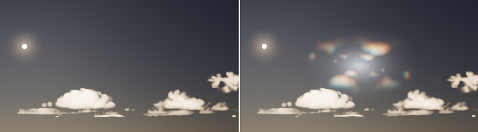
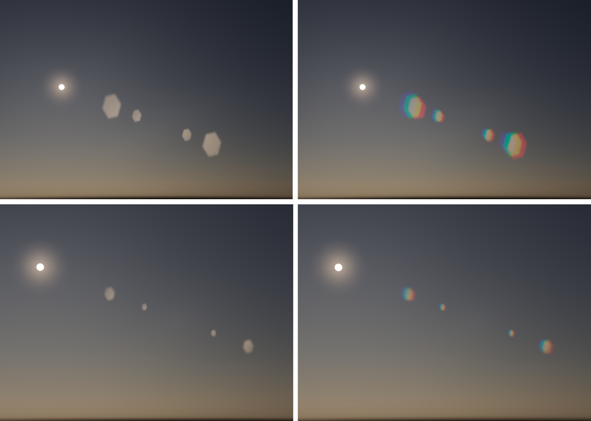
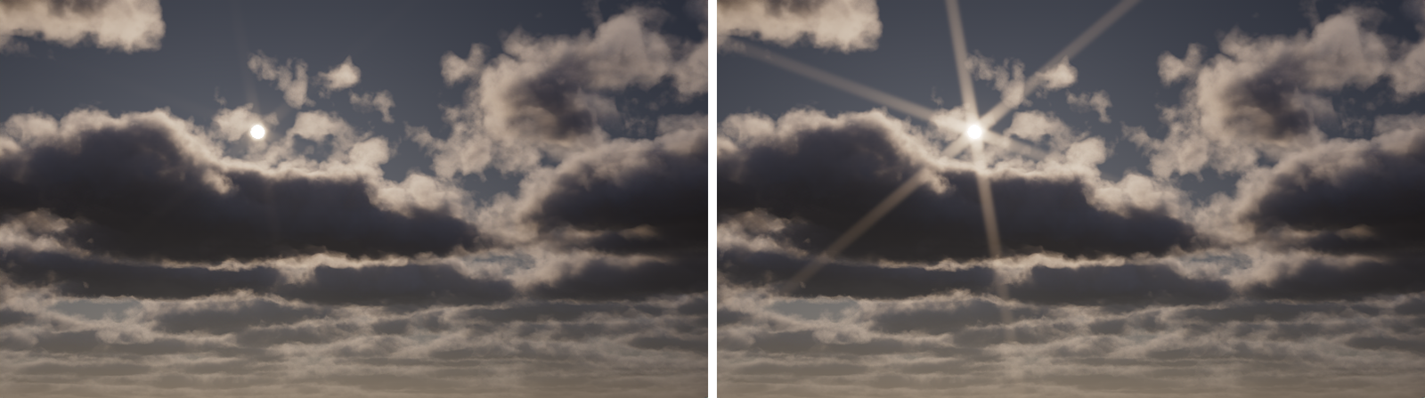
Flare
Flares are caused by multiple reflections of bright specular highlights or surface reflections on the glass inside the camera lens. This creates different colored shapes that correspond to the aperture opening. By default, a hexagonal aperture is simulated.
The flare shapes are placed along a line that runs through the center of the image and the bright areas of the image. The Flare effect can also calculate a separate Halo ring that is always placed centered in the image and matches the proportions of the render resolution.
Flare
If you want to apply the Flare effect to the rendering, switch the mode to On here.
As you can also see in Figure 11, the softness, size, and spacing between the flares change depending on the Focal Length of the camera used. At a shorter Focal Length, the flares appear sharper, larger, and closer together overall.
Intensity
This Intensity value controls the overall strength of the Flare effect. In this context, also note the Softness value, as this can be used to control the size of the effect, which can have a similar effect.
Threshold
The Threshold defines the minimum brightness of an image pixel required to trigger the flare effect. This means that the lower the Threshold is set, the more parts of the image will trigger flares.
Softness
The Softness value can be used to control the size of the flare effect by adding more blur to it.
Chromatic
By default, the Flares take on the color of the bright pixels on which they are based. This option simulates the natural effect of lenses that are not optimally coated, on which the light is refracted differently depending on the color. This results in the typical rainbow colors that we can also observe, for example, in the dispersion effects.
Size
Use this to scale the individual Flare elements. However, enlarging the flares can also cause them to lose some brightness, as shown in the following video.
Halo
A Halo is an additional, circular or elliptical glow effect that can be added to the Flare overlay. This parameter can be used to influence the visibility of the effect. A Halo is always centered in the camera view and adapts to the aspect ratio of the render resolution.
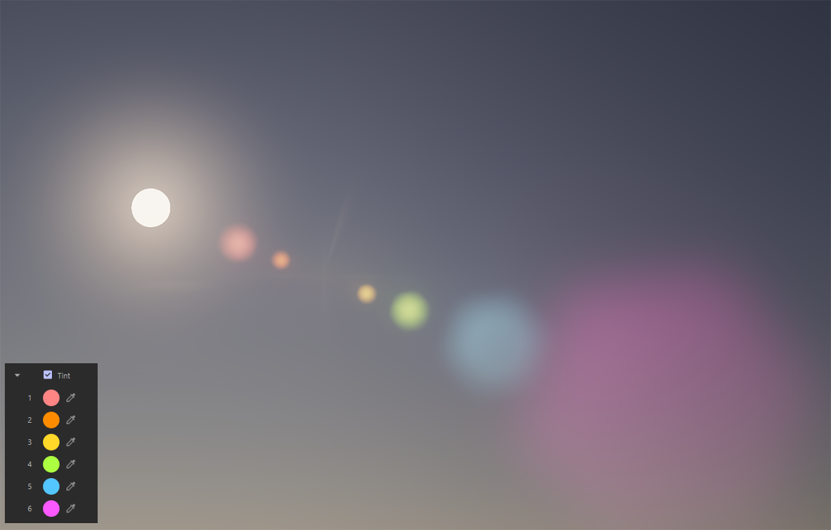
Tint
Up to six individual Flares are created for each pixel brightness that corresponds to at least the Threshold value. Normally, these automatically take on the color of the bright image pixels, but after activating Tint, you can also assign your own color values, which are then multiplied in sequence by the brightness of the flares. Only with perfectly white Tint colors can the original colors and intensities of the flares be calculated. Therefore, try to use colors that are as bright as possible if you want to make individual color changes.
The darker the colors you choose, the weaker the corresponding Flare will be.
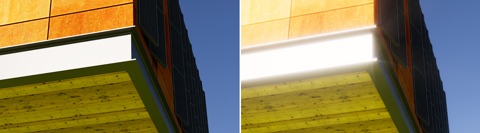
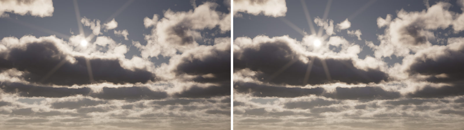
Streak
The Streak effect is suitable for highlighting gloss, e.g., on metallic or other reflective surfaces. The reflections of bright areas of the image are then given additional halos and a glowing appearance. This effect can also be seen in Figure 13. On the left is the normal rendering and on the right is the rendering with the streak effect added. This further highlights the steel girder illuminated by the sun and additionally intensifies the intensity of the sunlight.
Streak
If you want to apply the Streak effect to the rendering, switch the mode to On here.
Intensity
This Intensity value controls the overall strength of the Streak effect.
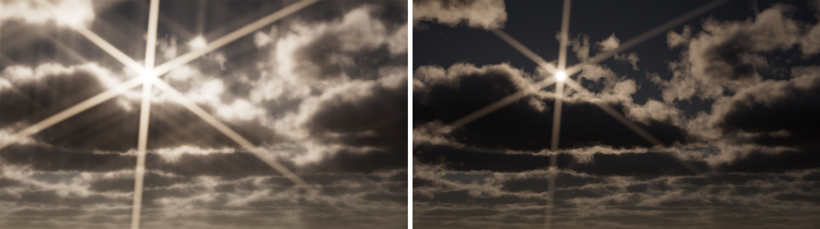
Threshold
The Threshold defines the minimum brightness of an image pixel required to trigger the streaks. This means that the lower the Threshold is set, the more parts of the image will trigger streaks (see Figure 14).
Tail
This value controls the visible length of the streaks. Please note that the brightness within a streak is automatically reduced between its starting point (the bright areas of the image selected above the Threshold) and its end point. The outer ends of the streaks therefore automatically become less visible. Figure 15 provides an example about this.
Softness
The Softness value can be used to control the width and edge visibility of the streaks by adding more blur to it.
Number
The streaks are always generated in pairs. For example, a Number of 1 results in two streaks, one running to the left and one to the right. A Number of 2 results in a cross-shaped arrangement of four streaks, and so on (see also Figure 16). The direction of the streaks can then be rotated individually using the subsequent Angle value.
Angle
Use this value to rotate the Streak sunbursts around their centers.