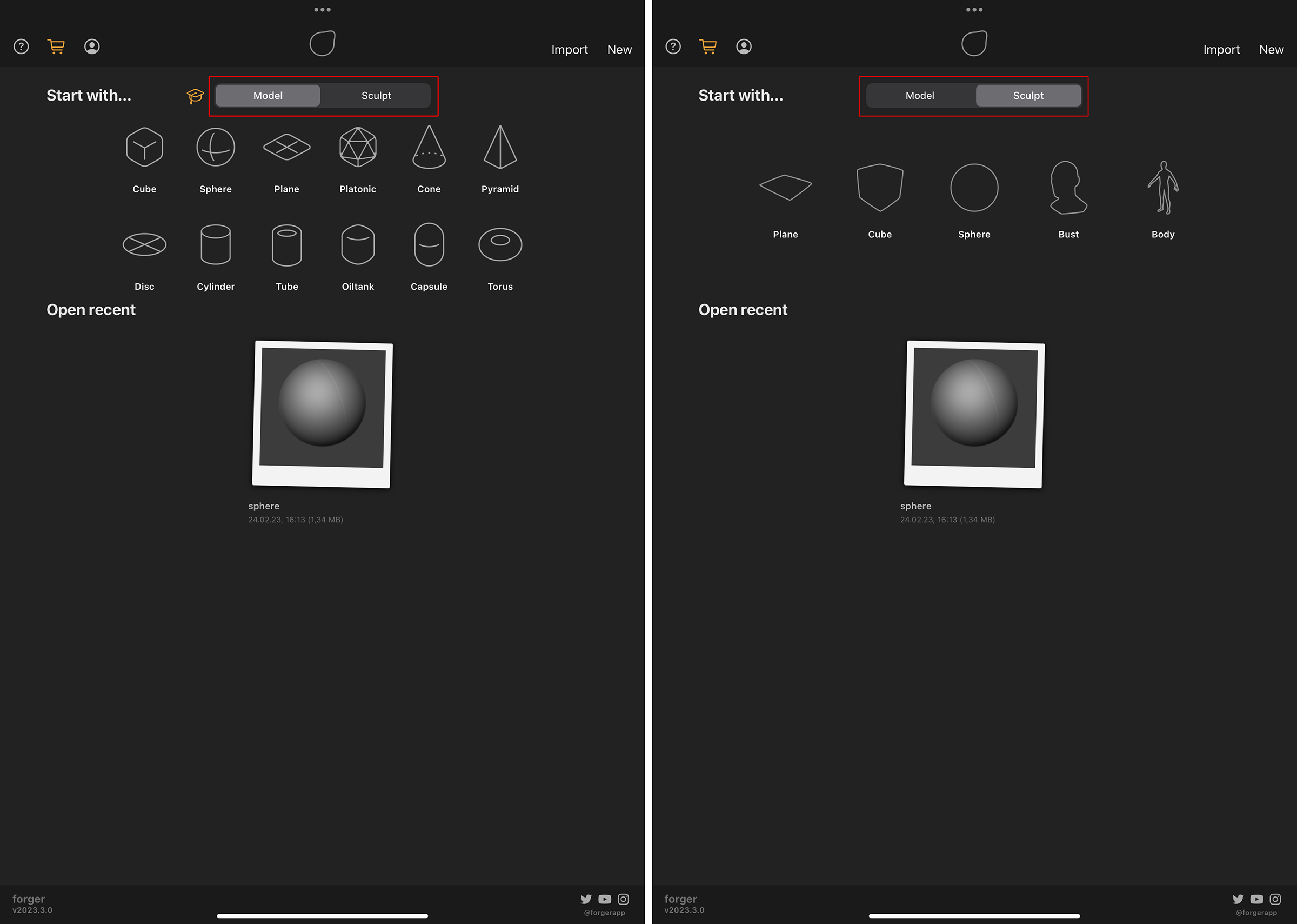
 The left side shows the options for Modeling, the right side the options for starting a Sculpting project.
Here you will find all information about the most important elements of the interface. This includes the function of the most common shortcuts and options, as well as the navigation in the viewport.
Table of content
The left side shows the options for Modeling, the right side the options for starting a Sculpting project.This menu shows up every time that Forger starts up and every time you start a new project. You can always come back to this page by clicking the gallery icon  in the top left corner of the Forger layout.
This menu page allows you to open previously saved scenes (see previews in the lower half of the screen) or Start with one of the built-in primitive objects in Model mode or one of the Geometry templates in Sculpt mode.
 Modeling Run-through: Available only in Model mode. This starts a short Step-by-Step tutorial about how to add an object to your project and how to apply typical modeling actions to its geometry.
 Help content: This gives you quick access to various forms of documentation.
This menu is also available from within the standard Forger interface during modeling and sculpting.
Help content: This gives you quick access to various forms of documentation.
This menu is also available from within the standard Forger interface during modeling and sculpting.  Subscription options: This opens the different subscription options and also gives access to the free version.
 Account settings: Here you can manage your Forger license and your subscription.
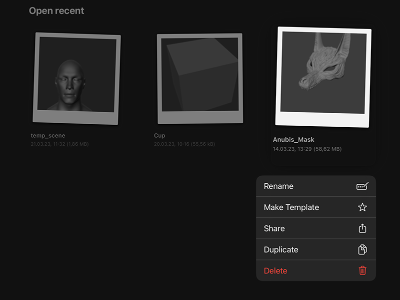 Holding a tap on one of the previews of the recently used projects will open a context menu.
Opening the context menu for one of the previews in the lower half of the start screen offers these actions:
Rename: Here can change the name of the project
Make Template: Having a project marked as a template allows you to directly choose that scene from the "Gallery" view or from the New Scene command.
Share: Opens the iOS dialog to save, copy or share the file.
Duplicate: Creates a copy of the project.
Delete: Deletes the project
You can also choose the New option to start from a fresh scene, or start a scene with imported geometry by choosing Import (see commands in the top right corner). The left side of the following image show the Import dialog, where you can chosse the file to be imported. Clicking the Browse command gives you access to all available online and offline file Locations.
You can learn more about additional import options on this File I/O page.
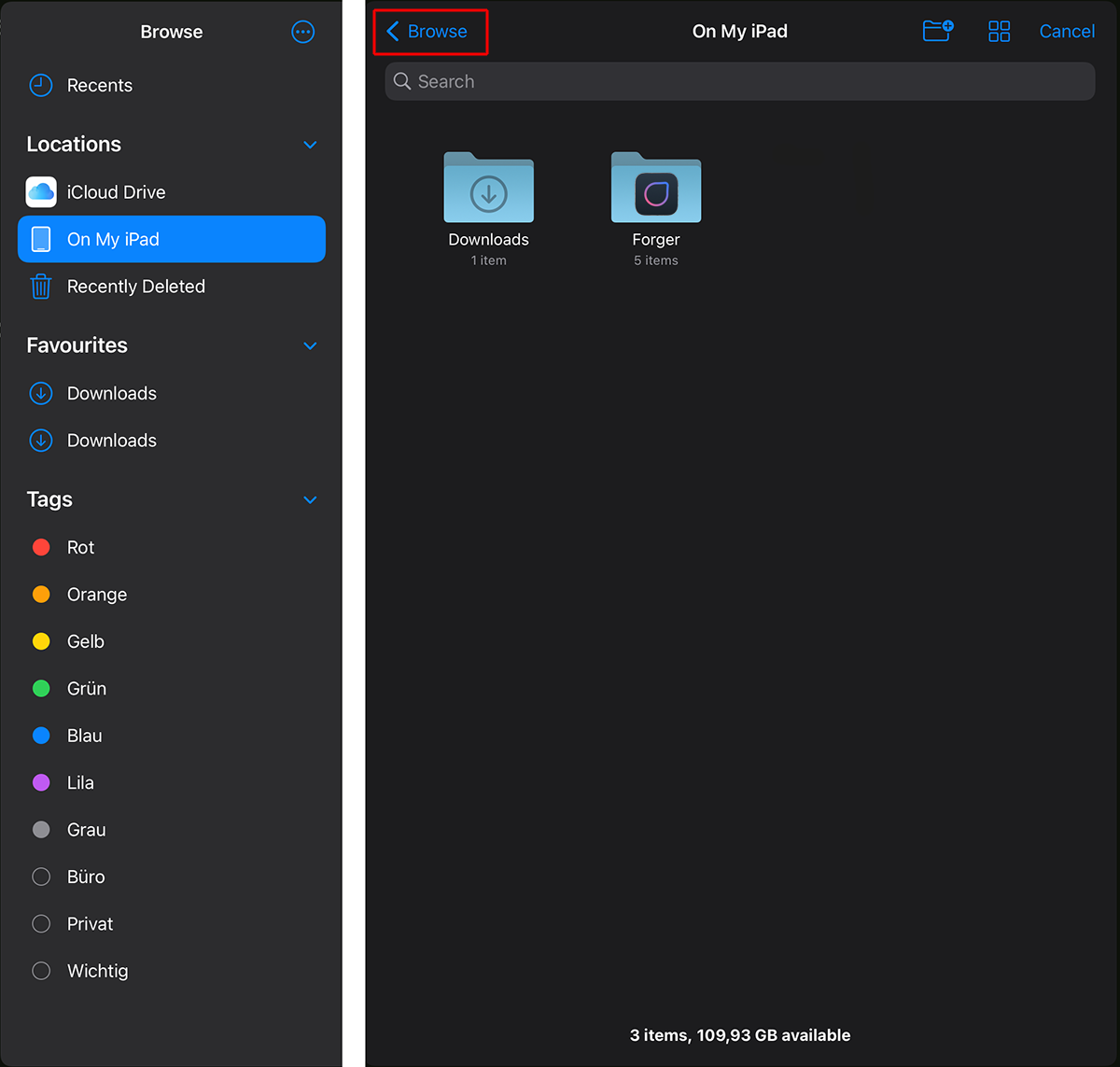 Forger's Import dialog allows to browse locations on your iCloud Drive and folders on your device..
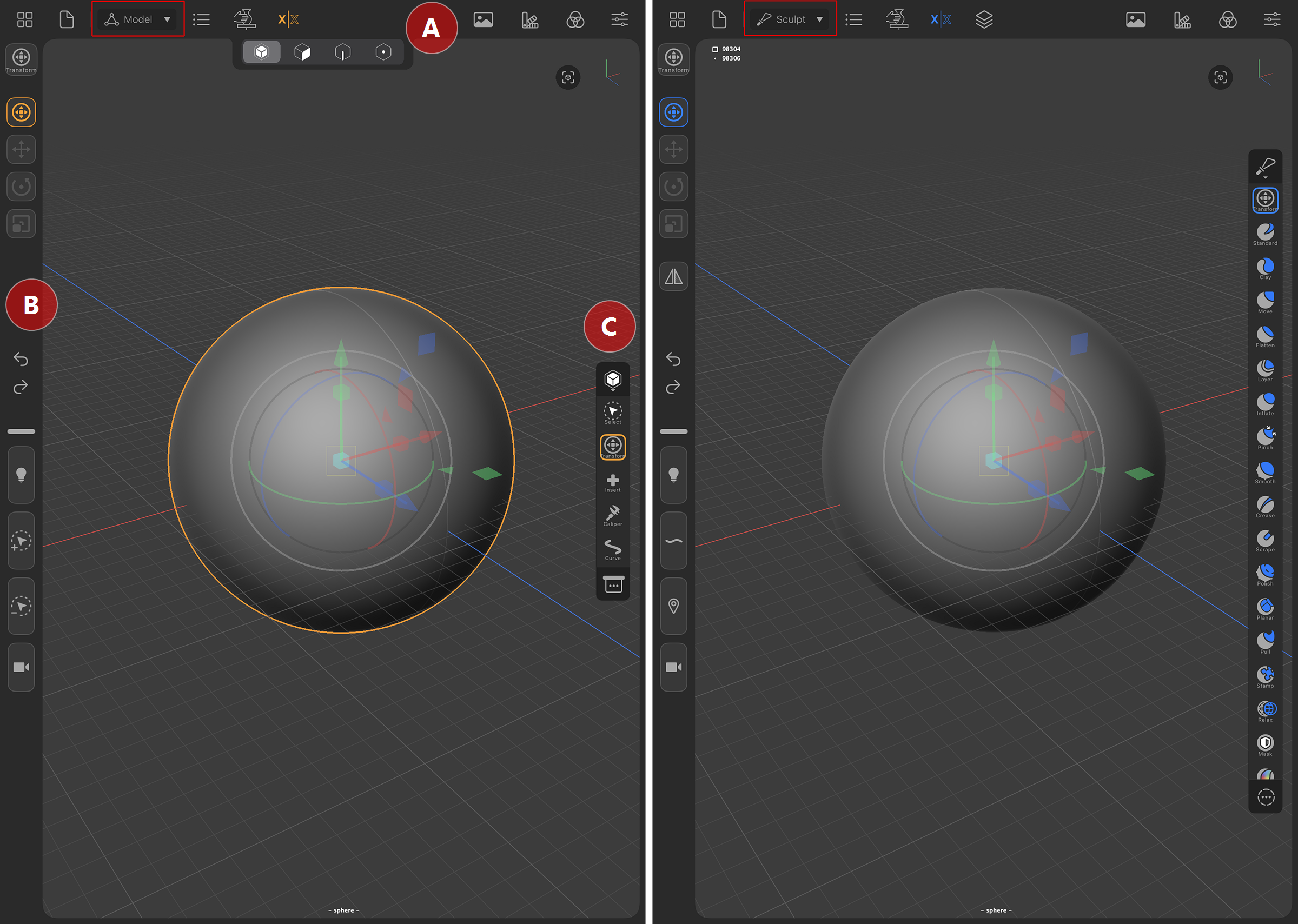 Forger's interface in Modeling mode (left) and Sculpting mode (right).
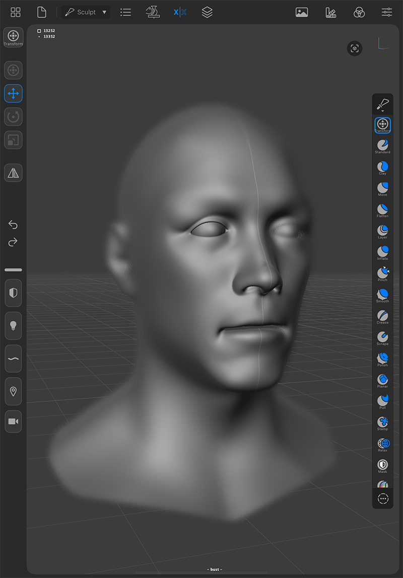
The color scheme and the displayed icons change depending on the selected mode. On the left you can see the Model mode, which uses orange icons. On the right is Sculpt mode, which uses blue icons. However, the placement of the main menus remains identical.
At A you can find the horizontal Main Menu.
At B you will mainly find the currently selectable options, commands and shortcuts in the Sidebar and
at C the available tools are displayed in the Toolbox.
Forger gives access to all functions through the top Menu Bar.
Gallery: Goes back to the Start Menu, to start a new project, to open a saved project or to import data from a file into a new scene.
 File I/O commands:
 Import: Allows you to import 3D models, stamps, images, materials, or IBLs. (See Import)
 Save: Allows you to save your scene, save incrementally or save as some new name. If you tap-hold, it will run a Save action. (See Save)
 Export: Allows you to export 3D models, textures, or renders. (See Export)
 Model: Polygonal modeling app context. A selected Editable Mesh can edited and modeling tools are offered in the Toolbox.
 Sculpt: Sculpting app context. A selected Sculptable Mesh can be edited by using the sculpting tools in the Toolbox.
 Objects List: Lists the contents of your scene and offers options to add and select individual elements. Offers access to additional object parameters, such as for the applied material or the subdivision surface feature.
 Nothing is selected
 Having a Primitve object selected, the symbol of the object is displayed. In this example a Cube primitive was selected.
 This is the symbol for a selected Editable Mesh. You can use the Object, Polygons, Edges and Points Edit Mode to specify, which part of the object should be edited. Switch to the Model Context to get access to all tools that can be used with Editable Meshes. An Editable Mesh can also be converted to a Sculptable Mesh.
 This is the symbol for a Sculptable Mesh.Switch to the Sculpt Context to get access to all tools that can be used with Sculpatble Meshes. A Sculptable Mesh can also be converted to become an Editable Mesh, but a Sculptable Mesh is more memory efficient and the sculpting tools are optimized to work with Sculptable Meshes.
 This is the symbol for a Camera object.There is always a default camera in the scene.
 An Area Light object is selected. The light emanates from the surface of a shape. You can choose between a Rectangular, a Disk, a Sphere and a Cylinder shape for this lightsource. Area lights are generally the most realistic lights for the simulation of artificial lightsources.
 A Photometric Light object is selected. The light emanates from the position of the light source, similar to using a Point Light. Additionally an IES-File can be used to control the intensities and directions of the emitted light.
 A Point Light object is selected. The light emanates from the position of the light source and is emitted uniformly in all directions.
 A Spot Light object is selected. The light emanates from the position of the light source and is specifically emitted within a light cone.
 A Directional Light object is selected. With this light source, the position does not matter, because a very distant light source, such as the sun, is simulated. The light can only be changed in its direction and thus hits all objects equally. The default light is a Directional Light as well and is always available in the scene.
 Symmetry Menu: Allows you to do various operations that have to do with symmetry. If you tap-hold, it toggles symmetry on/off.
The available options differ for Editable Meshes and Sculptable Meshes.
Symmetry Menu: Allows you to do various operations that have to do with symmetry. If you tap-hold, it toggles symmetry on/off.
The available options differ for Editable Meshes and Sculptable Meshes.  Layers Menu: Lists the sculpting layers of your current selection (Only available in Sculpt context).
 Resources: Contains references previously imported.
This panel also offers options to load images or even to use photos taken by the device. Images can be dragged from the Resources panel directly to the viewport to be used as a background image for reference and commands like Import from Image can use these images to create Vertex Colors. Background images are created as an ImagePlane object that gets grouped below the default camera object in the Objects List.
Resources: Contains references previously imported.
This panel also offers options to load images or even to use photos taken by the device. Images can be dragged from the Resources panel directly to the viewport to be used as a background image for reference and commands like Import from Image can use these images to create Vertex Colors. Background images are created as an ImagePlane object that gets grouped below the default camera object in the Objects List. Materials: Lists the materials of the scene, and allows you to create and modify them.
 Display Settings:
Basic Display Options
Grid: Allows you to toggle the display of the viewport grid.
Wireframe: Allows you to toggle the display of the wireframe (display of the edges that shape the polygons).
Backface Culling: Allows you to toggle the drawing or not drawing of back-facing polygons.
Shading: Allows you to adjust the viewports display mode.
Smooth: Draws objects with smooth shading (per-pixel interpolated normals)
Faceted: Draws objects using constant normals across each facet or co-planar surface
Constant: Draws each object in its raw form, without using any lighting contribution
Colors:
None: Disables vertex colors.
Vertex: Displays vertex colors.
Group: Displays face groups as vertex colors.
Unselected Display Mode: Allows you to choose how to shade objects that are not selected.
Normal: Does not make any difference between the selection and the rest.
Darker: shows unselected modes slightly darker than the selected one so they are easier to tell apart.
Transparent: Will make non-selected objects transparent. (Useful for example for placing eyes inside a head).
Hide: will hide anything that isn’t selected. (Some applications call this “Isolate selection” or “Solo”).
Background Color: This color is used in the viewport for all areas that are not covered by geometry.
Camera:
Projection: Here you can choose between Perspective and Orthographic. Perspective simulates a photographic perspective and allows you to use a focal length to adjust the field of view to your needs. This can result in a natural perspective of objects. Orthographic restricts perspective distortions and results in a more technical rendering. The Width value lets you adjust the size of shapes in this mode.
Focal Length: This is only available for Perspective cameras. Use this slider to manually enter any number between 8 and 100 to adjust the Focal Length. Some preset values are also available right below. Smaller values let you see more of the 3D space, but they also increase the amount of optical distortion with which objects are displayed. For example, a cube may appear trapezoidal, depending on the angle of view. For a representation of the objects similar to human vision, values around 50 are suitable.
Width: This function is only available in Orthographic camera mode and adjusts the visual scale of the displayed objects.
Display FX Settings
Enabled: This can be used to activate additional optical effects for the representation of objects in the 3D view. These include overlighting and glow effects for highlights, a distance-dependent blur and the simulation of occlusion shadows (Ambient Occlusion). Since these effects slow down the performance of the viewport, it is recommended to turn this option off until you want to add the display effects for a final rendering of the objects.
Hint:
You can learn more about the export of a rendered still or a rendered turntable video on this page.
Quality: There are three quality settings available for the calculation of the display effects. The computational effort increases with increasing quality level.
 Example for the Ambient Occlusion effect. The area between objects and also deeper grooves of a surface are darkened.
Ambient Occlusion Settings: These settings control the Ambient Occlusion effect, which can increase the contrast between the highs and lows of a surface by adding shading.
Radius: The effect is based on the detection of valleys, grooves and subsidence of the surface, as well as distances between surfaces facing each other. In the process, calculation rays are emitted from the respective surfaces. If such a ray hits another surface within the distance specified via Radius, this can lead to darkening of the surface from which the calculation ray was emitted. In the example of the neighboring objects, the gap between the objects must not be larger than this value for Ambient Occlusion to be visible.
Bias:This controls the angle at which the calculation beams are emitted. A small Bias value results in a stronger bundling of the rays, which leads to a sharpening of the Ambient Occlusion. However, this also makes the darkened area smaller and concentrates it on the areas with the smallest distances between the surfaces.
Intensity:This is the overall strength of the Ambient Occlusion effect. Higher values result in a stronger darkening.
 Example for the Depth of Field effect. The manual focus of a camera can be imitated.
Depth of Field Settings: When shooting with a normal camera, it is focused at a certain Focus Distance. Elements that are closer to the camera or far behind this distance are blurred. The following settings mimic this effect.
Hint:
Every Camera Object is able to overwrite these global Depth of Field settings.
Debug: This mode colors the viewport red for areas that are completely in focus and blue for areas that are completely out of focus. The transitions between these areas are colored accordingly in a mixture of red and blue. So this option is mainly intended for checking the defined distances and intensities of the blurs.
Bokeh Radius: This value allows you to control the amount and intensity of blur in front of and behind the chosen focus distance.
Near/Far: These values control the intensity of blur at close range of the camera (Near) and behind the distance given by the Target Type setting (Far). For example, blurring should only occur in the rear area. reduce the Near value to zero. The area between the camera and the chosen focus distance then remains completely sharp.
Target Type
Focus Distance: At this distance, the camera is focused with Target Type Distance. Elements at this distance from the camera always remain sharply visible. You can also use the Distance Picker, to set this distance just by tapping into the viewport.
Coordinates: With Target Type Point you enter the position here, that should be in focus. You can also use the Point Picker to tap into the viewport to use that coordinate.
Object: Activate the Object Picker to tap on an object in the viewport that should be used here.
 Example for the Bloom effect. Bright areas of a surface can be given an additional glow effect.
Bloom Settings:
Steps: This is the number of calculation steps used to calculate the Bloom effect. A higher number usually also leads to softer overexposure effects.
Radius: This value controls the size of the effect. The effect can also go far beyond the limits of the object.
Intensity: This is the overall strength of the effect.
Threshold: This indirectly specifies the brightness, but the overexposure should be calculated. The smaller this value, the more likely it is that relatively dark areas are already subject to a Bloom effect.
 Example for the Chromatic Aberration effect. A color shift occurs that increases in intensity at the edges of the image.
Chromatic Aberration Settings: This describes the effect that optical lenses can have that not all colors are refracted equally. As a result, red and blue color components are shifted, leading to visible color fringes.
Strength: This controls the intensity of the color shift.
 Example for the Grain effect. Adds a noise structure to the viewport.
Grain Settings: In the days of analog film recording, the developed film material often showed a characteristic graininess, but digital image sensors can also produce noise, e.g. when the digital signal has to be artificially amplified to compensate for low brightness in a shot. This Grain effect adds noise to the image that mimics these effects.
Strength: The amount of visible noise that is added to the display.
 Example for the Vignetting effect. The outer areas of the viewport are darkened.
Vignetting Settings:Optical lenses often become thicker at the edge, which can result in less light being transmitted at the edge of a lens than at its center. As a result, the subject appears darker at the edge of the image than in the center. This effect can be reproduced here.
Size: Controls the size of the area that is darkened.
Strength: This controls the intensity of the darkening at the edge.
Preferences: Allows you to configure Forger to your liking:
Input: Use these settings to configure gesture control, stylus settings, and optional key input. Here you can find more info about using an Apple Pencil with Forger.
Navigation: Here you make specifications for gesture control in the viewport and specify speed values for movements in 3D space.
File I/O: Forger has options for automatic saving in a fixed time rhythm which can be configured here.
UI: Here you can switch from right-handed to left-handed use. In addition, some of the interface and viewport colors can be customized here.
Other: The energy-saving mode can be configured here and displays for memory utilization and display pressure can be activated.
Help: Gives direct access to the Forger manual, tutorials and shortcut overviews:
Walkthroughs: Gives access to vaious step-by-step introductions to workflows with several modeling tools.
Gestures: Displays an overview of all available gestures used within Forger.
Shortcuts: Displays an overview of all available shortcut combinations.
Keyboard: When using a keyboard, here you can find a list with all Forger shortcut key combinations.
Tutorials: This starts a short slideshow of screenshots, guiding you through the Forger interface and general workflows.
Manual: Opens this help manual directly in Forger or in an externat browser.
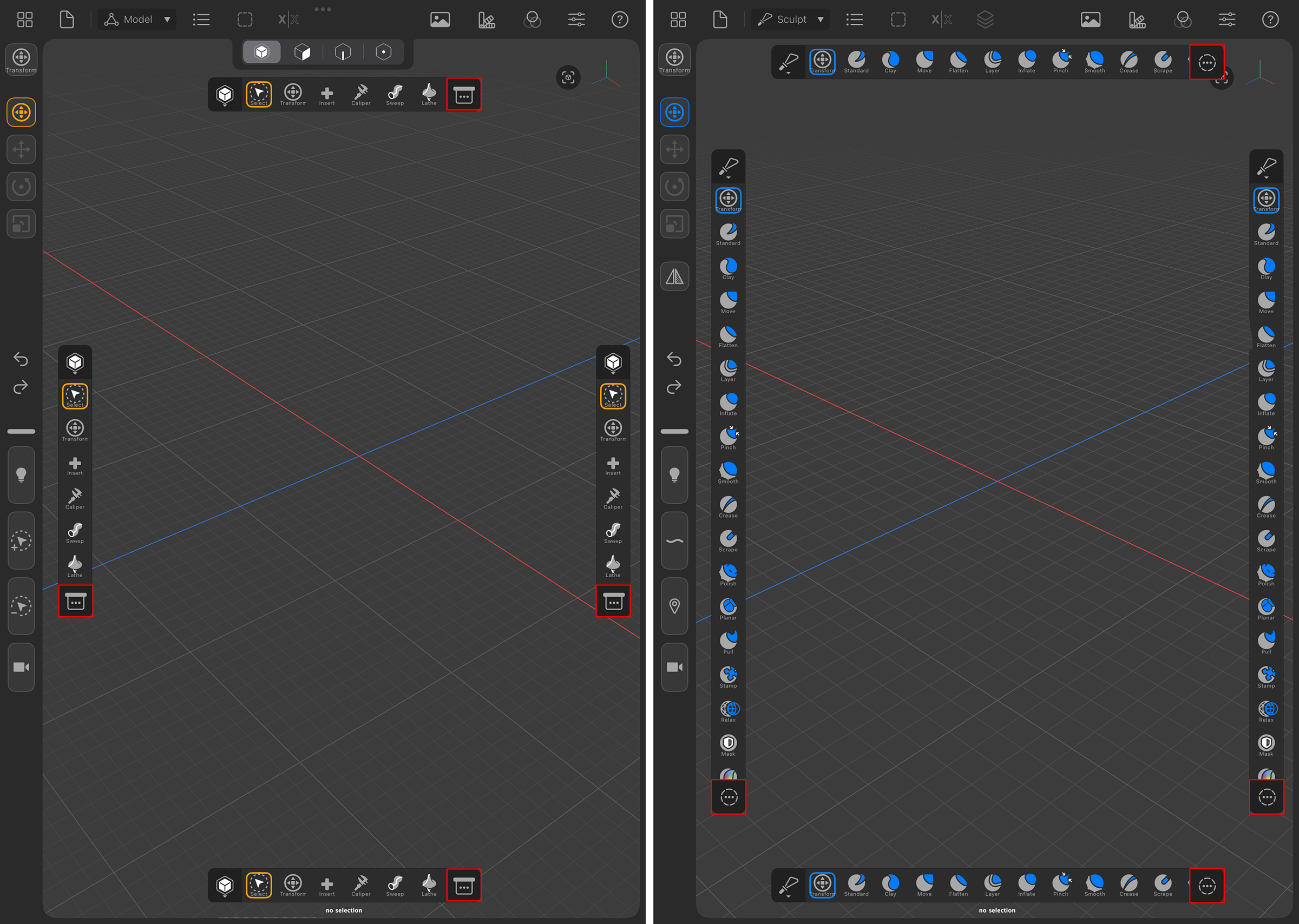 The images show the Model mode on the left and the Sculpt mode on the right, each with all possible placements of the Toolbox bar. The icon highlighted in red in the figure gives access to additional actions and commands.
The Toolbox gives quick access to all available tools for the active context (Model or Sculpt).
It can be dragged anywhere to another edge in the viewport. When released, the Toolbox automatically snaps to the center of the corresponding side, as shown in the figure above. Once it's docked, the Toolbox can also be partially hidden by dragging it to the nearest edge of the screen, this helps in cases where it could get in the way.
Tapping on any Toolbox button will change the active tool to the selected one.
Tool buttons within the Toolbox can be rearranged by tap-holding and dragging them around. If there is not enough space to display all the icons in the Toolbox bar, you can scroll its content by swiping over it. An additional icon at the end of the toolbox (see the area outlined in red in the figure above) offers additional commands and actions.
|
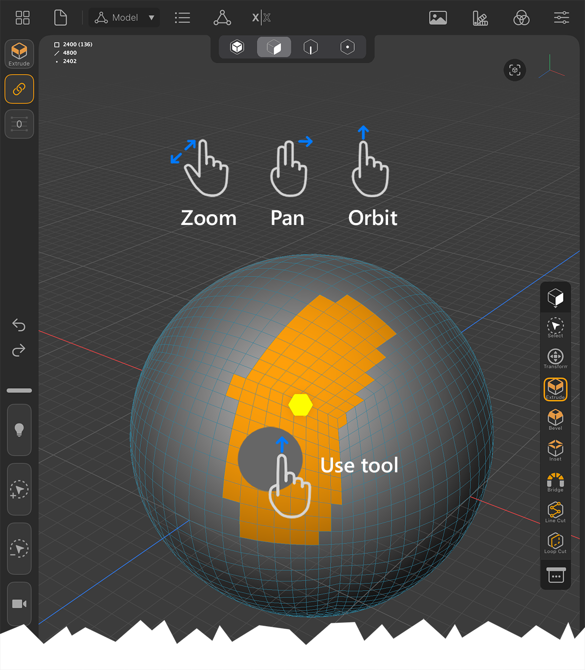
You can zoom and pan the view using the typical two-finger pinch and drag gestures. These gestures can be used anywhere in the viewport, including over a surface. The one-finger orbit gesture can only be used in an empty area of the viewport. When you apply the one-finger gesture to a selected object, the active tool is executed on that geometry. |
The viewport is where all of the action happens, users can navigate in 3D, use modeling commands, sculpt meshes and paint by interacting with it. When working with a stylus you can also pan and zoom by holding the Camera icon in the left Shortcut Panel. You can find more information about that Sidebar in the following section.
The current selections name is displayed at the bottom center of the view.
The top left of the view displays some information, such as polycount, edgecount and pointpoint of the currently selected mesh, if working with an editable mesh or a sculptable mesh.
Hint:
More detailed information about viewport navigation and available gesture controls can be found on this page.
The Sidebar gives handy access to some of the current tool settings as well as having shortcuts.
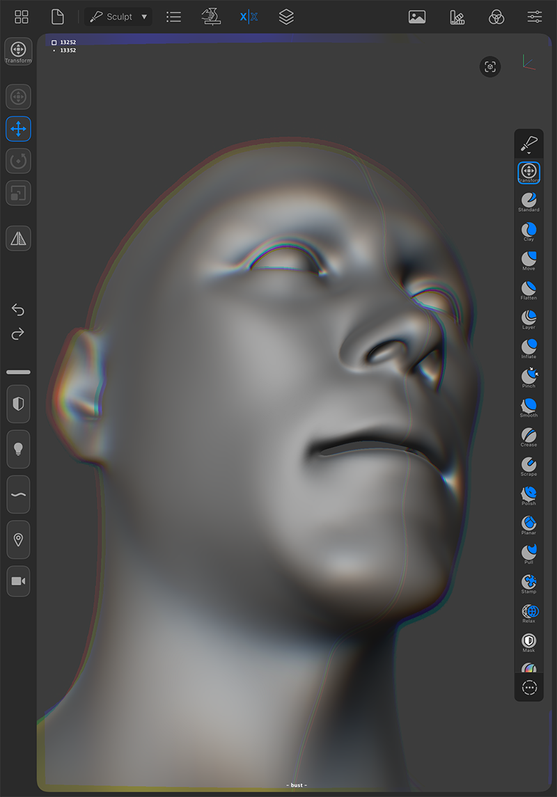
The upper half of this area on the left edge of the interface adjusts to the currently used mode (Model or Sculpt), as well as the currently selected tool. The number and function of these icons is therefore not fixed. The following figures give examples of typical functions:
The following image shows an example of using the Extrude tool in the Forger Model context. The topmost icon always shows the active tool (outlined in red here) and offers the individual settings of this tool when clicked. This also applies to all the following examples.
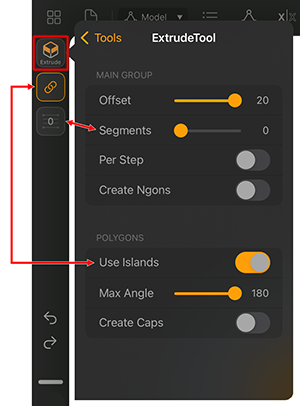
The icons below the activate tool icon can vary in meaning and number, depending on the selected tool. In this example, the information about the number of Segments during extrusion and the state of the Use Islands option are also available as icons.
The Use Islands option can thus be operated directly via the icon, for example, without first having to switch to the settings of the tool.
|
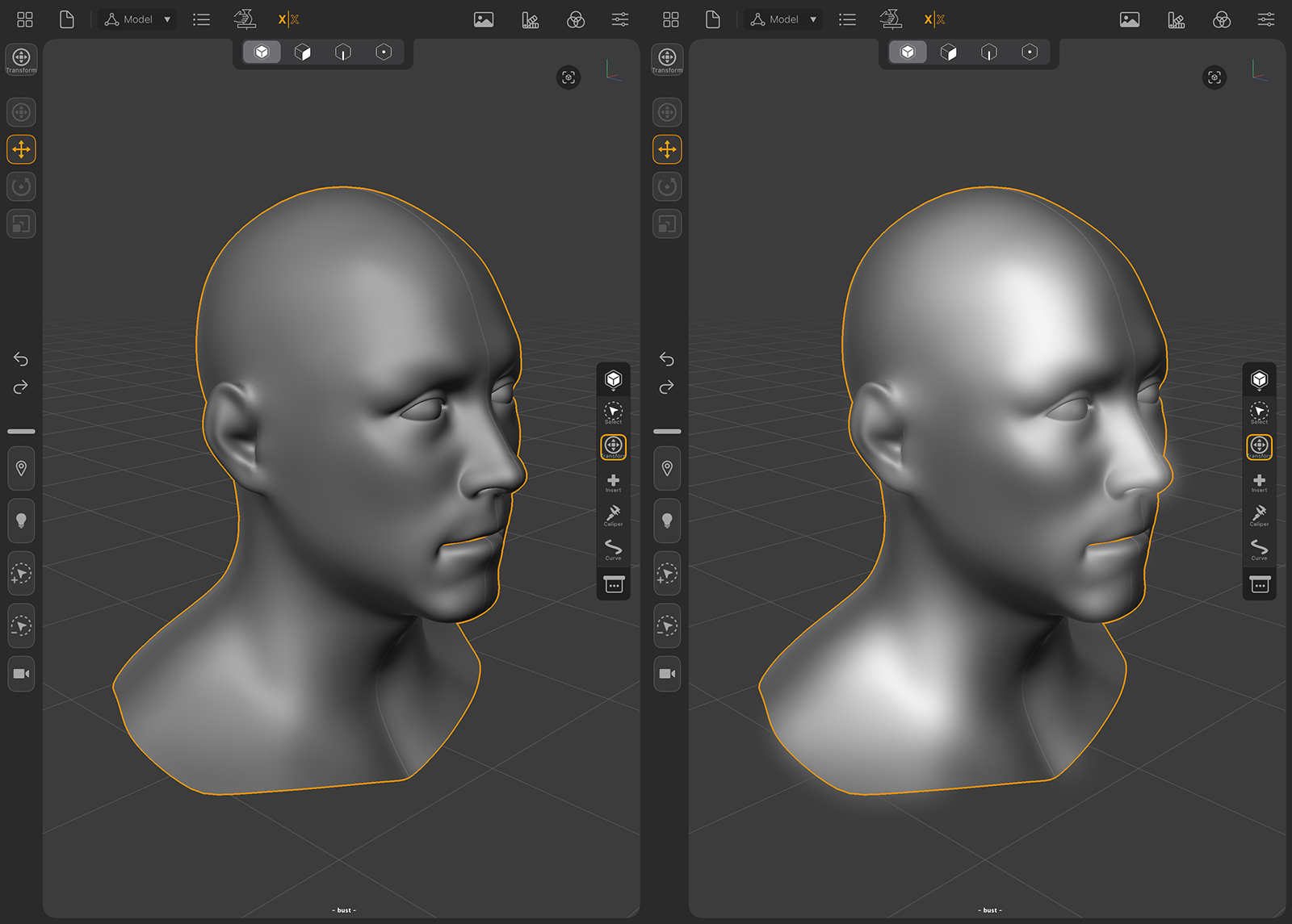
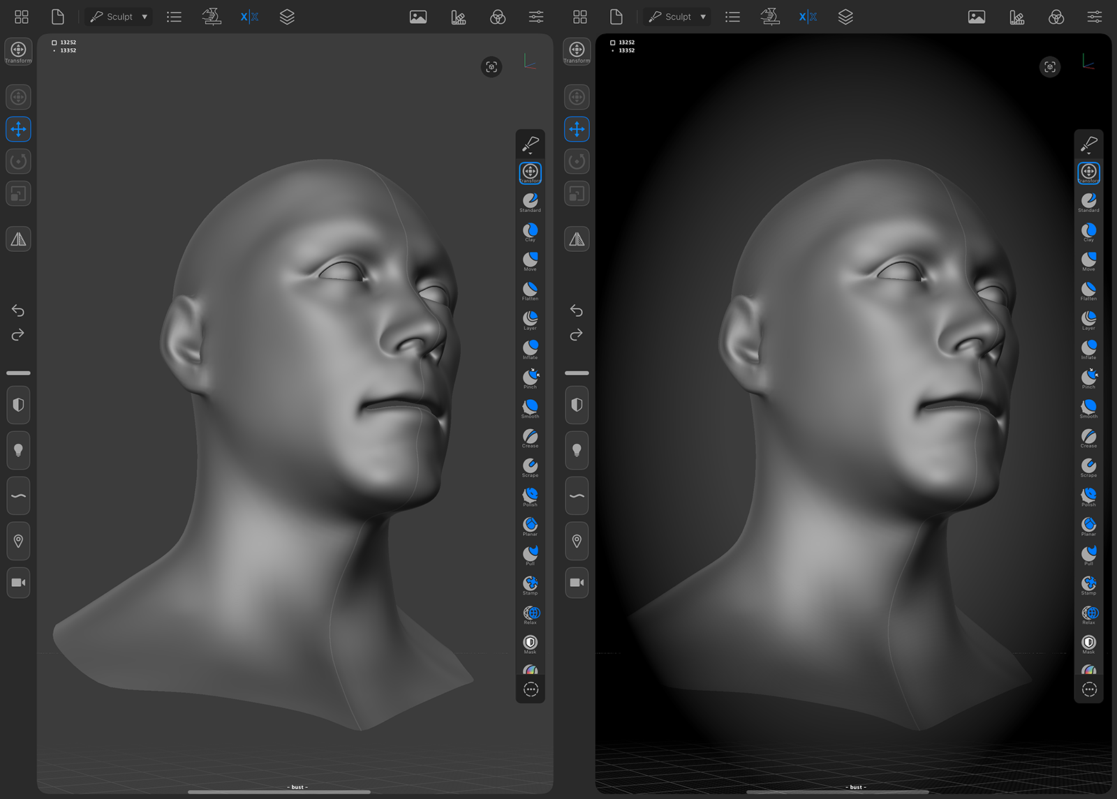
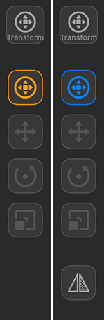
Example of an active Transform tool, Model context on the left, Sculpt contex on the right. Below the Transform tool icon, you can also select the individual functions Move, Rotate and Scale. In the Sculpt context, a mirroring icon is also available. This mirrors the pivot point of the currently selected Transform function along the current symmetry direction. This is especially helpful if the pivot point has been moved manually and is therefore no longer central in the object. |
|
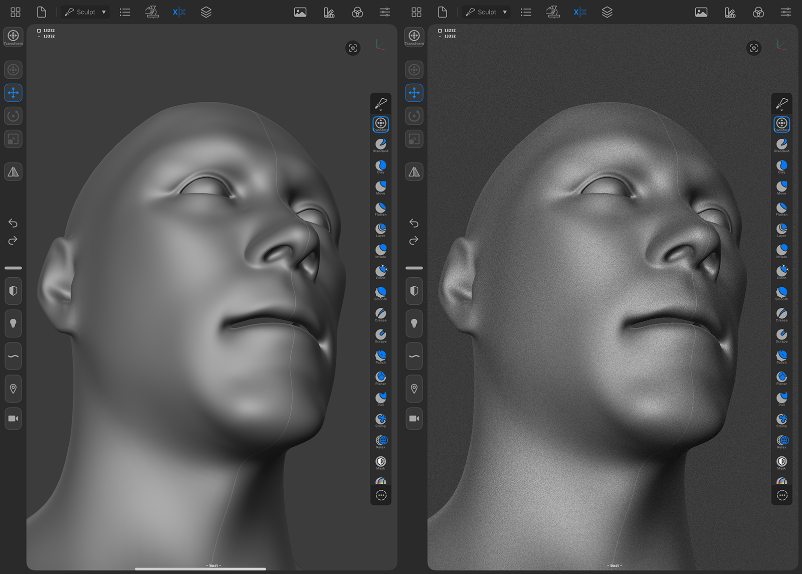
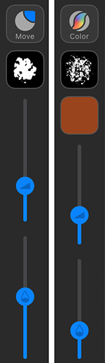
Examples of using a sculpting tool (Move brush) and the coloring tool, both in Sculpt contex. Below the respective tool icon there is an icon for the texture of the brush tip. Clicking on this icon opens a corresponding selection option. The color icon can be clicked to select the desired color. This option is only available for the Color tool. Below this you will find the sliders for the Size of the respective brush tip and for the Strength or opacity of the drawing effect. |
The following two icons offer the typical Undo/Redo commands:
|
The Undo function |
|
The Redo function |
The second half of this Sidebar menu partially reacts to the active tool and provides different modes and functions. This part of the menu can be detached by dragging the separator bar into the viewport and placed directly in the view. A held click on this separator bar opens a configuration window. The following images describe this process.
Below a separator bar, which can also be used to detach these icons, you will find further shortcut icons that can be freely configured and, for example, activate the alternative mode of a tool or switch the navigation for positioning light sources or a camera.
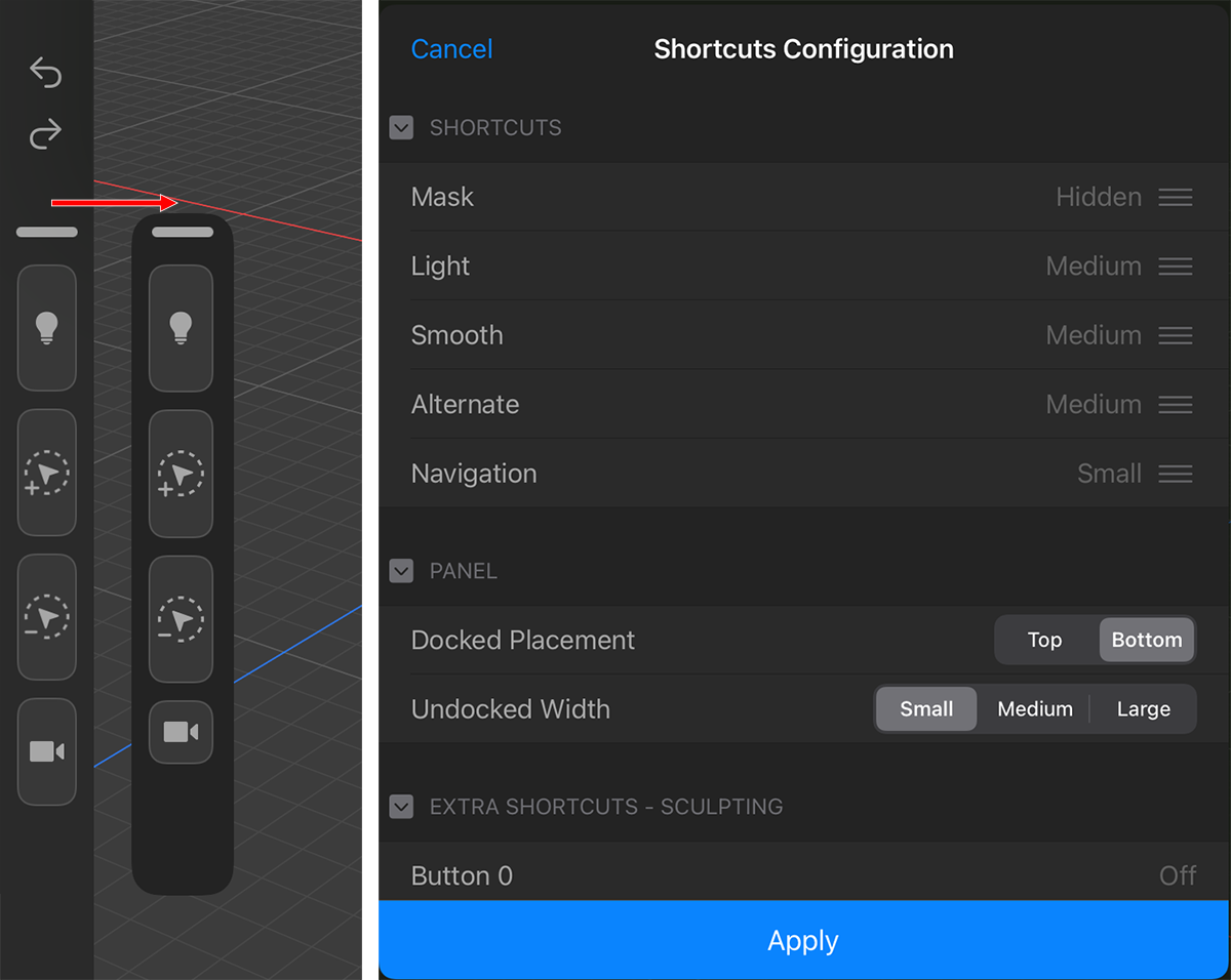 The left side indicated the undocking process for the Shortcuts Panel of the Sidebar. The image on the right shows the configuration dialog for the Shortcuts.
The shortcuts panel can be detached from the sidebar and placed anywhere in the viewport (see left side of the image above). It can also be configured to show buttons in your preferred order with customizable sizes and panel width (see dialog on the right in the image above). Extra shortcut buttons can be added that will display when floating and its docking area can be set to the top/bottom.
When the panel is docked (on the Sidebar), tap-hold the top grabber element to separate it. When the panel is undocked (floating around), you can interact with the top grabber element like so:
The first part of the Shortcuts Configuration dialog list the currently visible shortcut functions. Using a menu on the right of each shortcut you can choose from three different sizes for the shown icon (Small, Medium, Large) or use the Hidden setting to remove a function from the list of Shortcut icons.
Using Docked Placement Top will display the docked Shortcuts on top of the Sidebar, adding the Tool Settings below. Docked Placement Bottom is the default setting, showing the Shortcuts in the lower part of the Sidebar when docked.
When using undocked Shortcuts, the Undocked Width settings control the size of the Shortcuts between Small, Medium and Large.
With this part of the dialog you can add and configure additional sculpting functions that you like to add to the Shortcut panel.These functions will also be visible when in Model mode.
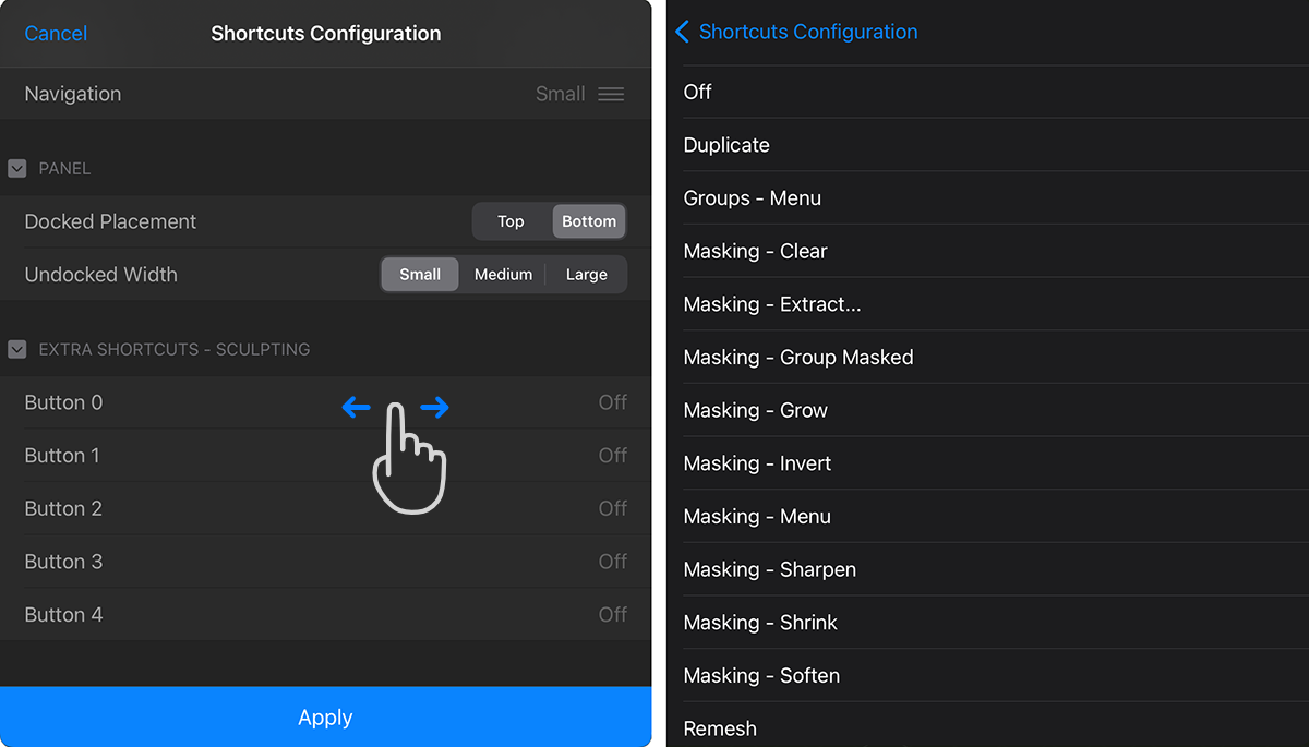 Use a swipe gesture on the Extra Shortcuts to configure additional functions for the Shortcuts panel.
As indicated on the left side off the image above, using a swipe gesture on one of the Button slots you can open a list of available functions. Just choose the function you like to add from that list and it will be added as an additional icon at the lower end of the Shortcuts panel.
Even without adding extra function icons to this panel, the Shortcuts Panel already holds many useful icons. Some of them will be automatically exchanged when switching tools or modes. These are the available standard functions:
|
The Mask shortcut. Press this button while touching the viewport to adjust the masking of the selection, combining this shortcut with various gestures you can quickly create, invert, clear, soften and sharpen masks using the masking brush or screen-space mask-selection tools. (For more details see here). Masks are used to protect sections of a surface from changes caused by sculpting. |
|
The Light shortcut. Press this button while touching the viewport to adjust the default lights placement and thus see your sculpts under different lighting conditions. |
|
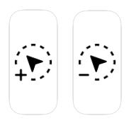
The Selection Modifier shortcuts. If you select points, edges or polygons in the Model Context, this will not always succeed with a continuous wiping motion for all required elements. As soon as you release your finger from the display, but then want to select more elements and thus add them to the existing selection, hold down the button marked with the plus sign while doing so. If, on the other hand, you have selected a few too many elements that need to be removed from a selection, hold down the button marked with the minus sign while wiping across the surface. Without these buttons, an existing selection will always be deleted and thus completely recreated after you put down your finger and touch it again. |
|
The Pipette shortcut. This can be used when working with the Color paint tool to pick up colors that have already been painted onto a surface and then use them again when continuing to paint. |
|
The Alternate option for the Transform tool (Pivot Modifier). Many tools offer an alternative mode of operation. For example, the Transform tool can also be used to reposition the object axis system without changing the position of the geometry. Holding this icon activates this alternative function. |
|
The Alternate option for the Sculpting tools and brushes. Holding down this icon activates an inversion of the normal sculpting function. Instead of raising a surface, it will be lowered, for example. There is also a special mode when using the ZRemesher tool. Holding down this key allows to delete specific guides drawn for the ZRemesher. |
|
The Smooth shortcut. Press this while sculpting to temporarily switch the active tool to the Smooth Brush. Can also be used to control the visibility of parts of a Sculptable Mesh. |
|
The Navigation shortcut.
|
Tip 1:
For a quick workflow, use the Mask shortcut to do screen-area masking (by starting outside of a mesh) and combine with the Smooth button to do quick screen-area visibility changes in selected meshes. Using the Alternate shortcut in combination with the other two will make them do the opposite (unmask/hide)
Tip 2:
If you're using a keyboard with your device, you can also use classic keyboard shortcuts for commands. Here you can find more information about this.
The Context Menu allows doing different actions based on the app's active context (modeling, sculpting), it can be opened by doing a 4-finger-tap on the viewport. All of these actions and commands are also available in the settings of the active object or in the Toolbar. You can learn more about these commands on this page.
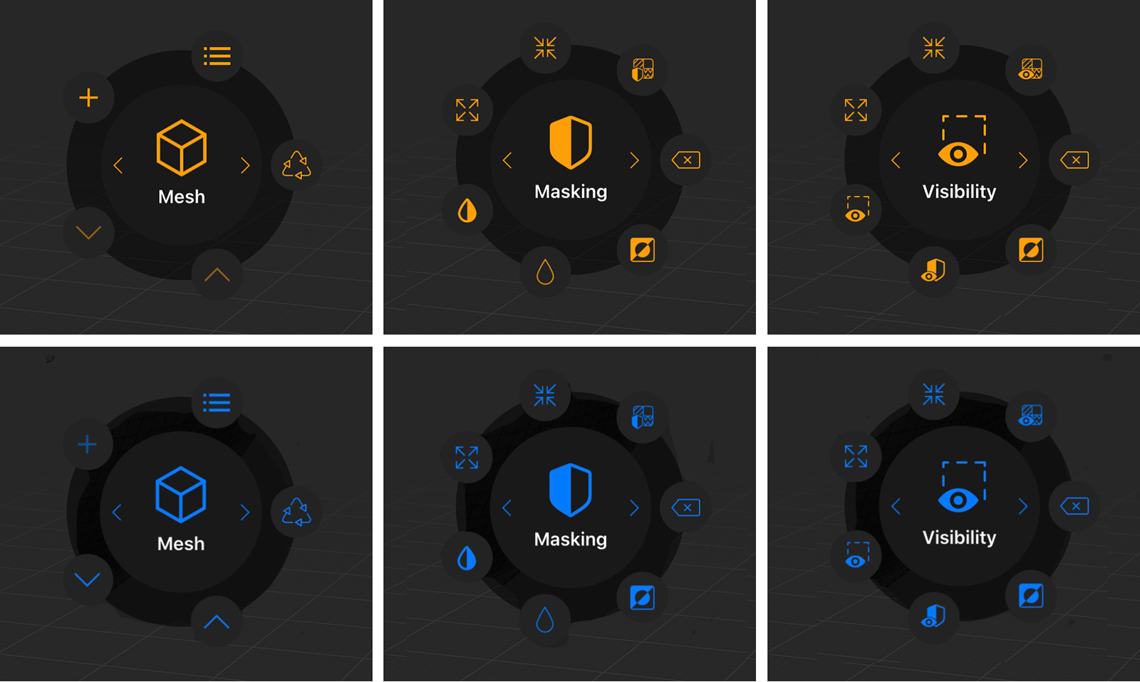 Using the arrow icons in the center, the Context Menu can show options for the Mesh, for Masking and for Visibility.
The image in the top row show the Context Menu for a selected Editable Mesh, the lower image row shows the Context Menu for a selected Sculptable Mesh.
Using the arrow icons in the center, the Context Menu can show options for the Mesh, for Masking and for Visibility.
The image in the top row show the Context Menu for a selected Editable Mesh, the lower image row shows the Context Menu for a selected Sculptable Mesh.