
ARRAY GUN

Easily add and modify an array of shapes to create fun background patterns, with options to customize columns, rows, and the interlocking areas between them.
Presets & Video Walk-Through
Array Gun can help create such a dizzying array of backgrounds that it can be hard to know where and how to start. This plugin's dozens of presets deliver one-click shortcuts to get you to a finished design from which you can then reverse engineer and fine tune to you exact vision. Find our presets via the blue Open Dashboard... button or the Choose a Preset... button below it.
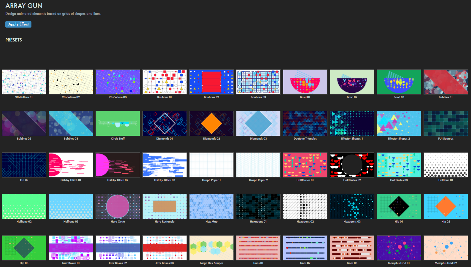
As with all other Universe tools, you can modify or create an Array Gun look and then save it under its own name by pressing the Save Preset... button.
As you'll soon see, Array Gun offers a surprising amount of depth and control over fixed and animated, geometrically-based backgrounds. If you'd like a visual overview of the plugin before diving into this guide, we recommend giving our Cineversity tutorial a watch.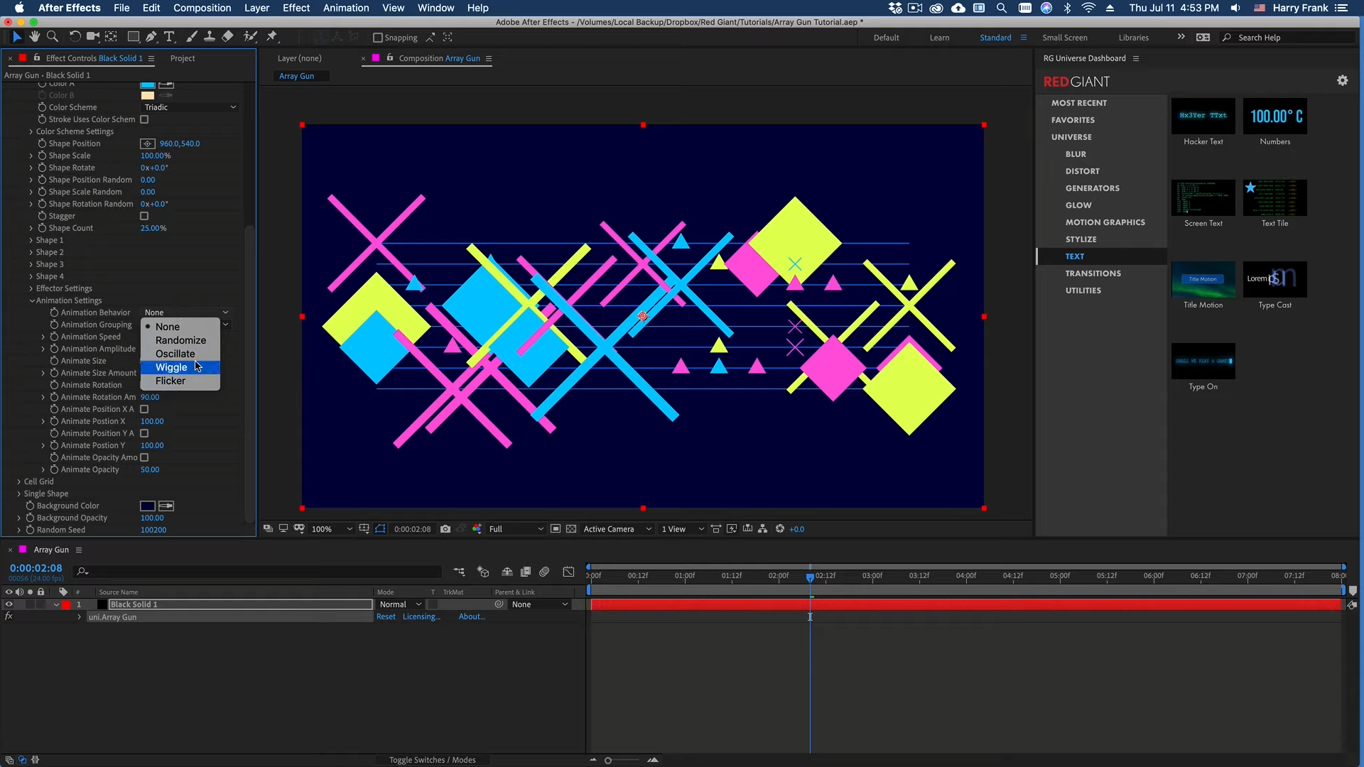
Modify the Design
- Position defines where within the comp frame the array will appear. Control this with manual x/y value entry or dragging the central anchor point.
- Width and Height adjust the sizing of the array on its x and y axes. Note that Array Gun defaults to array dimensions of 1500 x 900, but presets come with a range of different dimensions.
-
Columns
and
Rows
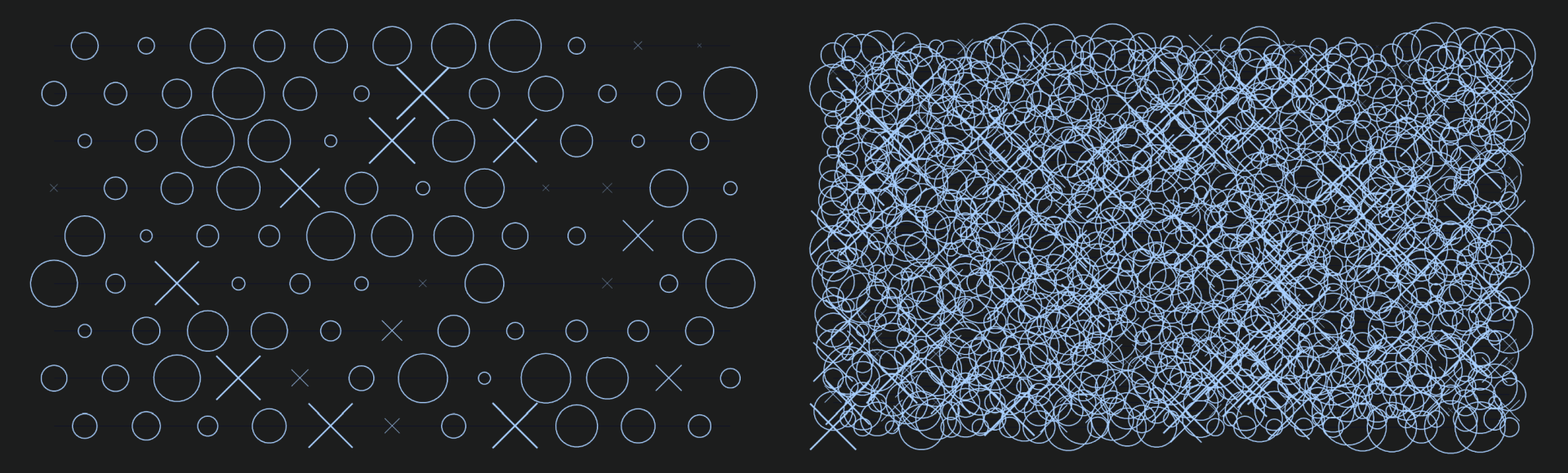
defines how many cells exist along the x and y axes.
The following comparison with the XOs 1 preset shows the default of Columns: 12 and Rows: 9 (left) versus Columns: 24 and Rows: 48 (right).
-
Line Grid
-
Draw Grid
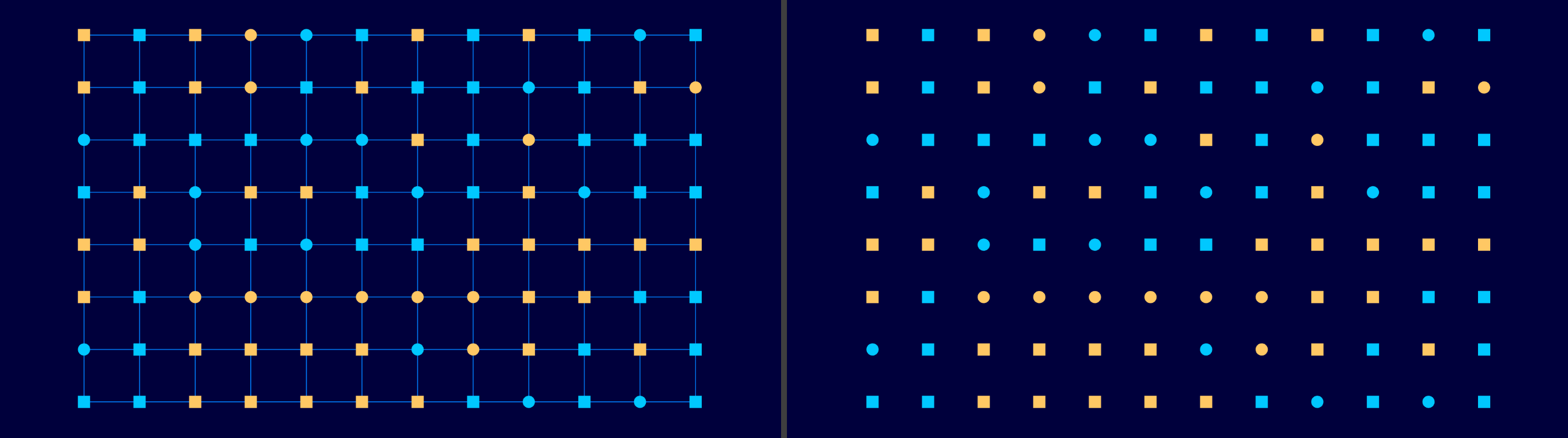
toggles the array's matrix of lines connecting Shape Grid and bounding the Cell Grid.
Here, you see Draw Grid enabled (left) and disabled (right).
- Grid Style determines whether the lines connect along both the horizontal and vertical axes (Grid) or just along the horizontal axis (Lines).
- Grid Stroke Style toggles whether the entire Line Grid's corners are Square or Round.
- Grid Color dictates the grid's color. These are the green lines in the image below.
- Grid Stroke Width adjusts the size of the grid's stroke. Notice how the green grid lines are thicker in our image? That's because we used a value of 10 as opposed to the default of 2.
- Draw Grid Subdivisions toggles whether cells within the grid are divided into smaller sections.
-
Grid Subdivide X/Y
specifies how many cells occupy the subdivisions along their horizontal and vertical axes.
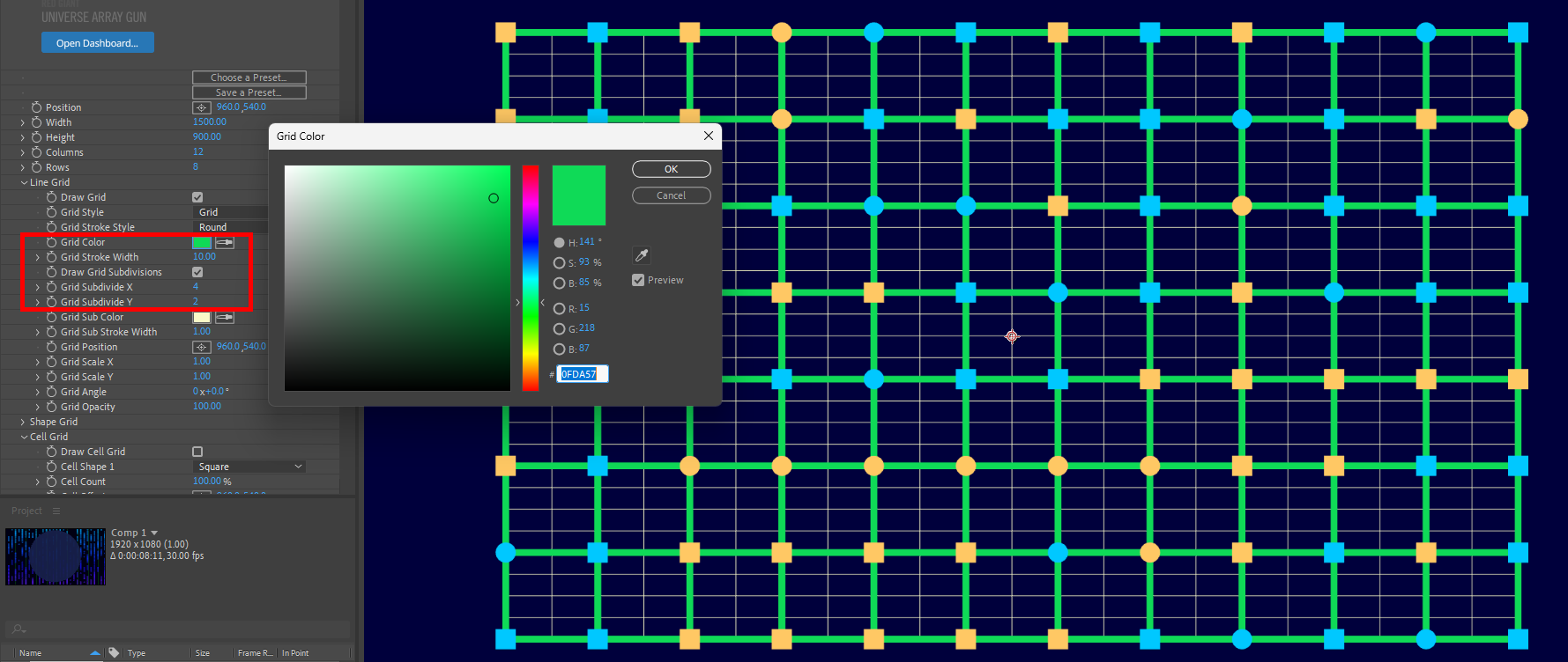
- Grid Sub Color dictates the subdivision's color.
- Grid Sub Stroke Width adjusts the size of the subdivision grid's stroke.
- Grid Position provides coordinates and controls that define where within the frame the grid will appear.
- Grid Scale X/Y adjusts the size of the entire grid.
- Grid Angle rotates the grid to the right (higher values) or left (lower values).
- Grid Opacity adjusts the grid's transparency between invisible (0) and opaque (100).
-
Draw Grid
toggles the array's matrix of lines connecting Shape Grid and bounding the Cell Grid.
Here, you see Draw Grid enabled (left) and disabled (right).
-
Shape Grid
-
Draw Shape Grid
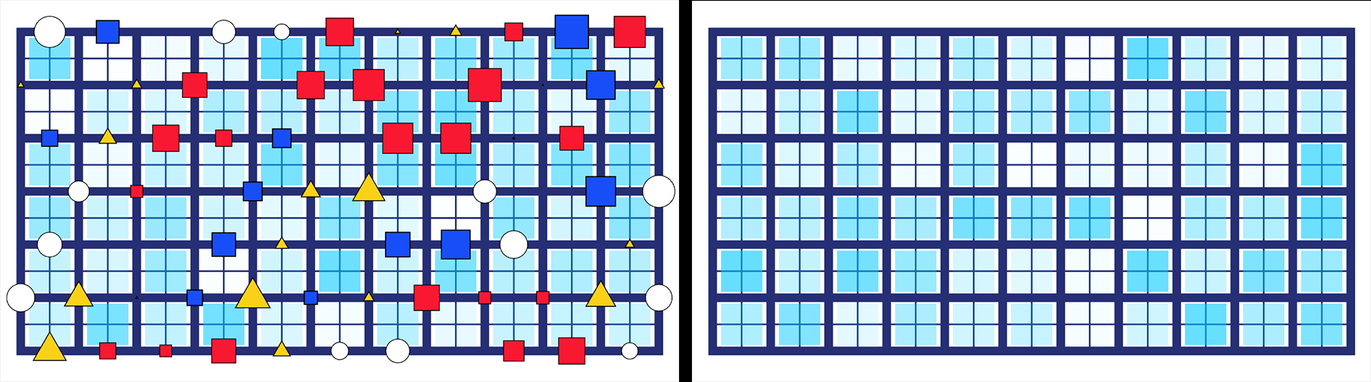
toggles the shape components positioned along the Cell Grid's lines and intersections.
The Bauhaus 03 preset shown below illustrates the Shape Grid being enabled (left) and disabled (right).
- Color A/B
dictates the alternating colors of shapes within the Shape Grid's Color Scheme when using A/B Colors. Note that one or both of these parameters may be disabled, depending on the selected Color Scheme.
- Color Scheme
provides an assortment of color presets that determine the color of the shapes in the Shape Grid.
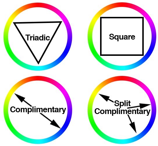
Four of the options have their selection schemes illustrated below.
- Color A only uses Color A.
- Color A/B alternates randomly between Color A and Color B.
- Random A to B randomly picks colors within a gradient from Color A to Color B.
- Monotone picks various shades of Color A.
- Analogous uses Color A in addition to two colors neighboring it on the color wheel.
- Triadic uses Color A in addition to two colors a third away from it in both directions on the color wheel.
- Complimentary uses Color A in addition to its opposite color.
- Split Complimentary uses Color A in addition to its opposite color's neighbors.
- Square uses Color A in addition to three colors evenly selected from it across the color wheel.
- Individual Colors uses the Shape Fill Color in the shape parameters (see below) to determine each shape's color.
- Stroke Uses Color Scheme toggles whether the shape's stroke adheres to the Color Scheme. Disabling this defers the stroke color to the Shape Stroke Color value.
-
Color Scheme Settings
- Hue Offset adjusts colors away from their selected values along the color wheel axis in either direction. Note that this parameter only affects Color Scheme options from Monotone downward on the Color Scheme pull-down menu.
- Lightness 1/2 define the brightness values randomly assigned among the colors.
- Shape Position provides coordinates and controls that define where within the frame the Shape Grid will appear.
-
Shape Scale
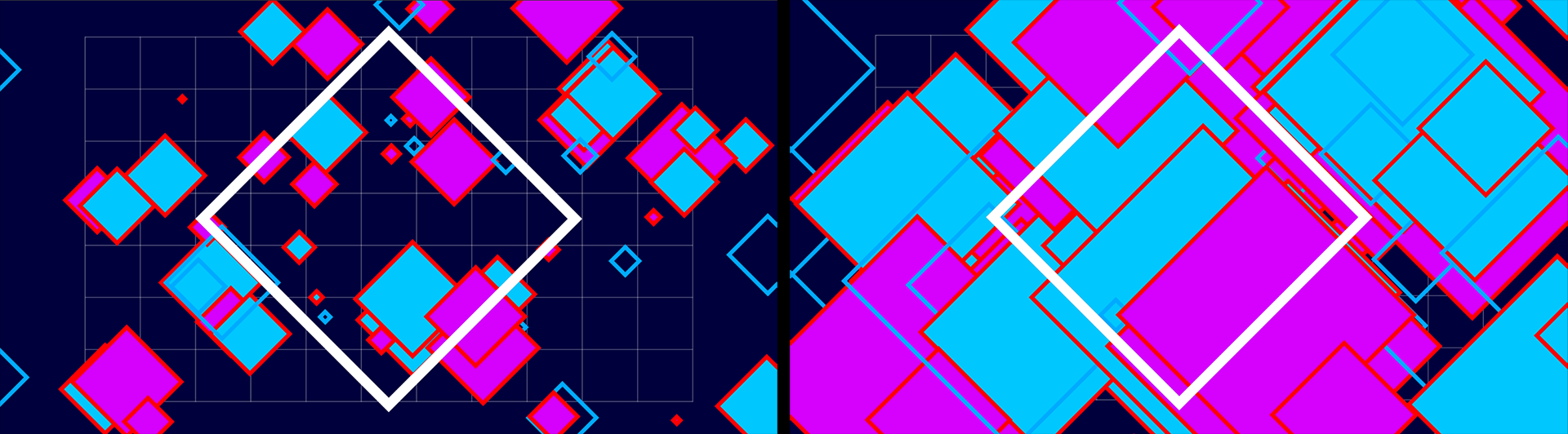
adjusts the size of each shape.
Shown below are values of 100 (left) and 300 (right) percent.
- Shape Rotate rotates the individual shapes to the right (higher degrees) or left (lower degrees).
- Shape Position Random offsets the shapes away from their default positions in a randomized pattern.
- Shape Scale Random offsets the size of the shapes from their default sizes in a randomized pattern.
- Shape Rotation Random offsets the rotation of the shapes from their default orientations in a randomized pattern.
-
Stagger
toggles whether every other row of shapes is adjusted half a cell to the right along the horizontal axis.
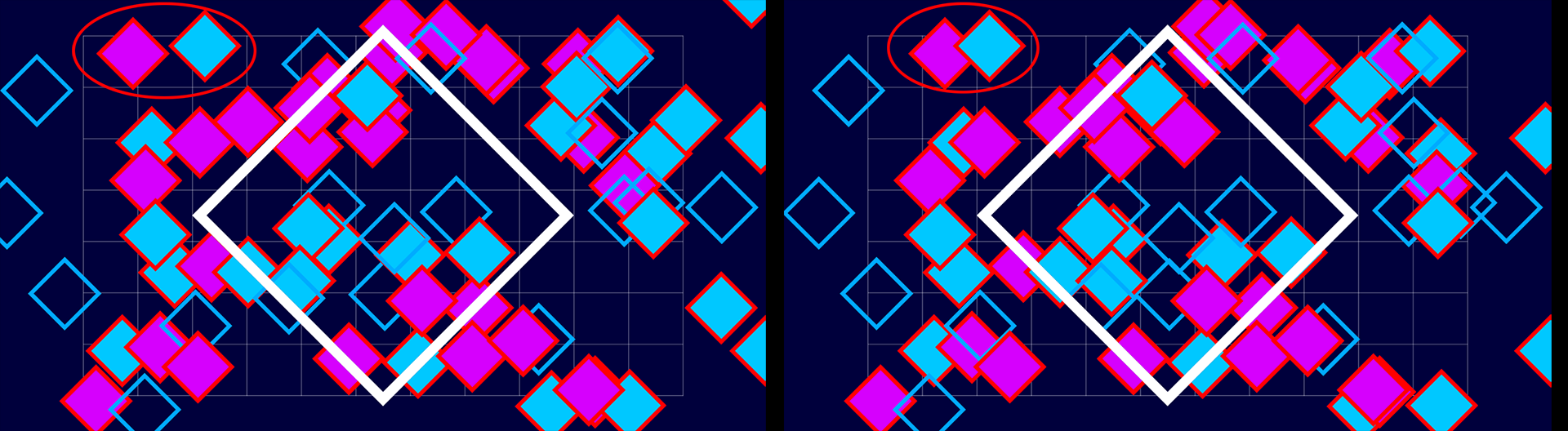
- Shape Count populates the shape grid between full (100%) and empty (0%).
-
Shape 1-4
contains controls that affect each of the four possible shapes in the Shape Grid.
-
Shape 1
determines one of the shapes used in the Shape Grid.
-
Using
Choose a Shape S1...
sets this parameter to Sprite Library. The example below starts from the Vertical Primitives 03 preset and changes Shape 1 from the Rectangle default to the Abstract X4 shape in the Sprite Library.
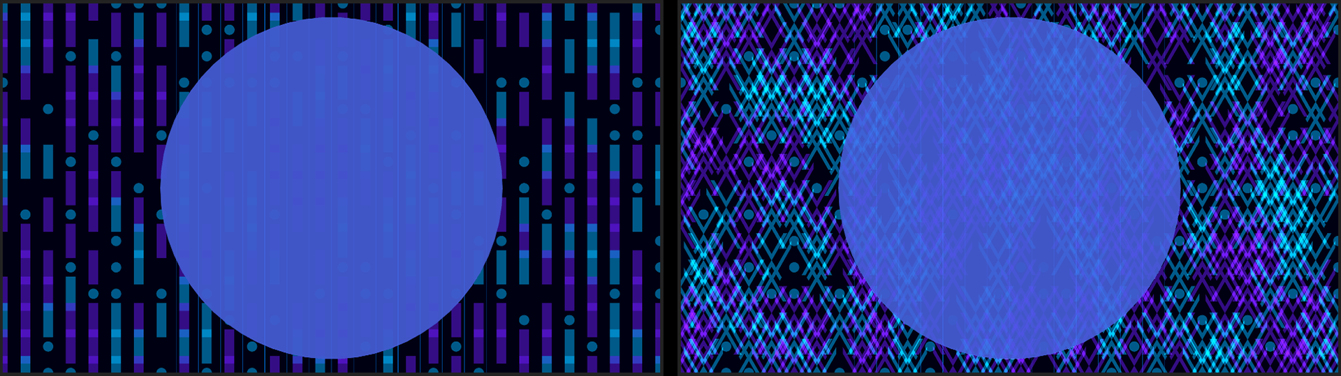
- Using Custom Layer enables the Custom Layer 1 parameter in the Shape 1 Custom Settings. Here you'll find dozens of shapes to choose from in the asset browser.
-
Using
Choose a Shape S1...
sets this parameter to Sprite Library. The example below starts from the Vertical Primitives 03 preset and changes Shape 1 from the Rectangle default to the Abstract X4 shape in the Sprite Library.
-
Shape 1 Custom Settings
- Custom Sprite 1 contains a list of possible custom shapes to use when Sprite Library is selected as the Shape 1.
- Custom Layer 1 selects which layer is to be used when Custom Layer is selected in Shape 1.
- Custom Layer 1 Colorize determines whether the shape's color will fill the shape, colorize its original colors, or leave them unchanged (Original).
- Shape Size 1 adjusts the size of Shape 1.
- Shape Rotate 1 rotates Shape 1 clockwise (positive values) or counterclockwise (negative values).
-
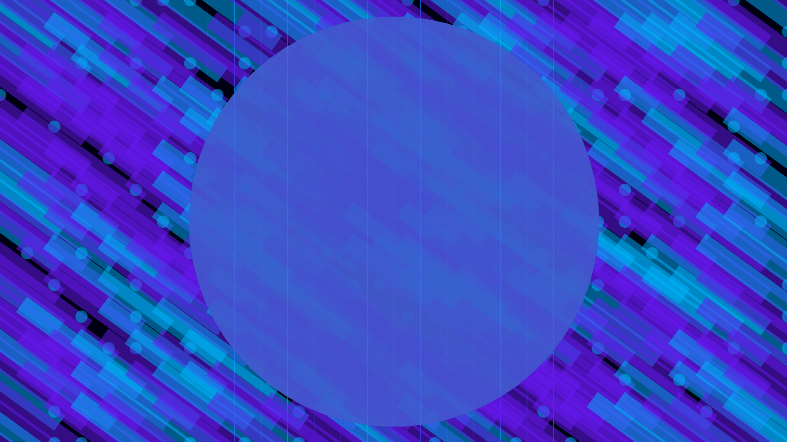
Shape Aspect 1
adjusts the aspect ratio of Shape 1.
Compare the preset default above with the following image after adjusting its Shape Size/Rotate/Aspect settings.
- Shape Size Random 1 offsets the size of Shape 1 from its default size with randomized values.
- Shape Rotate Random 1 offsets the rotation of Shape 1 from its default orientation in a randomized fashion.
- Shape Fill toggles whether the shape is filled with color. Without a Shape Stroke enabled, unchecking the Shape Fill box will render the shape invisible.
- Shape Fill Color 1 determines what color the shape is when Individual Colors is selected from the Color Scheme option for the Shape Grid.
- Shape Opacity 1 adjusts the shape's transparency between 0 (transparent) and 100 (opaque).
- Shape Opacity Random 1 randomizes the opacity of Shape 1 anywhere in the Shape Grid.
- Shape Stroke 1 toggles whether the shape has a stroke around its edges.
-
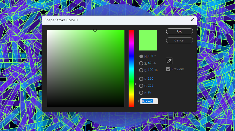
Shape Stroke Color 1
determines the color of the shape's stroke.
Below, we show the Shape Stroke Color picker with Stroke Width set to 4 and randomized rotation and a little randomized opacity.
- Shape Stroke Width 1 adjusts the size of the shape's stroke.
-
Shape 1
determines one of the shapes used in the Shape Grid.
-
Effector Settings
contains parameters for a customizable area that affects various properties of Shape Grid objects.
- Effector Center defines the center position of the area that will affect the shapes.
- Effector Width and Height control the size of the area along the x and y axes.
-
Effector Min Value
and
Effector Max Value
determine the minimum and maximum amount of offsetting done by the area to the shapes' properties enabled (below), where 0 is the default property value.
Let's illustrate the above Effector parameters. The Vaporwave 2 preset (left, below) has default values of Width: 150, Height: 79, Min Value: 0, and Max Value: 15. We then moved the Effect Center lower on the y axes and changed the values to Width: 37, Height: 26, Min Value: 2, and Max Value: 15 (right).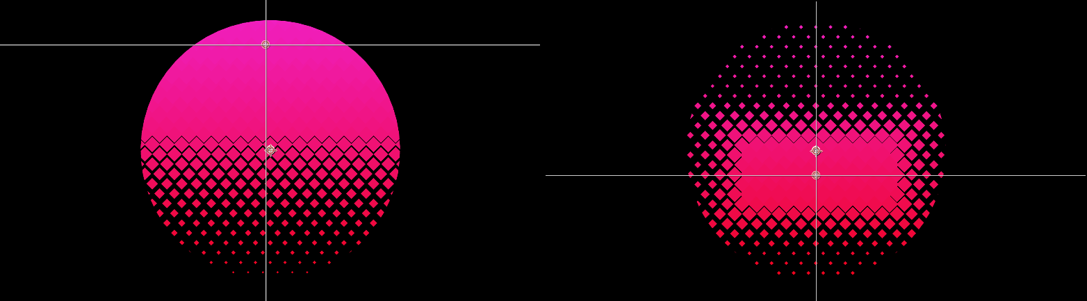
- Effect Size toggles whether the area will affect the size of the shapes. Disabling this may eliminate the shape pattern.
- Effect Size Amount scales the shapes in the area above (positive values) or below (negative values) their original sizes.
- Effect Rotation toggles whether the area will affect the rotation of the shapes.
- Effect Rotation Amount adjusts the rotation of the shapes clockwise (positive values) or counterclockwise (negative values) from their original orientations.
- Effect Position X toggles whether the area offsets the shapes along the horizontal axis.
-
Effect Position X Amount
offsets the shape along the horizontal axis to the right (positive values) or left (negative values).
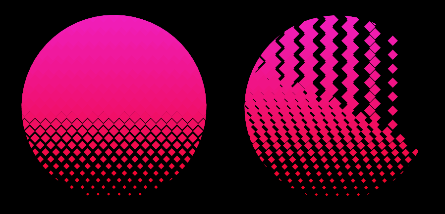
Below, you can see the impact of Effect Position X disabled (left) versus enabled with a value of -50 (right).
- Effect Position Y toggles whether the area offsets the shapes along the vertical axis.
- Effect Position Y Amount offsets the shape along the vertical axis higher (positive values) or lower (negative values).
- Effect Opacity toggles whether the area affects the shapes' opacity.
- Effect Opacity Amount offsets the transparency from opaque (100) to invisible (0).
-
Animation Settings
contains optional animation behaviors within the Shape Grid.
-
Animation Behavior
determines how the values of the shapes are animated.
Note that if none of this subgroup's parameters are enabled, you won't see any animation. Animation Behavior and Animation Grouping work in conjunction with the subgroup's other parameters.
- None turns the animation off.
-
Randomize
randomizes the animations throughout the Shape Grid.
Here, we show Behavior: Random, Grouping: Random, and Size enabled.
-
Oscillate
animates the shape properties to and from their values at a consistent speed.
Here, we see Behavior: Oscillate, Grouping: Unision, and Position X enabled with a 200 Amount.
-
Wiggle
animates the shape properties to and from their values at random speeds.
The following animation shows Behavior: Wiggle, Grouping: Vertical, and Rotation and Opacity (100) both enabled.
-
Animation Grouping
adjusts the order and sets of shapes affected by the animation.
- Unison affects all shapes at the same time.
- Random selects random shapes for animation at different times.
- Horizontal animates across the horizontal axis.
- Vertical animates across the vertical axis.
- Animation Speed defines the animation's forward speed (positive values) or backward speed (negative values).
- Animate Size toggles whether the animation affects the shape size.
- Animate Size Amount determines the size the shape grows (positive values) or shrinks (negative values) to during its animation.
- Animate Rotation toggles whether the animation affects the shape's rotation.
- Animate Rotation Amount determines how far the shape rotates clockwise (positive values) or counterclockwise (negative values) during animation.
- Animate Position X toggles whether the animation affects the shape's position along the x axis.
- Animate Position X Amount determines how far the shape moves to the right (positive values) or left (negative values) during its animation.
- Animate Position Y toggles whether the animation affects the shape's position along the y axis.
- Animate Position Y Amount determines how far the shape moves upward (positive values) or downward (negative values) during animation.
- Animate Opacity toggles whether the animation affects the opacity of the shapes.
- Animate Opacity Amount determines how transparent (lower values) or opaque (higher values) the shape becomes during animation.
-
Animation Behavior
determines how the values of the shapes are animated.
Note that if none of this subgroup's parameters are enabled, you won't see any animation. Animation Behavior and Animation Grouping work in conjunction with the subgroup's other parameters.
-
Draw Shape Grid
toggles the shape components positioned along the Cell Grid's lines and intersections.
The Bauhaus 03 preset shown below illustrates the Shape Grid being enabled (left) and disabled (right).
-
Cell Grid
-
Draw Cell Grid
toggles the cell component of the array, positioned within the Line Grid's spaces.
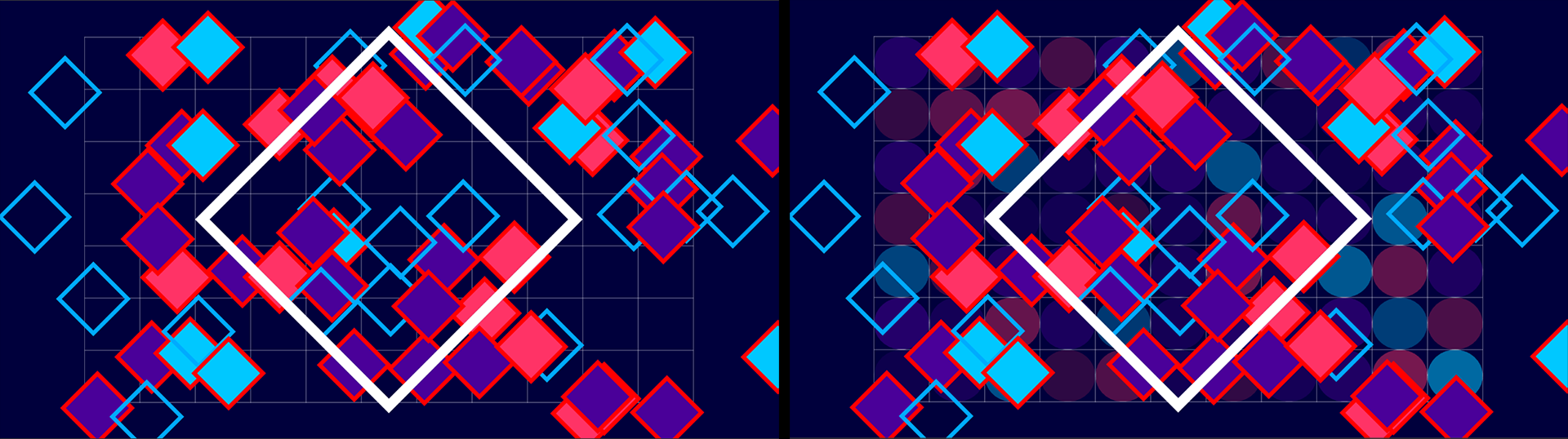
Here, you see the Cell Grid disabled (left) and then enabled with Ellipse selected for Cell Shape (right).
- Cell Shape provides a preset list of shapes that determine the cell's appearance.
- Cell Count populates the Cell Grid between full (100%) and empty (0%).
- Cell Offset offers coordinates and controls that move the Cell Grid away from its default positioning within the Line Grid's spaces.
- Match Grid Size toggles whether the cells are proportionate to the Line Grid. Disabling this defers the cell size to Cell Size.
-
Cell Size
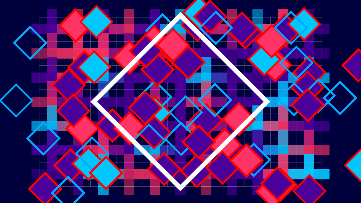
adjusts the size of the cells when Match Grid Size is disabled. In the following example, we chose the Plus Cell Shape, cranked up Cell Size to 320 so that the shapes extended beyond their cell borders, and set Cell Opacity to 70, which is why the shapes are more noticeable than the Ellipse forms shown above.
- Cell Aspect adjusts the aspect ratio of the cells.
- Cell Rotation rotates the cells clockwise (positive values) or counterclockwise (lower values).
- Use Shape colors toggles whether the cells adhere to the Shape Grid's Color Scheme. Disabling this defers the color to the Cell Color.
- Cell Fill Color determines the color of the cells when Use Shape Colors is disabled.
- Cell Opacity adjusts the cell's transparency between 0 (transparent) and 100 (opaque).
- Cell Opacity Random offsets the opacity of the cells throughout the Cell Grid in a randomized pattern.
- Cell Scale Random offsets cell size throughout the Cell Grid in a randomized pattern.
-
Draw Cell Grid
toggles the cell component of the array, positioned within the Line Grid's spaces.
Here, you see the Cell Grid disabled (left) and then enabled with Ellipse selected for Cell Shape (right).
-
Single Shape
-
Draw Single Shape.
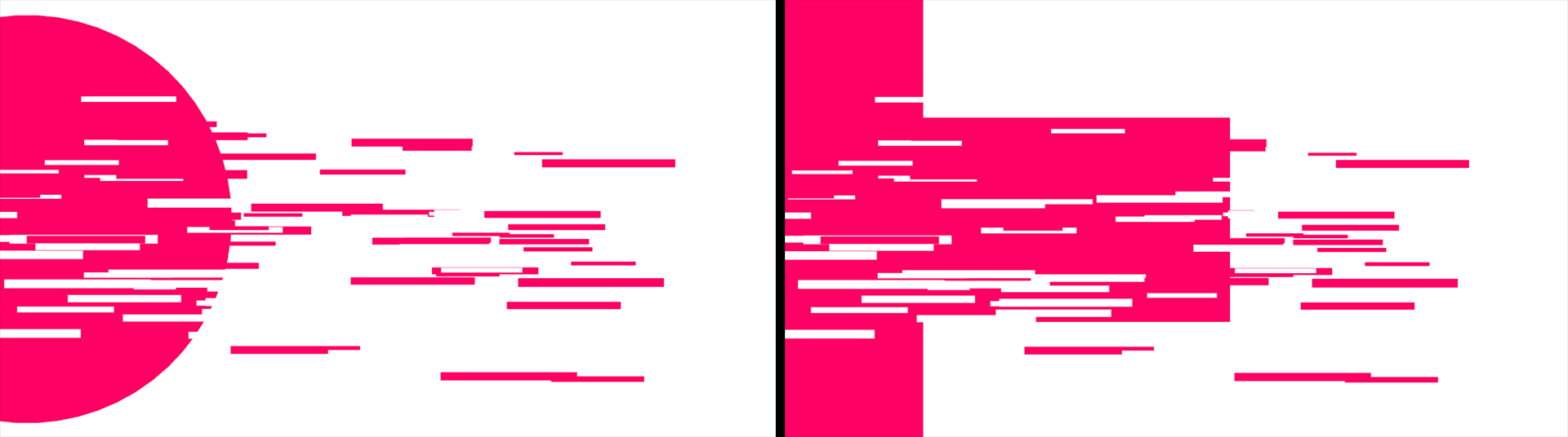
You've likely noticed that many of our examples have a single large shape overlaying the background grid and shapes. The "Single Shape" is that large item. This checkbox toggles the Single Shape array component.
Here, you see the Glitchy Glitch 01 preset with its default Ellipse Single Shape Type (left), then a Plus type (right).
- Single Shape Type provides a preset list of shapes that determine the shape's appearance.
- Shape Position provides coordinates and controls that define where within the frame the shape will appear.
- Single Shape Size adjusts the size of the shape.
- Single Shape Rotate rotates the shape clockwise (higher degrees) or counter-clockwise (lower degrees).
- Single Shape Aspect adjusts the shape's aspect ratio.
- Single Shape Opacity adjusts the shape's transparency between 0 (transparent) and 100 (opaque).
- Single Shape Fill toggles whether the shape is filled with color. Remember that a shape with no fill and no stroke will be invisible.
- Single Shape Fill Color determines the color of the shape's interior.
- Single Shape Stroke toggles whether the shape has a stroke around its edges.
- Single Shape Stroke Color determines the color of the shape's stroke.
- Single Shape Stroke Width adjusts the size of the shape's stroke.
-
Matte Shape Grid
determines the interaction between the Single Shape and the Shape Grid. Shown below is the Hero Circle preset with its Matte Shape Grid set to the default of Single Shape on Top (left), Below Shape Grid (center), and Below Line Grid (right).

-
Draw Single Shape.
You've likely noticed that many of our examples have a single large shape overlaying the background grid and shapes. The "Single Shape" is that large item. This checkbox toggles the Single Shape array component.
Here, you see the Glitchy Glitch 01 preset with its default Ellipse Single Shape Type (left), then a Plus type (right).
- Background Color defines the color behind the array.
- Background Opacity adjusts the background's transparency between 0 (transparent) and 100 (opaque).
- Blend Mode includes the standard blending controls which determine how the effect integrates into the rest of your composition.
- Blend with Original mixes the effect of the Array Gun effect with the layer to which it’s applied. Raise this control to a higher value to make the effect more subtle.
- Random Seed adjusts the calculations used for any randomizations throughout the effect. This can be useful for differentiating one array from another when using equal parameter definitions for randomized behavior.