
TEXT TILE
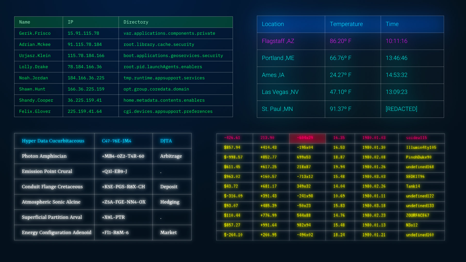
Universe Text Tile generates multiple columns of random data, such as characters, numbers, timestamps, computer data, and more.
Presets & Video Walk-Through
Not sure where to start with creating your screen(s) of structured data? Text Tile offers 20 presets suitable for a range of applications. Find our presets via the blue Open Dashboard... button or the Choose a Preset... button below it.
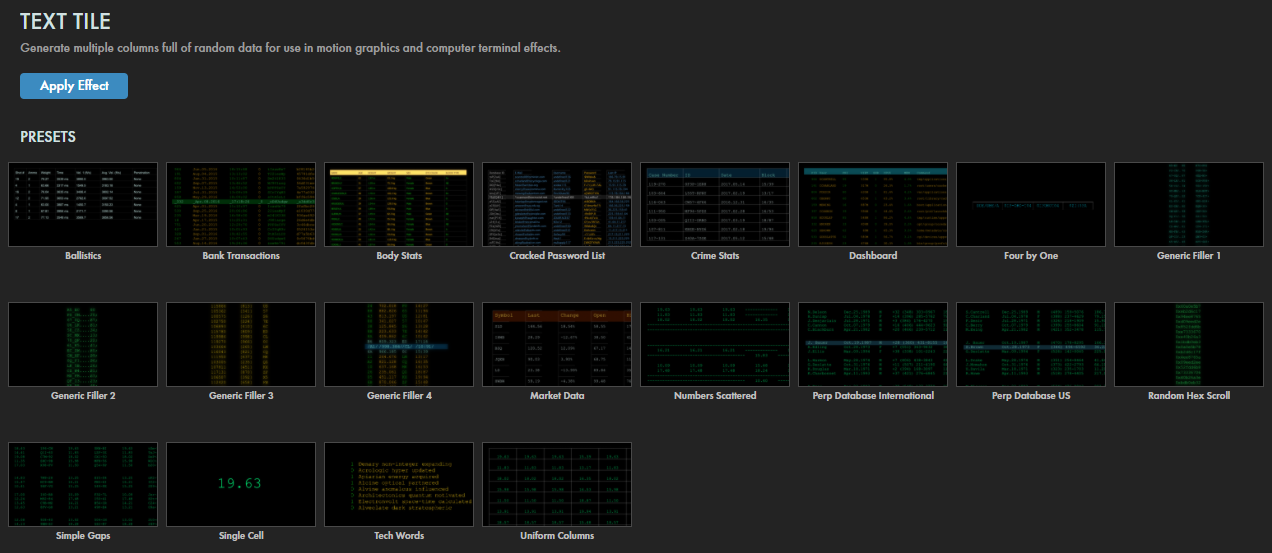
As with all other Universe tools, you can modify or create a Text Tile look and then save it under its own name by pressing the Save Preset... button.
If you'd like a visual overview of Text Tile before diving into this guide, we recommend giving our Cineversity tutorial a watch.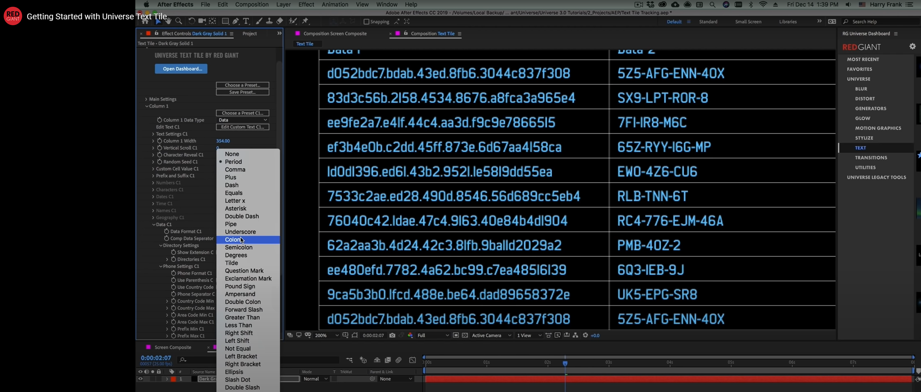
Modify the Effect
- Position controls the coordinates that define where within the frame your text will appear. By default, the Position control point is near the top-left corner of your generated text.
-
Text Style
launches a modular window with options to customize the text. Choices include: alignment, font, font size, font style, color, line spacing, and character spacing.
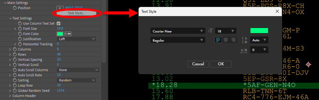
- Text Settings parameters replicate several of the controls found in the Text Style window (e.g., Font Size, Font Color, and Justification). Staying in the ECP can help maintain a cleaner, more consistent UI, if that's your preference. The one item in this subsection not found in the Text Style window is the Use Column Text Set checkbox. Enabling this passes control of the column text formatting to the Column subgroups (covered below).
- Columns and Rows define how many of each to include within the text tile.
-
Vertical Spacing
controls the spacing between rows.
Shown below are values of 20 (left) and 50 (right).
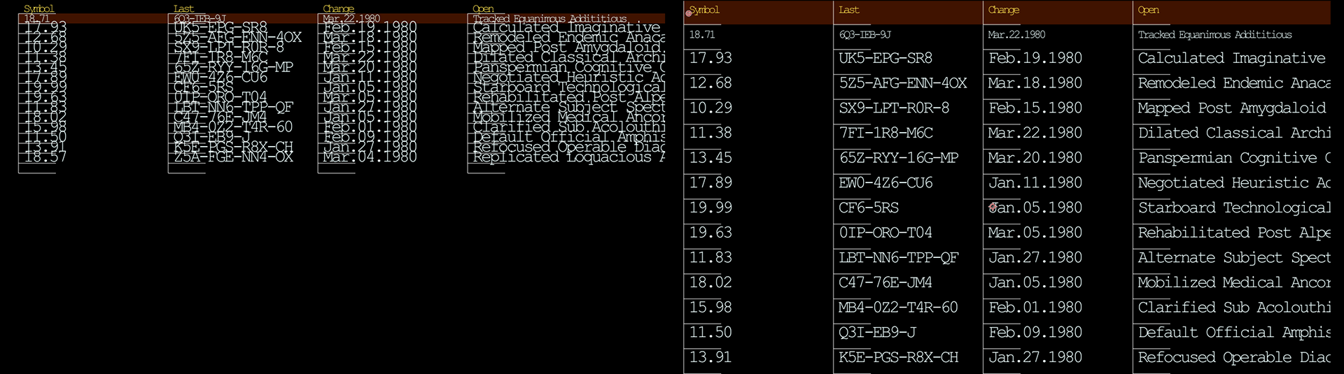
- Vertical Scroll animates the text scrolling up the rows of the tile when keyframed.
- Auto Scroll Columns toggles whether column contents continually scroll sequentially (Scroll Vertical), at random (Randomize Columns), or not at all (None).
- Auto Scroll Rate adjusts the speed at which contents scroll through the columns. This will not have an effect if Auto Scroll Columns is set to None.
- Sorting dictates if column contents are arranged at Random, alphabetically (A-Z), or reverse-alphabetically (Z-A).
-
Loop Row
defines the last row to appear when scrolling the contents before looping the next row back from the top.
In other words, how many novel rows display before repeating? Compare the values of 2 (left) and 5 (right) below.
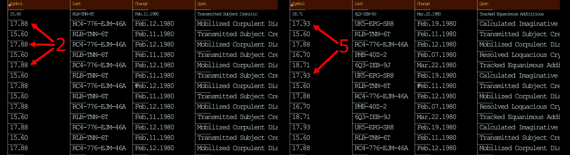
- Global Random Seed adjusts the algorithm used to create randomizations throughout Text Tile. Use this control to add variance between other Text Tile effects that share similar settings.
-
Column Header
- Use Header toggles whether the first row remains static as a header column. When disabled, the first row of data appears in the header row.
-
Edit Column Headers
launches a modular window with text entry, wherein each line of text becomes the headers used across the columns.
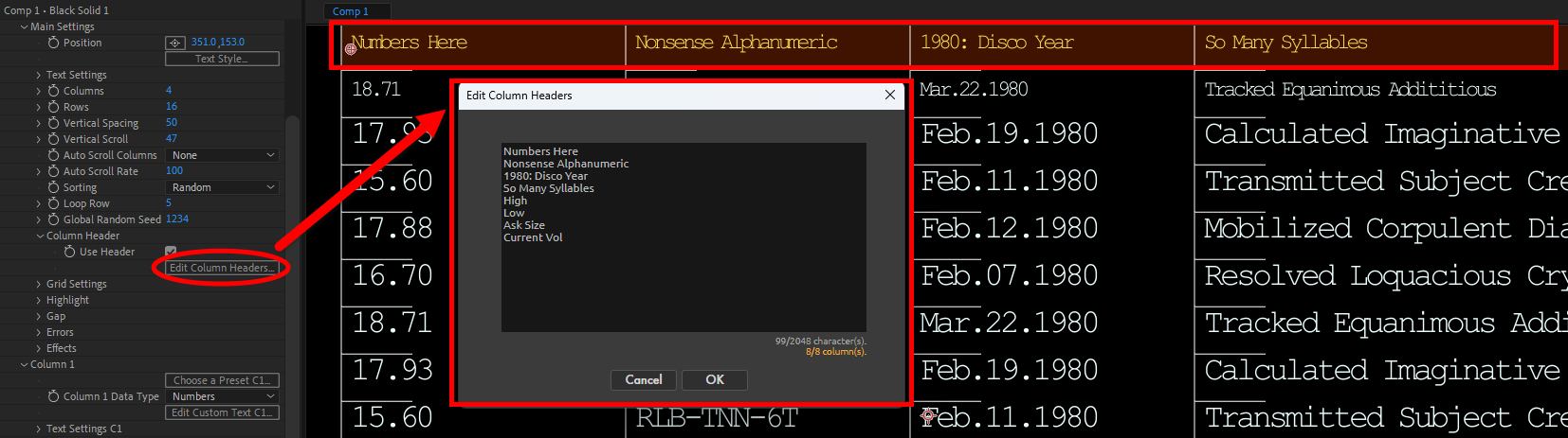
-
Grid Settings
- Enable Grid toggles whether a grid separates the table's cell contents. Compare the above screen captures with the one below and you'll see how the latter applies a (mostly complete) grid dividing the text cells.
- Complete Horizontal toggles whether the horizontal lines of the table extend completely between columns.
-
Grid Completion
adjusts how much of the grid is filled in when Complete Horizontal
is disabled. In the image below, note how a value of 290 almost spans the cell width of the first three columns. To drive home the point that this is a pixel width, not a percentage, observe how the fourth column has a much wider grid completion gap owing to it having a width of 500 rather than the other columns' 300.
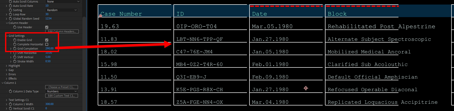
-
Shift Horizontal
and
Shift Vertical
offset the grid from the table contents along the horizontal or vertical axis.
The image below shows these shifts as we increase values.

- Stroke Width controls the grid lines' thickness.
-
Highlight
- Enable Highlight toggles a highlight to appear on single or multiple cells within the table.
- Highlight Entire Row toggles the highlight to extend across all columns in a single row. A 0 value will highlight the header row.
-
Highlight Row
and
Highlight Column
adjusts which row and column to set the highlight on.
Note that you can highlight an entire row but not an entire column. Observe in the following image the results of Highlight Row: 2 and Highlight Column: 8. Given the other parameter settings, the selected value for Highlight Column has no effect on the output here.

However! If you deselect Highlight Entire Row, you can then use Highlight Column to supply the value for which individual cell gets highlighted. In the comparison below, we use values of Highlight Row: 4, Highlight Column: 0 (top) and Highlight Row: 0, Highlight Column: 2 (bottom). Remember that row and column counts begin with 0, not 1.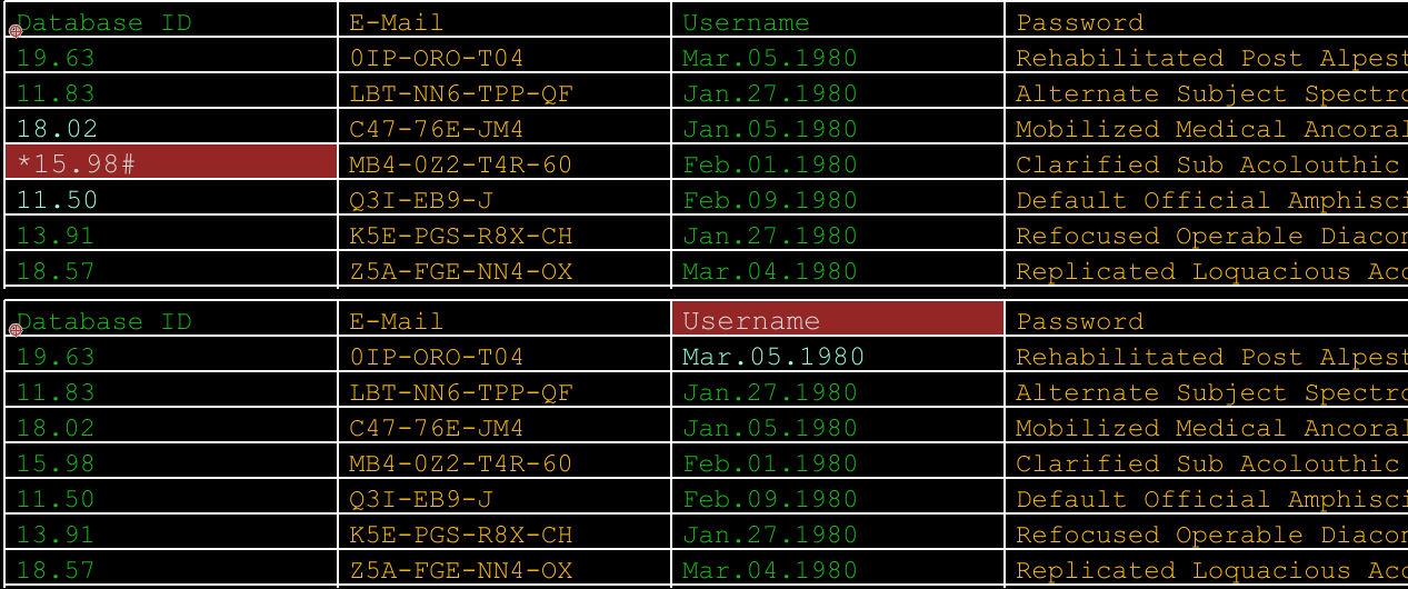
- Block Fill toggles whether the background colors within a highlighted cell or row.
- Block Fill Color sets the color of the background when Block Fill is enabled.
- Highlight Opacity adjusts the colored background's transparency when Block Fill is enabled.
- Highlight Character 1 sets what (if any) character prefixes the highlighted cell(s) contents.
-
Highlight Character 2
sets what (if any) character suffixes the highlighted cell(s) contents.
See how both of these characters display in the third row shown below.

- Highlight Color defines the text color within the highlighted cells.
- Use Secondary Color toggles whether cells adjacent to highlighted cells are colored.
-
Highlight Secondary
Color
defines the color of highlighted cells' adjacent cells if Use Secondary Color is enabled.
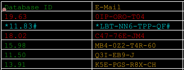
Below, you can see how we have Highlight Color set to light blue and Highlight Secondary Color set to red.
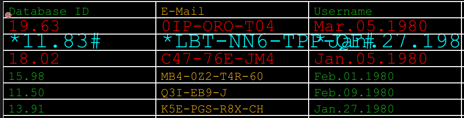
- Highlight Size Modify adjusts an optional sizing offset of the highlighted cell contents. A 0 value leaves sizing unchanged. In the example below, we set this value to 20. Note that this 20 is additive on top of our default 20 value set in our Text Style window controls. We've also left the example a bit jumbled and overflowing so you can see how adjusting row and column dimensions in tandem with this parameter might be needed.
-
Highlight Ramp Factor
adjusts an optional sizing offset of highlighted cells' adjacent rows (shown with red text below with a value of 0.5) in relation to the highlighted rows' size. This only has an effect when Highlight Entire Row is enabled.
-
Enable Gap
- Enable Gap toggles gaps in the table rows to occupy the cells' contents.
- Gap Follows Scroll toggles whether the gap moves in line with any scrolling outlined in the above Vertical Scroll and Auto Scroll Columns parameters.
-
Gap On 1 & 2
and
Gap Off 1 & 2
define the rows where the gap(s) begin (On) and end (Off).
These controls can benefit from some illustration, so let's take a couple of examples.

In the triptych above, we show the respective values used for Gap On:Off (for 1; we zeroed out Gap 2). It may be helpful to think of these parameters as "three rows on, zero rows off," "three rows on, two rows off," and so on. Then, the pattern becomes more intuitive.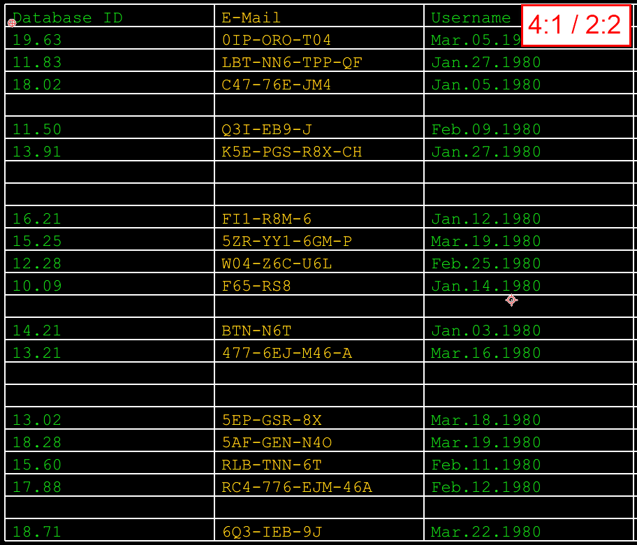
Now, when we add in the Gap 2 parameters, we add to the pattern. In the above example, we use values of Gap On 1: 4, Gap Off 2: 1, Gap On 2: 2, Gap Off 2: 2. Maybe read this as "Four rows on, then one row off and then two rows on, two rows off," then repeat. These controls help to break up long, simulated data lists and create more realism.
-
Errors
- Random Error Freq adjusts the percentage chance that a cell's contents will be overwritten with a generated error message. The maximum value of 100 prints the error message in every cell.
- Error Message contains a list of predefined error messages to appear when an error appears, such as !ERROR, #NULL, and {REDACTED}. Note that the Custom option prints the word "Custom" as the error; it does not allow you to input your own custom error message.
-
Effects
- Enable Glow toggles a glow around the text with control, as you might especially notice in old CRTs.
- Glow Intensity
and
Glow
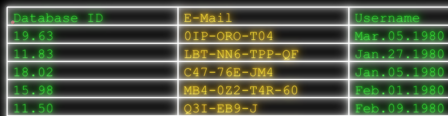
Radius control the glow's brightness and spread, respectively. A small radius value can go a long way while high values may, from a distance, resemble a monitor with a layer of dust on it. In the example below, we show values of Glow Intensity: 90 and Glow Radius: 2.
-
Enable Scan Lines
toggles an array of lines that overlay the text, mimicking the look of old CRT displays. Fine tune this effect with adjustable line width (Scan Line Thickness),
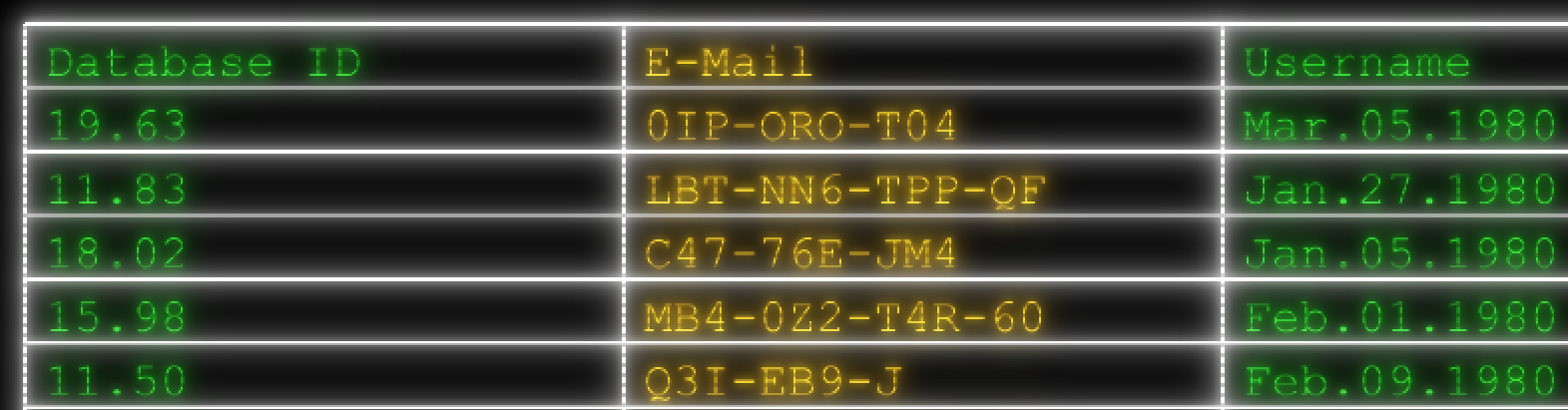
spacing between lines (Scan Line Spacing), and opacity (Scan Line Opacity). Below, we show the above glow settings with additional values of Scan Line Thickness: 2, Scan Line Spacing: 5, and Scan Line Opacity: 50.
Columns 1-8
Each column has an identical set of parameters, with C1-8 suffixes denoting which column the parameter references. The Column parameter definitions (below) apply across all eight Column parameter subgroups.
-
Column
- Choose a Preset... launches a modular window with presets available that populate the column's contents.
-
Column Data Type
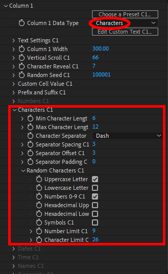
contains a list of data types that unlock various parameter sets (below) depending on the selection made. The Data Type you select enables that set of subgroup parameters while the other subgroups are grayed out, as shown here.
The Custom Data Type option allows you to overwrite the default Column 1 values with your own via the Edit Custom Text pop-up window.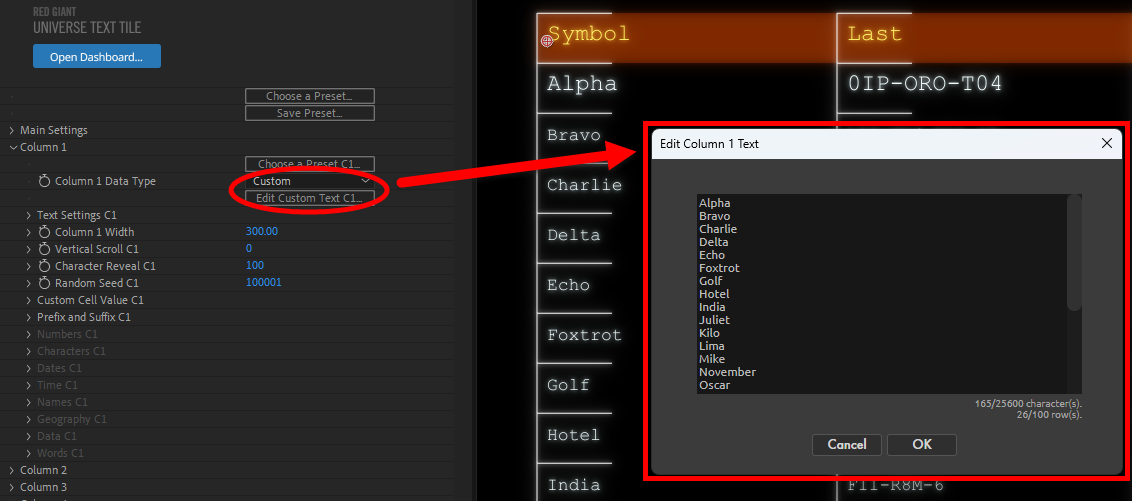
- Text Settings twirls down options to customize the Font Size, Font Color, Justification, and the spacing between characters (Horizontal Tracking).
- Column Width adjusts how wide or narrow the column is.
- Vertical Scroll animates the cell contents upward (positive parameter values) or downward (negative values) through the column.
- Character Reveal adjusts how many characters in each column cell are displayed.
- Random Seed adjusts the algorithm used to create randomizations within the column. Use this to add variance between other columns that share similar text inputs.
-
Custom Cell Value twirls down a few parameters that determine whether and how a cell within the column is overwritten with a custom input. First, you must check
Enable Custom Value , then give Custom Row a value to select on which row the custom input displays. Click the Edit Custom Cell Text button to customize the specific cell text (see below).
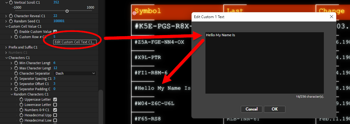
Keep in mind that Custom Cell Text overrides any future Column Data Type choices. So, say you make your Custom Cell Text be "Hello My Name Is," then you change the Column Data Type to Numbers, you're going to have one cell with that text amidst a column of numbers. While that may sound and look like a mistake, you might use the feature to embed a special, hidden message amidst a jumble of figures. -
Prefix and Suffix
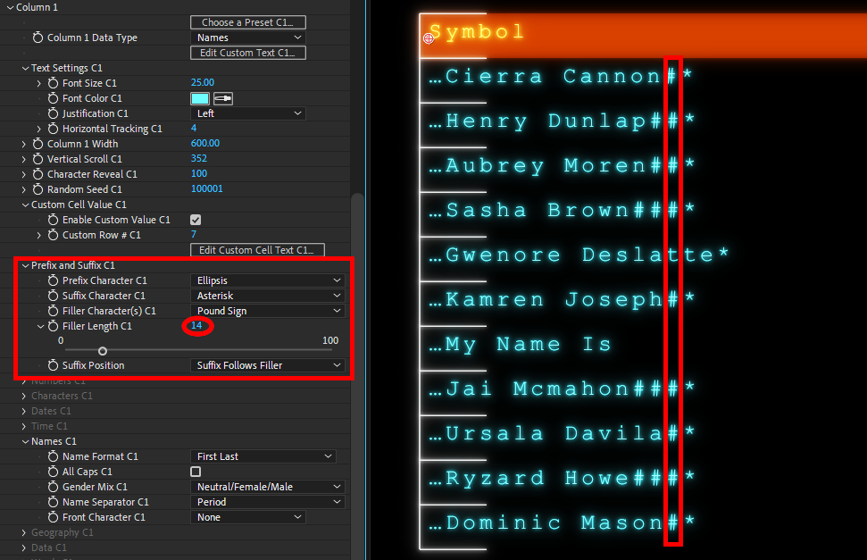
- Prefix Character and Suffix Character contains options with characters (e.g., asterisk, tilde, M (for million), ellipsis, etc.) that either precede or follow each of the column's cell inputs. In the example below, we used an ellipsis and asterisk, respectively.
- Filler Character(s) determines what character(s), if any, fill the empty space between the text input and the Filler Length.
- Filler Length establishes the number of character (and space) places between the prefix and suffix characters. This parameter will not truncate your text if the text extends beyond the set length. To illustrate, we set Filler Length to 14 in the example below. There are 14 character places, including spaces, separating the ellipsis prefix and asterisk suffix. Aubrey Moren consumes 12 spaces, so Text Tile fills in the remaining two spaces with pound symbol filler. Gwenore Deslatte occupies 16 spaces, so that cell has no filler symbols, but it does retail its prefix and suffix characters without truncating the name/text.
-
Suffix Position
determines whether the Suffix Character precedes or follows the Filler Character(s).
-
Numbers
This set of parameters is only usable when Column Data Type is set to Numbers.- Min Value and Max Value determine the minimum and maximum number values allowed within the column. This can be useful if, for example, you need to produce a table of seven-figure embezzlement transfers, and you don't want something paltry like $4.60 ruining the white-collar crime mood.
- Number of Decimals dictates the number of numeric places allowed after the decimal point.
- Decimal Separator contains an array of options as to what gets placed in the decimal's position. Note that if you select None from the pull-down list of options, all numbers that would have appeared following the decimal will not be displayed.
- Use Commas toggles whether commas are used every three places before the decimal.
- Swap Comma/Period toggles whether commas and the decimal separators are exchanged.
- Unit of Measure contains a set of measurement demarcations (e.g., percent, candelas, milliseconds, etc.) that accompany the cell contents.
- Currency contains options to display the column's numbers as currency, complete with options that control the Currency Format, whether the currency symbol is shown alongside the numbers (Symbol After Numbers), and the Currency Type. Note that you can select multiple Currency Type options to have multiple currencies in your output. Text Tile may apply a very loose currency conversion multiplier so that values appear more realistic. For example, Japanese Yen values will be noticeably higher than U.S. Dollar values owing to exchange rates.
-
Characters
This set of parameters is only usable when Column Data Type is set to Characters.- Min Character Length and Max Character Length define the minimum and maximum number of characters allowed in the column's cell contents.
- Character Separator defines what character(s), if any, gets used to separate each character group within the cell.
- Separator Spacing adjusts how many characters occur in the string between separators. You can see in the example below how a value of 6 creates groups of six characters separated by an empty space, which we selected as the Character Separator.
- Separator Offset adjusts the position of the separators within the text input's characters.
- Separator Padding adds optional spacing between each separator and the text around it.
-
Random Characters
contains options controlling what characters are allowed within the randomized character output. Parameters include
Uppercase Letters, Lowercase Letters, basic Numbers 0-9, Hexadecimal Uppercase, Hexadecimal Lowercase, Symbols, and options to limit the numbers that appear (Number Limit) and the character limit within the 26 letters of the alphabet (Character Limit).
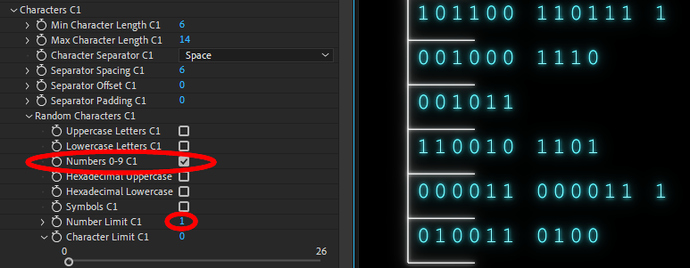
The above example shows how you could create fake binary code. If we had restricted the Number Limit to 0, all output would have been 0 characters, just as the first row is actually row 0, not row 1. Selecting a Number Limit of 1 actually means allowing the 0 and 1 values in the allowed sequence. If we had checked Uppercase Letters rather than Numbers and selected a Character Limit of 0, the output would have been all A characters (and spaces).
The above example shows how you could create fake binary code. If we had restricted the Number Limit to 0, all output would have been 0 characters, just as the first row is actually row 0, not row 1. Selecting a Number Limit of 1 actually means allowing the 0 and 1 values in the allowed sequence. If we had checked Uppercase Letters rather than Numbers and selected a Character Limit of 0, the output would have been all A characters (and spaces).
-
Dates
This set of parameters is only usable when Column Data Type is set to Dates.- Date Format holds an array of options that dictate the date's formatting. Note that MM will output the month's two-digit number while MMM yields a three-character abbreviation (e.g., Jan or Feb) and MMMM spells out the entire month name.
- Date Separator determines what character gets used to separate month from day from year.
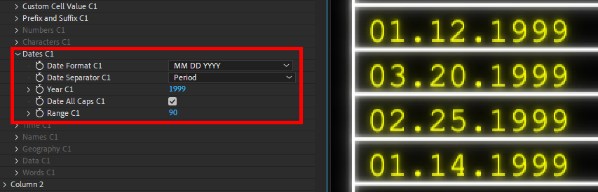
- Year sets what year anchors the dates shown in the column, with Range adjusting how far behind and ahead (in days) the randomized dates can get.
- Date All Caps toggles if the dates are all written in capital letters (when applicable).
-
Range
adjusts the span of days within which dates are randomized.
For example, selecting 1999 for Year with a Range of 365 will generate dates from across the entire year of 1999. A value of 90 would constrain output to the first three months.
-
Time
These parameters are only usable when Column Data Type is set to Time.- Format determines the formatting of the clock as 12 Hour Clock, 24 Hour Clock, or Timecode.
-
Hours Offset
and
Minutes Offset
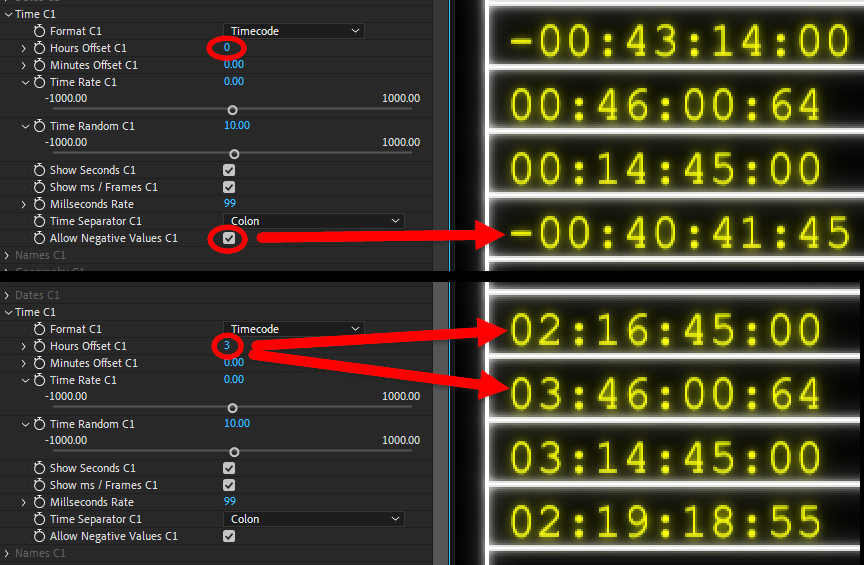
set how far ahead from the clock's start time the time values appear. If all time parameters are zeroed out, the starting time will be midnight or 0:00:00:00. As shown below in the bottom image, an Hours Offset value of 3 will move the time value ahead three hours. However, the Time Random (see below) value of 10 introduces some random variance in the output, which is why all values aren't exactly 03:00:00:00.
- Time Rate sets the interval at which time values increase or decrease from their original values.
- Time Random adjusts the amount of value randomization among the cells (as shown above).
- Show Seconds toggles whether seconds appear.
- Show ms / Frames toggles whether frames/milliseconds appear in time values.
- Milliseconds Rate sets the interval at which values increase or decrease from their original values when milliseconds are present.
- Time Separator contains a drop-down list of options (e.g., comma, ampersand, double colon, etc.) for what separates the hours, seconds, and milliseconds.
- Allow Negative Values toggles whether time values can dip into negatives (as shown in top image, above). Disabling this results in time rolling over values.
-
Names
This set of parameters is only usable when Column Data Type is set to Names.- Name Format contains presets with options on how first and last names are displayed.
- All Caps toggles if the names are all written in capital letters.
- Gender Mix dictates the mix of neutral/female/male names prevalent throughout the column.
- Name Separator contains a drop-down list of options for what separates the first and last names. Some options may or may not have an effect on the output, depending on the Name Format selected.
-
Front Character
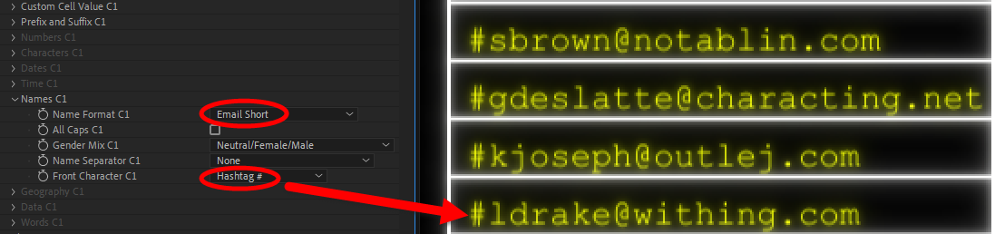
contains optional @ or # symbols to prefix each name, as shown below.
-
Geography
This set of parameters is only usable when Column Data Type is set to Geography.- Include City toggles whether the city is displayed alongside the location.
- Include Region/County toggles whether the region/county is displayed within the location.
- Region Lower Limit and Region Upper Limit control the range within the alphabetical list (A being 0, Z being 100) of regions available to display.
- Abbreviate State/Province toggles whether states and provinces are abbreviated.
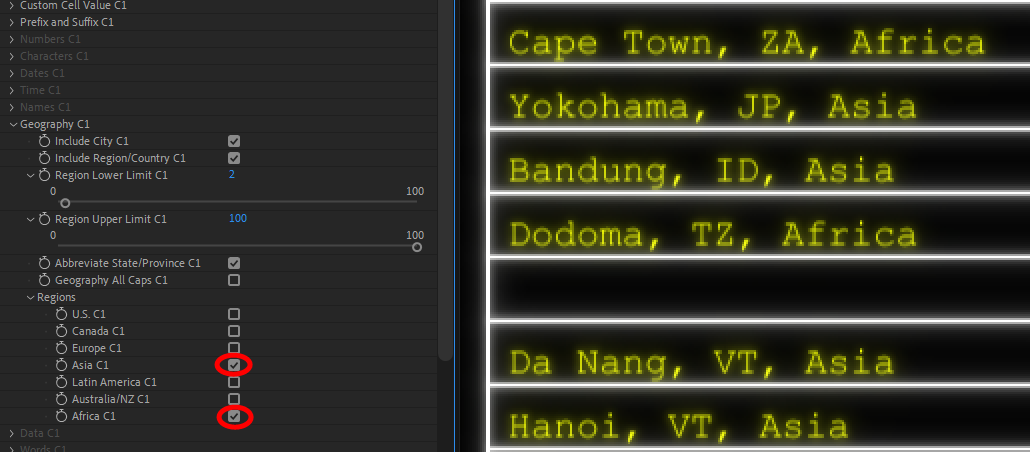
- Geography All Caps toggles if the locations are all written in capital letters (as shown below).
-
Regions
contains a checklist of regions from which to pull location data.
-
Data
This set of parameters is only usable when Column Data Type is set to Data.- Data Format contains a preset list of types of data strings to populate the column, including IPv4, IPv6, MAC address, and phone number.
- Comp Data Separator contains a preset list of characters to act as separators between data strings where applicable.
-
Directory Settings
contains parameters that only affect cell contents when Directories/Files is set as the Data Format.
-
Show Extension
toggles whether the files listed show their extensions (.xml, .json, etc.), as shown below.
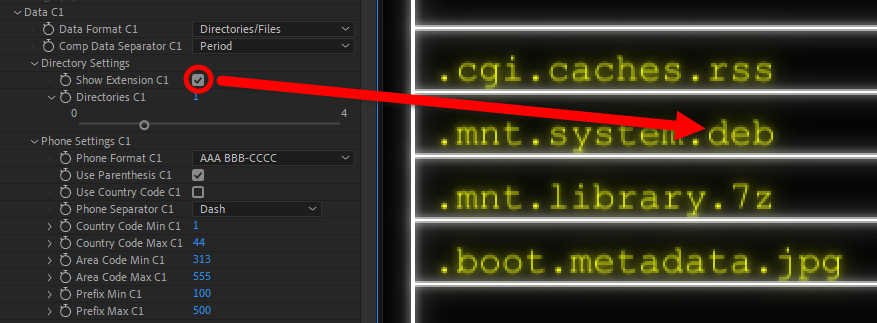
- Directories sets the level of directories shown per file. You can see a value of 1 at work in the image above.
-
Show Extension
toggles whether the files listed show their extensions (.xml, .json, etc.), as shown below.
-
Phone Settings
contains parameters that only affect cell contents when Phone Number is set as the Data Format.
- Phone Format contains presets that dictate how phone numbers are formatted.
- Use Parenthesis toggles whether the area code is enclosed in parentheses.
- Use Country Code toggles whether the country code is prefixed alongside phone numbers.
- Phone Separator contains a list of what character gets used to separate sections of the phone numbers.
- Country Code Min/Max defines the ranges used for country codes that prefix the phone numbers.
- Area Code Min/Max defines the range used for the area codes within the phone numbers.
- Prefix Min/Max defines the range for the prefix within the phone numbers.
-
Words
contains parameters that only affect cell contents when Words is set as the Data Format.
-
Word 1 Source
thru
Word 8 Source
contain a drop-down list of categories from which each word within the cell will be generated.
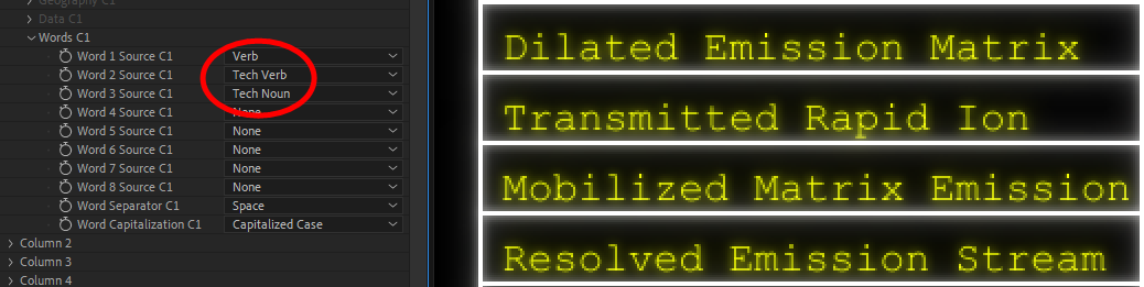
- Word Separator contains a list of what character gets used to separate each word within the column.
- Word Capitalization contains a list of capitalization options for the words within the column.
-
Word 1 Source
thru
Word 8 Source
contain a drop-down list of categories from which each word within the cell will be generated.
- Foreground Opacity and Background Opacity control the opacity of the text (Foreground Opacity) or the layer to which the text has been applied (Background Opacity), complete with the standard Blend Mode options that adjust how the effect interacts with the background. None is the default, with Normal overlaying the text on top of whatever background it has been applied to.