
Universe
TYPE CAST

Universe Type Cast animates text properties like color, opacity, size, position, and rotation either by word or by character.
Presets & Video Walk-Through
Type Cast offers a range of presets to help turn your text into engaging animations. Find our presets via the blue Open Dashboard... button or the Choose a Preset... button below it.
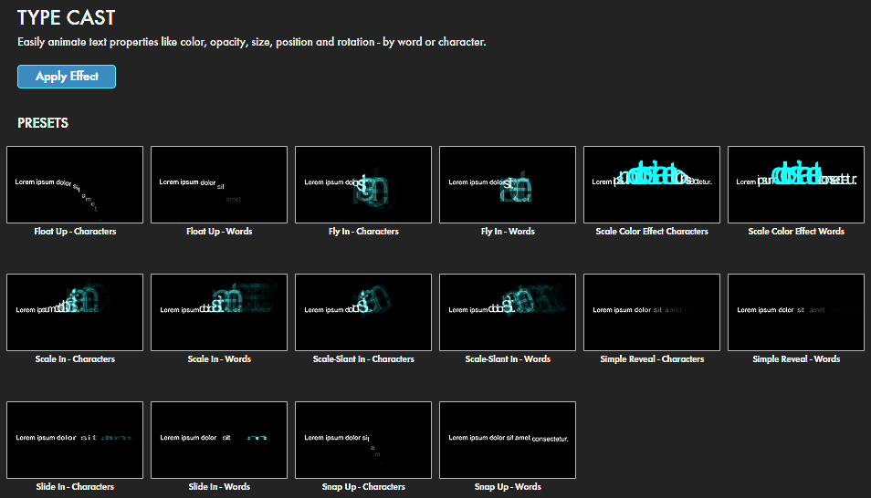
As with all other Universe tools, you can modify or create a Type Cast look and then save it under its own name by pressing the Save Preset... button.
If you'd like a visual overview of Type Cast before diving into this guide, we recommend giving our Cineversity tutorial a watch.
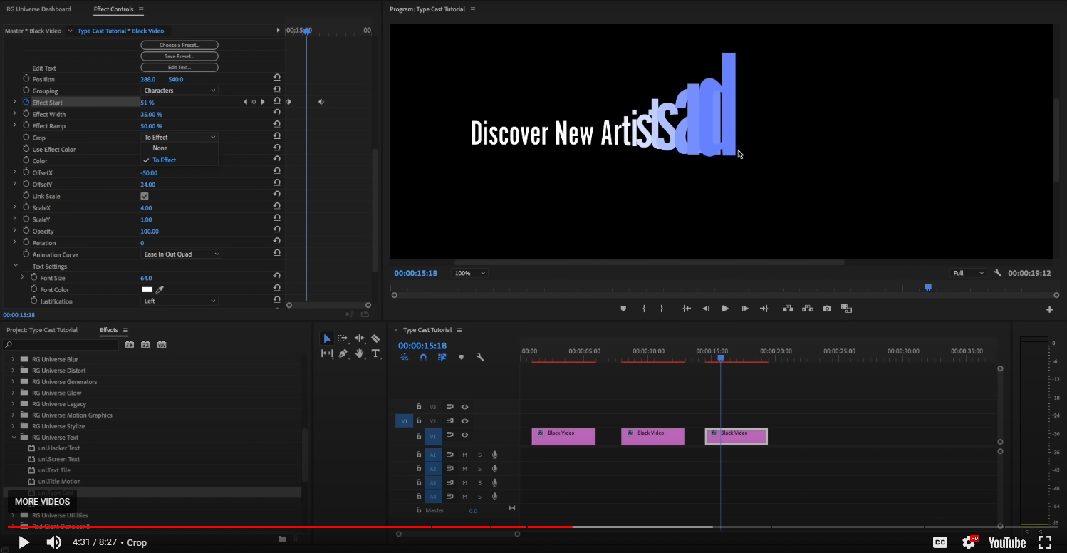
Modify the Effect
-
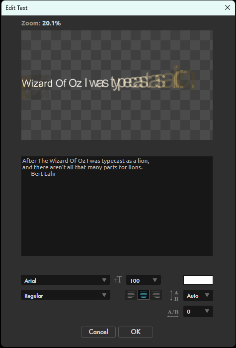
Edit Text
launches a modular window (shown below) with options to customize Type Cast's text input, including customization options for the font, size, color, emphasis (e.g., bold and italic), character spacing, and line spacing.
- Position defines the coordinates for where within the frame your text will begin to appear.
-
Grouping
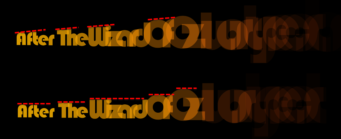
sets whether text animates by Characters or by Words. As you can see below, the top line shows words animating into position in which each new letter is larger than the one that preceded it (assuming equal character height normally). Said plainly, each letter starts big, then shrinks into its designated size as it moves into its final position. Alternatively, Words does the same thing, except with entire words rather than individual characters.
-
Effect Start
determines where within the provided text the effect begins its animation.
If you want your text to begin and/or end with a blank layer (no text at all), you may need to extend your Effect Start values to lower than 0% and/or beyond 100 percent. By sliding Effect Start's value, or keyframing it on the timeline, can see the effect animate in your preview window.
-
Effect Width
adjusts how wide of an area within the text input the animation effect spans.
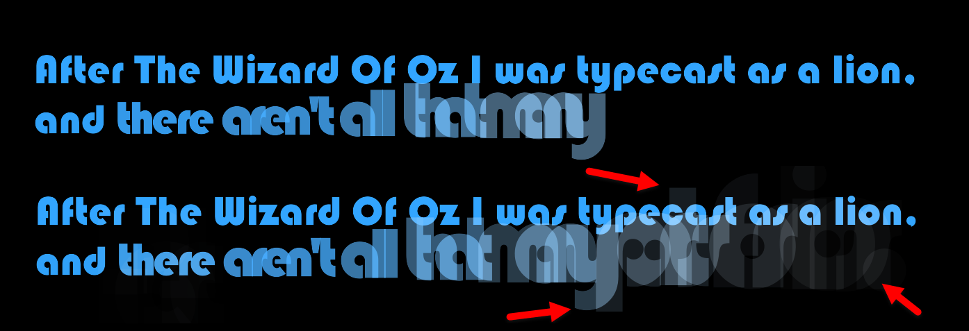
It can also affect apparent incoming character height. We illustrate this in the following image, showing values of 20% (top) and 100% (bottom).
-
Effect Ramp
sets the position of the animation's ramp within the text.
For example, if we set Effect Ramp to 0% in the above image, the text would cut off at "and," with no other incoming, or "ramping," words visible following it. Essentially, a 0% ramp negates the effect. Instead, that image uses an Effect Ramp of 60 percent. At 100%, you see the following result. Note how even with an Effect Start of -30%, which previously rendered the start of our effect blank, we now have some visible text at the animation's beginning and end.
- Crop determines if the effect crops out any text not within the animation (To Effect) or not (None).
-
Use Effect Color
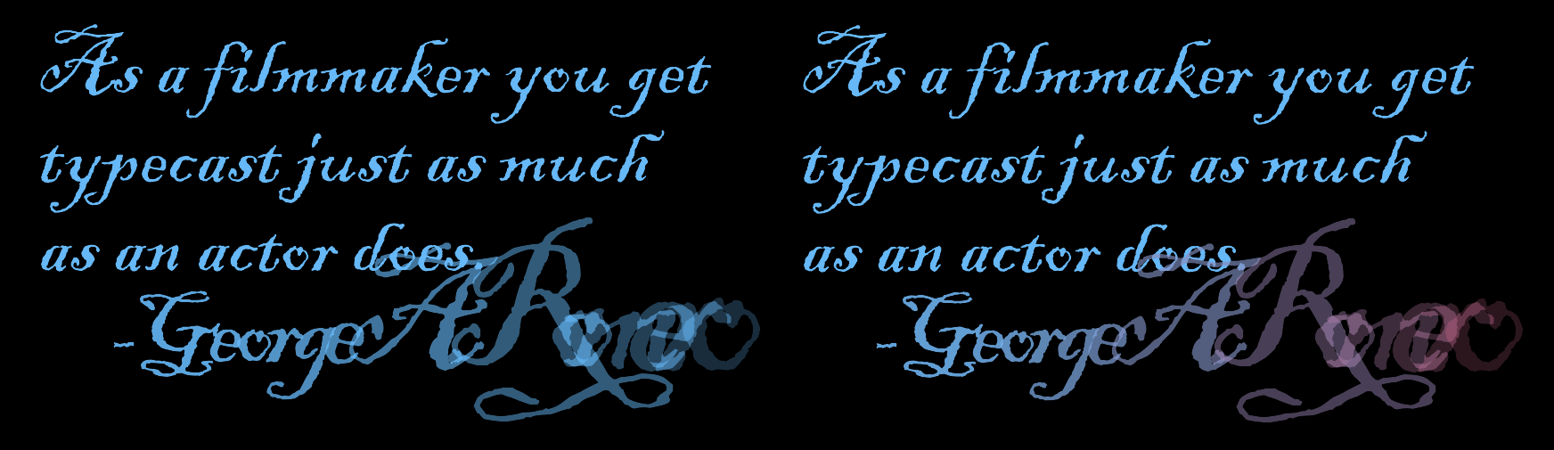
toggles whether the effect applies a second color to incoming text (as shown with red in the comparison below at right) or simply uses its own color for incoming text (left).
- Color sets the color used if Use Effect Color is toggled.
-
Offset X
and
Offset Y
adjust any text offsetting done by the animation.
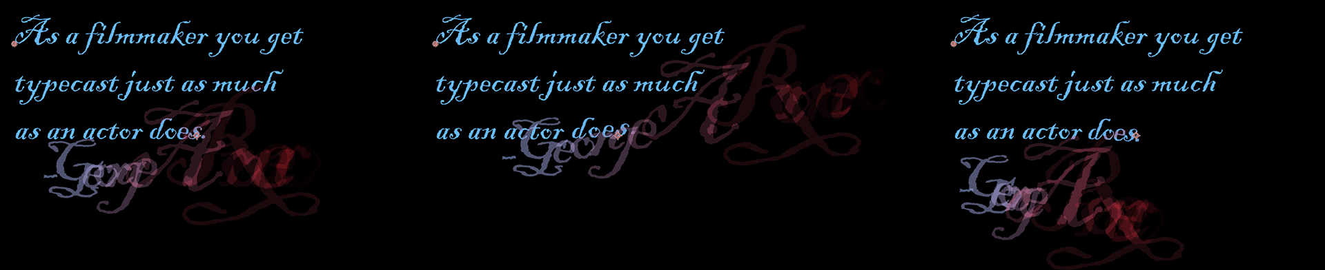
To illustrate, we show below values of X: 0 / Y:0 (left), X: -400 / Y: -200 (center), and X: 200 / Y: 150. Remember that the animation will complete with your text in its proper position; it's just the animation that gets offset.
- Link Scale determines whether adjustments made to Scale X apply equally to the y axis (toggled on) or independently from the y axis (toggled off).
-
Scale X
and
Scale Y
resize the animation along the x or y axis.
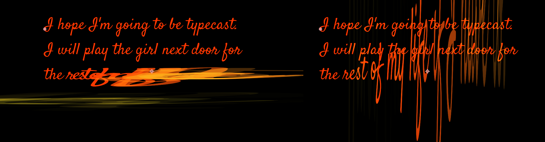
Below, you see the obvious difference between X: 50 / Y: 0 (left) and X: 0 / Y: 50 (right).
-
Opacity
adjusts the animation transparency.
Note in the following clip how our animation never fades to black, as in prior examples. We set Opacity to 40, which essentially overpowers our other settings that had the animation appearing to begin and end with black.
-
Rotation
alters the animation's incoming text angle. Here, we set Rotation to 90. You can see how the angle reverts to 0 over time as the text "settles" into place.
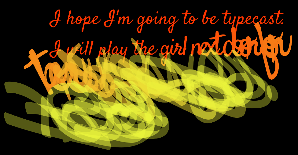
-
Animation Curve
provides over 20 choices of interpolation styles for your animation transition. The default is Ease In Out Quad, which is what we've used in prior examples. For comparison, here are Linear Tween (top), Ease In Quartic (middle), and Step (bottom).
- Text Settings, much like the Edit Text box, contains parameters that control the Font Size, Font Color, Justification, Line Spacing, Horizontal Tracking, and Kerning.
- Foreground Opacity and Background Opacity control the opacity of the text (Foreground Opacity) or the layer to which the text has been applied (Background Opacity), complete with standard Blend Mode options that adjust how the effect interacts with the background. None is the default. Normal overlays text on top of whatever background it's been applied to.