
This Capsule is exclusively for subscribers

Graph
With these settings you define the formatting and the type of display for the selected data.
Here you will find four different display types for your data:
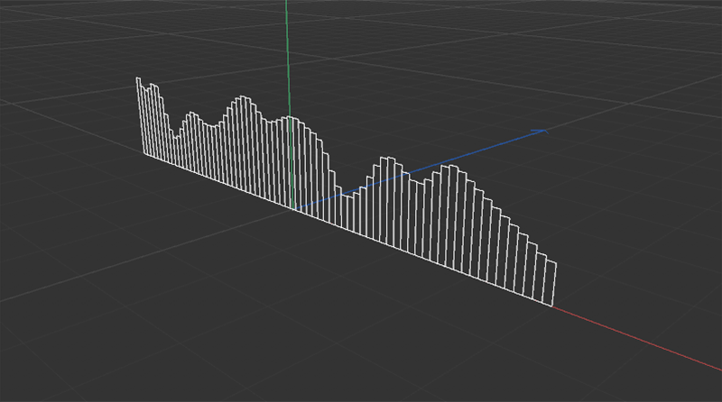 Type Bar: The data is broken down into individual values according to the count specification and each value becomes a rectangular column. The respective value will define the height of the rectangles.
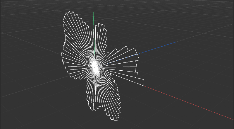 Type Pie: The data is resolved into individual values according to the count specification and arranged radially like pieces of pie. The respective value defines the outer radius of the pie chart.
 Type Line: The data is displayed as a soft interpolated spline curve.
 Type Step: The display is the same as for the Type Bar, except that this time only the upper areas of the rectangles are displayed. Different plateaus will be created in accordance with the Count number. For very high Count numbers, the display will be correspondingly more like the Type Line.
If you get the data from a noise structure (Noise), from random values (Random) or from a curve (Spline), you can define here the number of measuring points you want to use for drawing the diagram. Here you can define the number of steps in the graph for the Bar, Pie and Step type settings.
This setting is only available for the Type settings Bar, Line and Step and determines the position of the display relative to the axis system. For Left, the axis system lies at the left edge of the graph, for Right at the right edge and for Middle, the data will be displayed centered on the axis system.
This is the total width of the graph display. This value is only available for the Bar, Line and Step type settings.
The data in the Bar, Line and Step type settings will be converted relative to this height. The greatest ascertained value will be assigned this height, e.g., for the Bar display. Hence, this is the maximum expansion of the display along this height.
For the Pie type display, this value will be used for the largest data value that is found. All other data values will be converted relative to this. If Inner Radius is set to 0, this Radius will define the largest outer radius for the display. If an Inner Radius value greater than 0 is used, the size of the outer radius of the pie chart will increase accordingly.
Here, a region at the center of the pie chart (Pie type) can be define that should be kept empty. The outer radius of the pie chart will automatically be offset by this value.
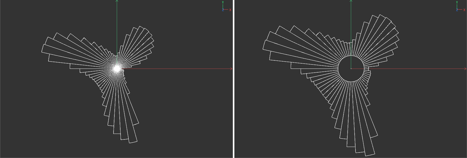 On the left, a pie chart with Inner Radius set to 0. On the right, the same database with an increased inner radius for the Pie display.
This setting is available only for bar chart display (Bar type) and can be used for shaping the top and bottom margins.
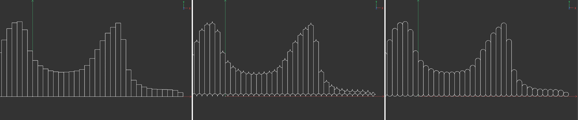 On the left is a representation of a bar chart without the use of rounding. At the center, a maximum negative Rounding and at the far right a maximum positive Rounding were used.
When using a bar chart (Bar type), the width of the bars can be define here. For values greater than 0, a gap will appear between the bars. Negative values will cause the bars to overlap.
When displaying a pie chart (type Pie), the angle range can be freely limited between 0° and 360°. This is the same principle as the section display, e.g., of a Cylinder primitive.
Here, the base line for a pie or bar chart can be moved from the point at which the pie sections or bars were drawn. For a pie chart with a Shift of -100%, all pie sections will have their common origin at the outer radius and will grow from there in the direction of the center point. A Shift of +100% will invert this behavior. All pie sections will have their common origin at the center at the inner radius of the pie chart and grow outwardly.
In the bar display, a Shift of -100% will cause the bars to all be aligned flush at their top edges. A Shift of +100% will place the bottom edge of the bars on a common line. Intermediate Shift values can be used to position bars or pie sections freely between these extremes.
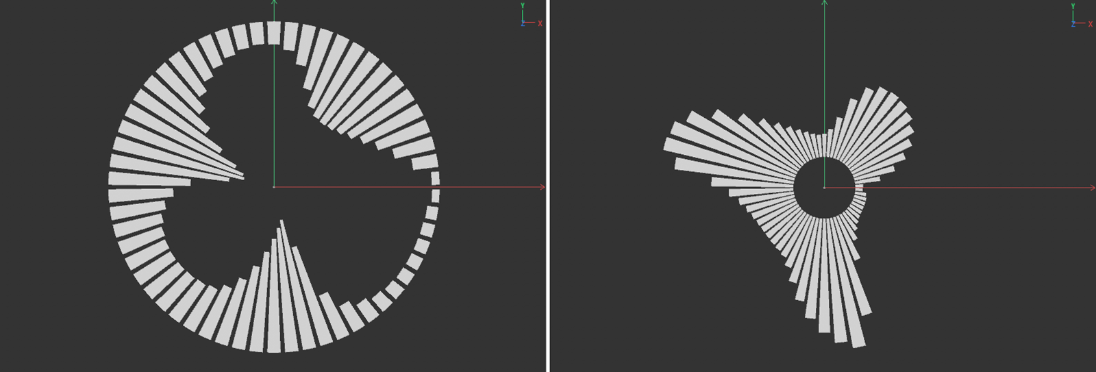 Both images show the same pie chart. At left, all pie sections were placed flush to the outer radius of the display. On the right, Shift was set to +100%, which places the pie sections' origin at the inner radius of the pie chart.
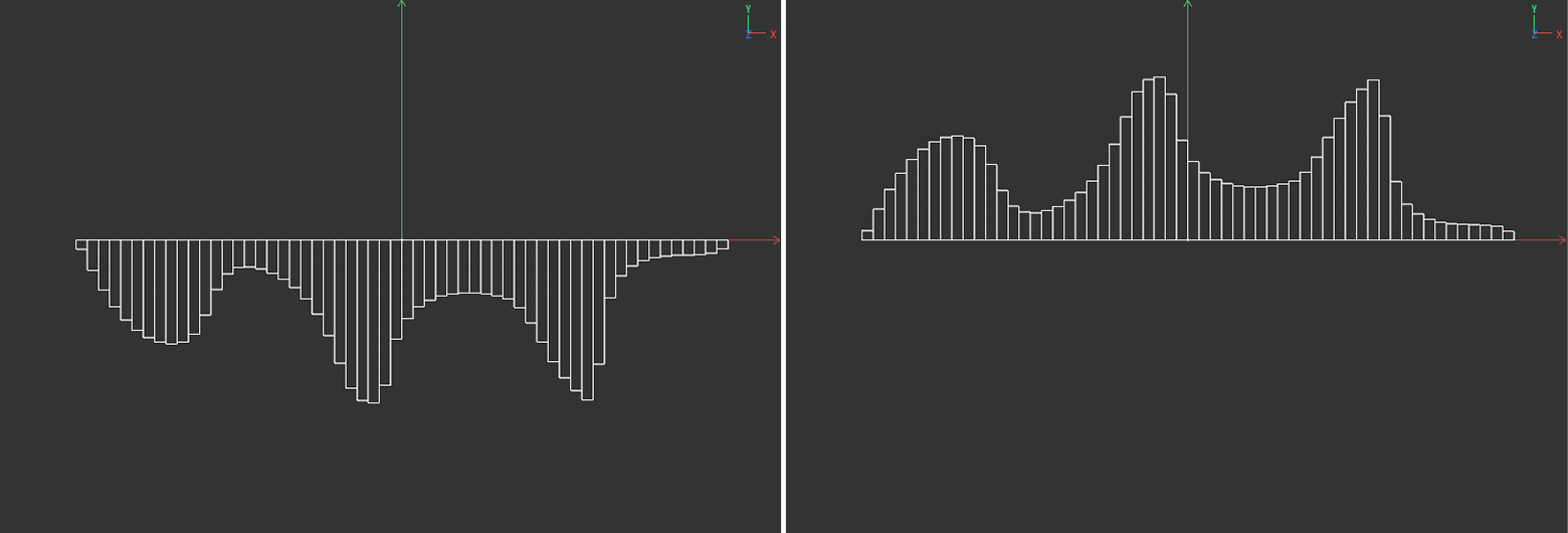 Both images show the same bar graph. At left, all bars were positioned flush to the top edge with Shift set to -100%. On the right, Shift was set to +100%, which places the pie sections flush with the bottom edge.
When using a pie chart, the width of the pie sections can be defined here. Values greater than 0 will produce a gap between the pie sections. Negative values will cause the bars to overlap. With Gap values greater than 0, the Parallel option can be activated, which can be used to force the sides of the pie sections to lie parallel to the neighboring section.
When using the pie chart display in combination with an increased Gap value, this option will ensure that the neighboring pie sections will maintain parallel borders. This will, however, shorten the pie sections at the center of the pie chart.
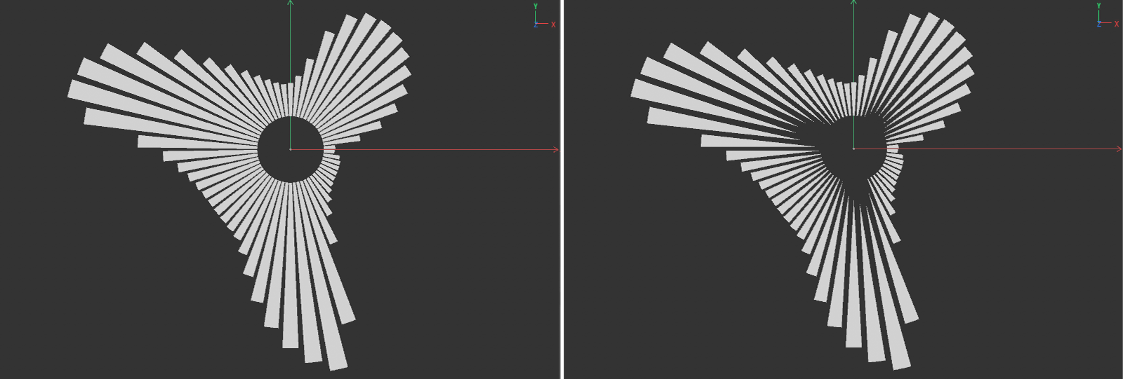 On the left is the representation of a pie chart without the Parallel option, and on the right with the Parallel option active.
With the display modes Line and Step the closure of the shape can be activated by a connection between the first and the last measuring point along the basic line of the diagram.
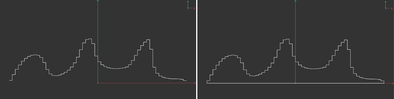 On the left is the display of a Step"curve without, on the right the same curve with active Close option.
As known from other spline basic shapes, the position of the shape in space can be defined using this setting.
This selection defines the type of diagram calculation and display. You can select from the following options:
- Graph: The graph is displayed as a bar chart, pie chart or curve chart (type Line or Step).
- Maximum: All diagram elements show only the maximum value of the evaluated data.
- Rectangle: The upper edges of the bars or pie pieces and also the measured values on the curve diagrams are displayed as rectangles.
- Circle: The upper edges of the bars or pie pieces and also the measured values on the curve diagrams are displayed as circles.
- Line: The upper edges of the bars or pie pieces and also the measured values on the curve diagrams are displayed as a line.
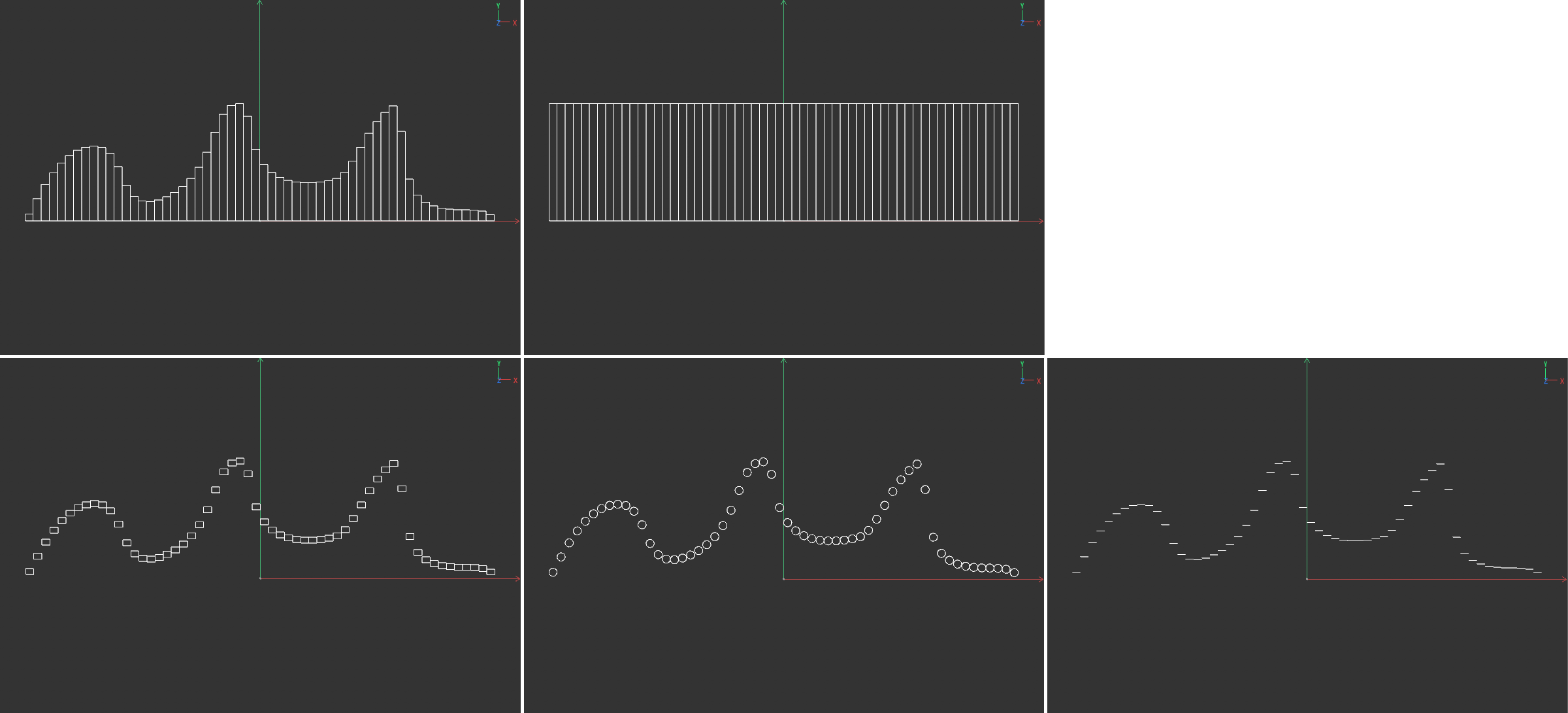 The two images above show a bar chart in the Graph output on the left and the same chart with the Maximum output next to it on the right. The same bar chart with the Output settings Rectangle, Circle and Line (from left to right) can be seen on the bottom line.
This setting is available for the Output modes Rectangle, Circle and Line and can change the width of the displayed elements in percent. The elements will become correspondingly more narrow with negative values. Positive values will make the elements correspondingly wider, which can result in overlapping.
This value is only available in Rectangle output mode. Here you can define the absolute height of the rectangles in the diagram.
This value is only available in the Circle output mode and can be used there to compress or stretch the circles in the diagram. Elliptical shapes will result. A perfect circular shape can only be achieved with an H.Scale value of 100%.
This value is only available for the Rectangle output mode and can be used there for rounding the rectangles.
This setting is only available for the Circle output mode and specifies the number of spline points along the circular path. Reducing this value will make the circles correspondingly more square. This also lets you create triangles or other shapes.
In the Output modes Rectangle, Circle and Line these shapes can be rotated around their center via the Rotation value. The rotation will be clockwise.
This value is available with the Output modes Rectangle and Circle and can be used to move these shapes vertically. By default, the center point of the rectangles or circles will lie exactly at the center of the measured value if V.Align is set to 0%. V.Align values greater than 0% will move the shapes over the measured value, negative V.Align values will place the shapes below the measured value.
This mode is only available for the Output modes Graph and Maximum for bar or pie charts and reduces there the bars, or pie pieces to simple lines.
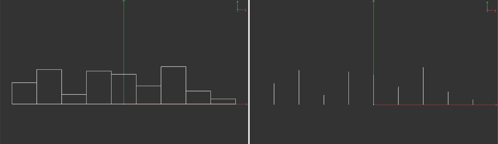 On the left is a diagram in normal Bar mode. Next to it on the right is the same diagram with Line mode activated.